
Charts and Dashboards: Venn Diagrams Part 1
24 December 2021
Welcome back to our Charts and Dashboards blog series. This week, I look at Venn Diagrams.
I have a very simple Table with some annual statistics for my salespeople:
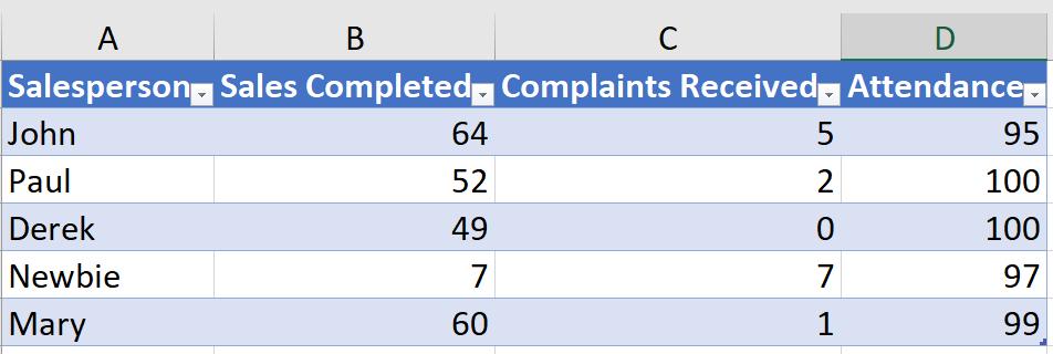
I want a quick visualisation to show which of my salespeople have reached the standards set. These are currently:
- over 50 sales
- at least 99% attendance
- less than two [2] complaints.
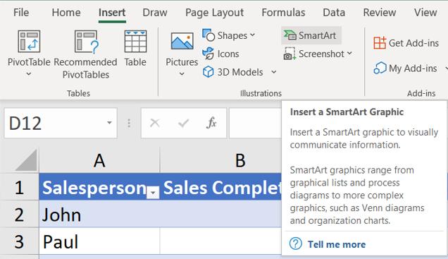
I am going to create a Venn Diagram to show which salespeople meet all these conditions. I start by going to the SmartArt option in the Illustrations section of the Insert tab.
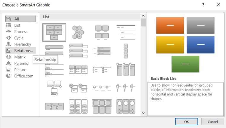
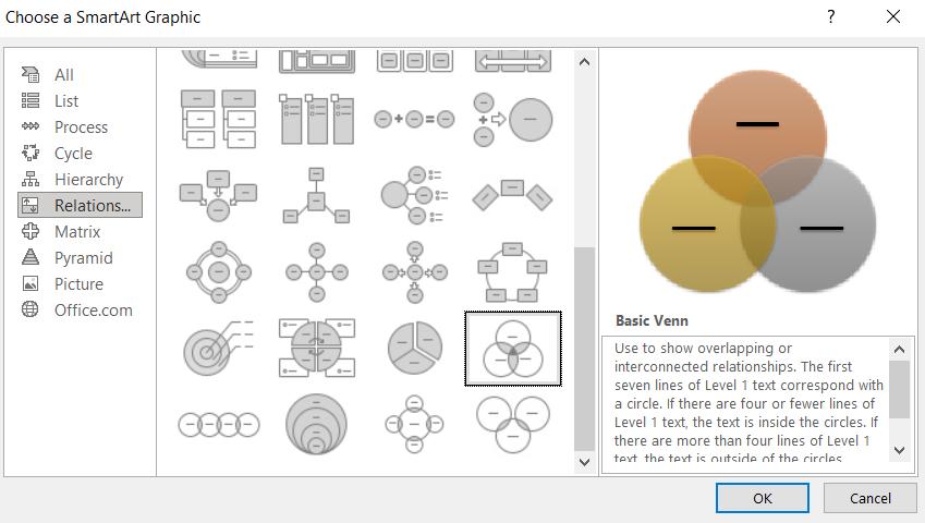
I can then choose which type of SmartArt Graphic I want to use from the dialog that appears. I pick the Relationship section:
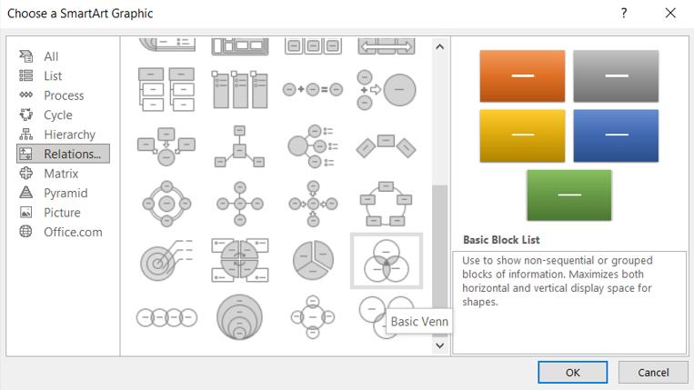
In the Relationship tab, if I scroll down, there are a number of options for Venn Diagrams. I choose a ‘Basic Venn’.
When I click on this icon, I get more details about the SmartArt Graphic:
I click ‘OK’ and the Basic Venn appears, ready for me to add text:

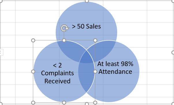
I enter the requirements for each of the categories that my salespeople are being judged on:
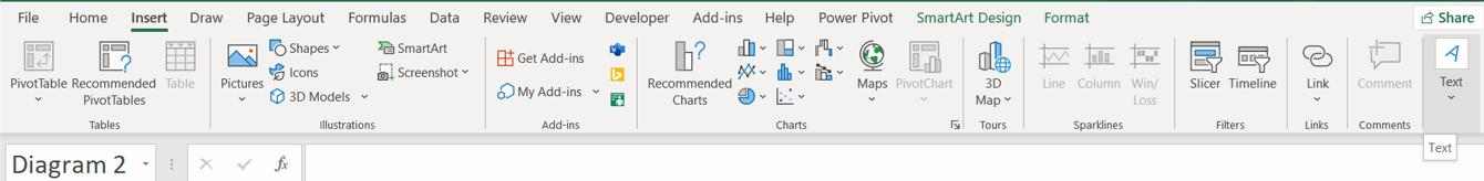
There are however, no automatic text inserts for the overlapping areas. To get around this, I can create a Text Box. I do this from the ‘Text’ group in the Insert tab:
This dropdown allows me to choose ‘Text Box’:
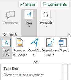
I select this, and choose the position of the new Text Box:
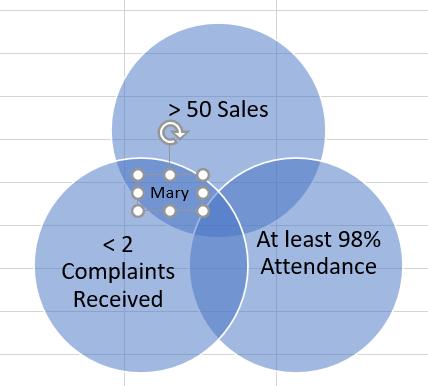
I can type into the Text Box. In this case, Mary has more than 50 sales and less than 2 complaints. I continue to fill the rest of the Basic Venn, and click and drag to enlarge it:
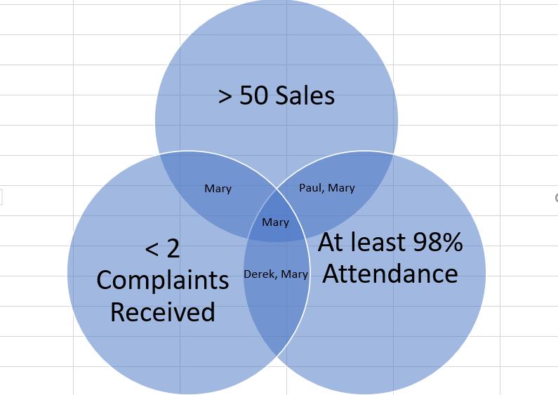
Mary is clearly a star. Next time I will continue to look at how I can format Venn Diagrams.
That’s it for this week. Come back next week for more Charts and Dashboards tips.