
Charts and Dashboards: The Risk Bubble Chart – Part 2
20 January 2023
Welcome back to our Charts and Dashboards blog series. This week, we’re going to continue looking at how to make a Risk Bubble chart.
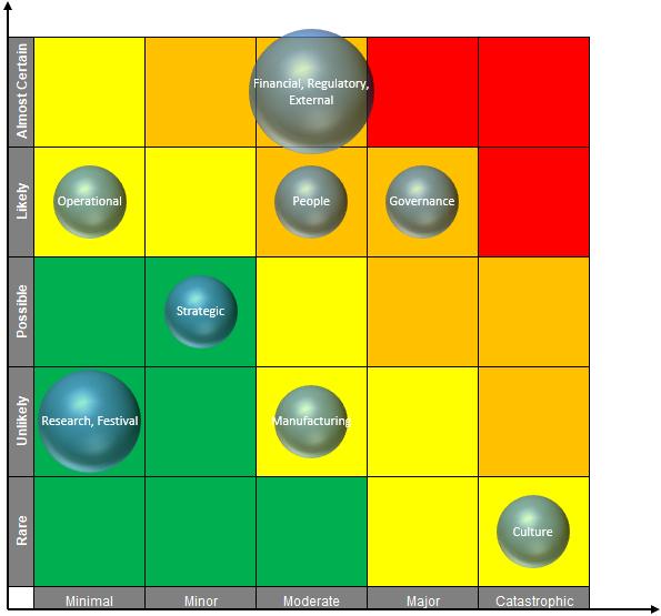
The Risk Bubble Chart
Last week, we set out the headings and shape for our chart:
This week, let’s take a look at how to colour it in line with our example.
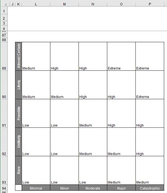
To colour the inner region of the chart we will use conditional formatting. First, we select all the inner regions of the chart and select Conditional Formatting -> Highlight Cells Rules -> ‘Equal To…’:
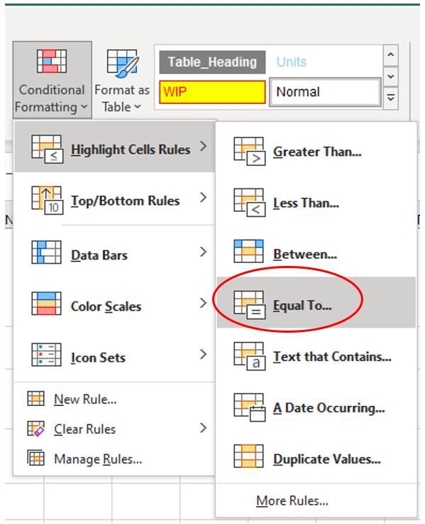
After selecting ‘Equal To…’ the following box will appear:
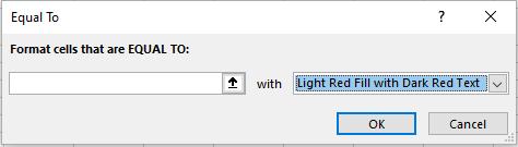
In the first box, we will put “Low”, and in the drop-down box we will select ‘Custom Format…’:
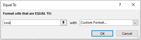
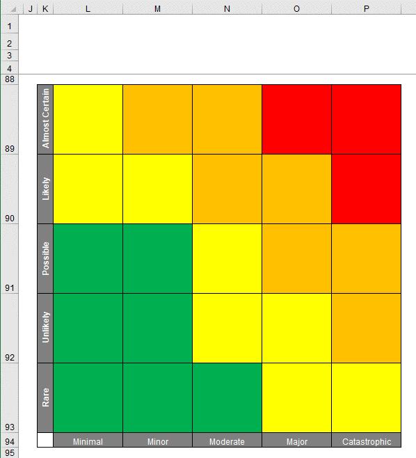
For the ‘Custom Format’, we choose the colour green for the font and the cell colour. We repeat this process for “Medium”, “High” and “Extreme”. For “Medium”, we use the colour yellow, for “High”, we use the colour orange and for “Extreme”, we will use the colour red. After applying the conditional formatting, we have the following visual:
We add two [2] arrows via the Shapes option in the Insert tab here for visual effect:
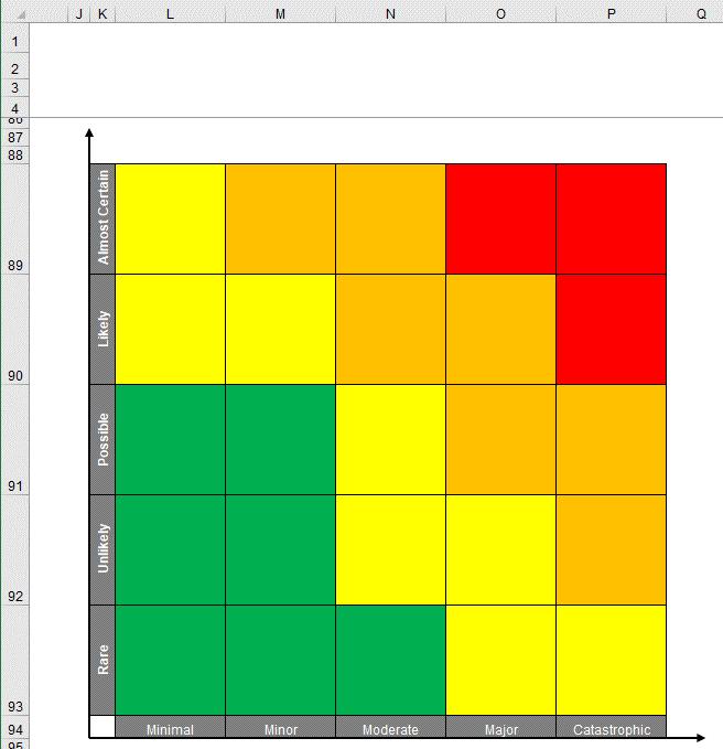
And that’s it, we have a colourful risk table (i.e. the higher the likelihood and the more severe the consequences, the “more dangerous” the colour). Next time, we will prepare the data needed to create the bubbles for our charts.
That’s it for this week, come back next week for more Charts and Dashboards tips.