Charts and Dashboards: Bar Charts
17 January 2020
Welcome back to this week’s Charts and Dashboards blog series. This week, we are going to look at Bar Charts.
By definition, a Bar Chart and a Column Chart are both members of the bar chart family. Excel differentiates them by classifying a Bar Chart as one where the bars are horizontal and therefore the categories are on the vertical axis and the value range is specified on the horizonal axis. A Column Chart, which I wrote about in my previous blog, has vertical bars and the axes are obviously the other way around.
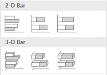
Just like for the Column Chart, Excel provides a number of Bar Chart variations, including Clustered and Stacked formats in 2-D and 3-D:
Reusing the sales data by customer group:

I can create a Bar Chart such as the one below:
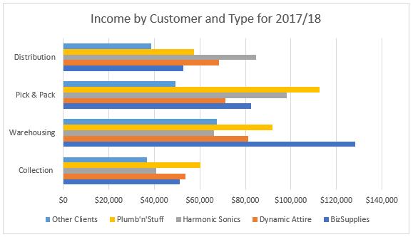
Initially, it looks the same as the Column Chart, but on further analysis, there are a few differences which might, and will in this example, require altering.
Below is the Column Chart generated from the data (from my previous blog):
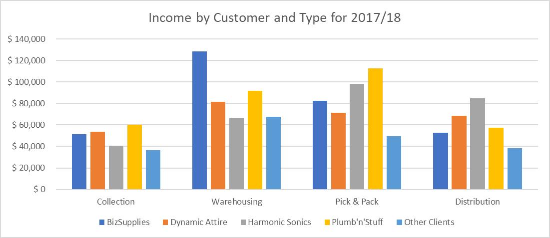
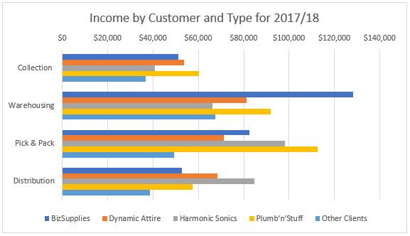
First, notice the bars for each income type series are touching in the default settings, whereas there were gaps between them in the Column Chart. Also, the income types on the vertical axis are in the wrong order. This is because Excel considers the bottom left corner of the chart to be the ‘starting point’ for the Line Chart, Column Chart, Bar Chart and most others that have a single horizontal and vertical set of axes. As such, working from this corner, Collection is the first income type, so it appears closest to the ‘starting point’ then working upwards, next is Warehousing, etc. Finally, note that the legend is also backwards compared to how it appeared for the Line Chart and Column Chart.
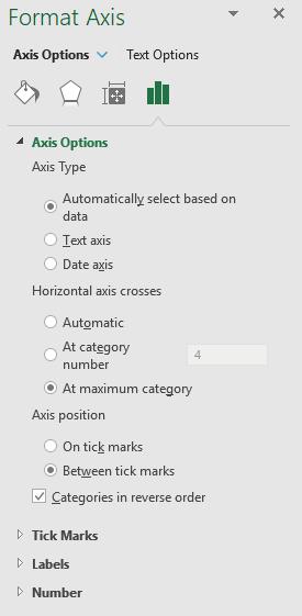
To change the order of the vertical axis, I select it, right click and choose ‘Format Axis’. Under the ‘Axis Option’, tick the ‘Categories in reverse order’ checkbox.
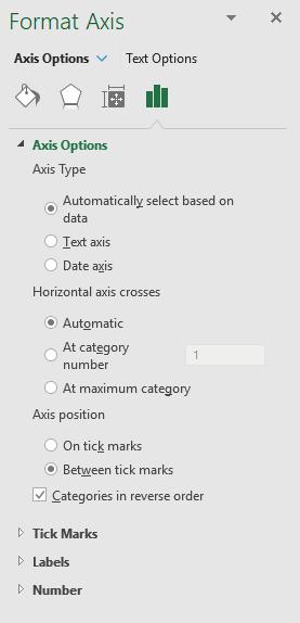
This will correct the order but now there is something weird: the horizontal axis is at the top, as this is where our first category is now located.
To fix this, I click on the axis and select ‘Format Axis’ once again. Under the ‘Horizontal axis crosses’, I tick ‘At maximum category’, which is Distribution.
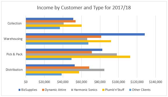
Also note that the above steps have also switched the legend around, putting BizSupplies first and Other Clients last, which is the order I prefer.
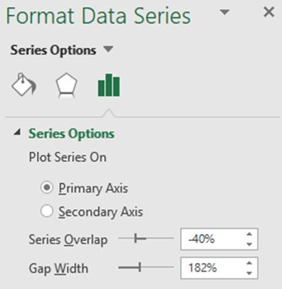
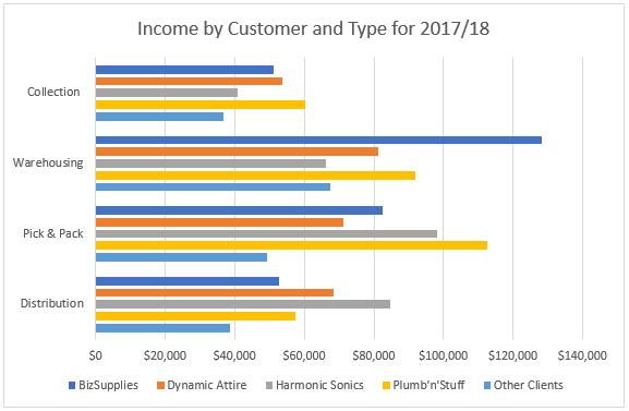
To create the gap between the columns within each income type, I select any of the data series on the chart, right click and choose ‘Format Data Series’. Under ‘Series Options’, there is ‘Series Overlap’. By setting this to be a negative value, this will separate the individual columns from each other.
Now my chart looks fine:
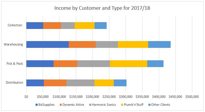
However, chart variations can sometimes communicate more information. For example, instead of using the Cluster type chart, I can change this into a Stacked chart, by clicking on the chart, then under the Design tab of ‘Chart Tools’ in the Ribbon, I choose ‘Change Chart Type’. In the ‘Change Chart Type’ dialog, I choose ‘Stacked Bar’:

The chart now appears as follows, showing the total income from each activity as well as the client breakdown:
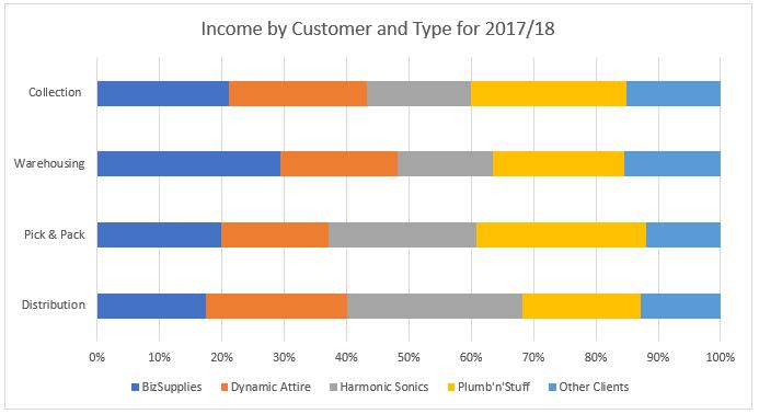
The other Bar Chart variation is the 100% Stacked Bar, which shows the percentage of income from each client by activity type:
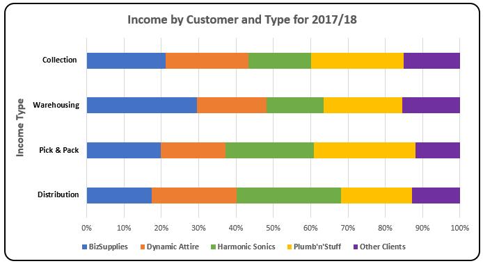
Finally, I do some further formatting similar to last week’s Column Chart here, and then I have a more “vivid” Stacked Bar Chart, viz.
That’s it for this week; check back next week for more Charts and Dashboards tips.

