Charts and Dashboards: Conditional Chart Labelling – Part 4
1 April 2022
Welcome back to our Charts and Dashboards blog series. This week, I take the final step and ensure my solution is sufficiently robust. Anything else would be (April) foolish!
I have the following chart data:
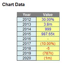
“All” I have to do is create the associated Excel chart with replicated label formatting:
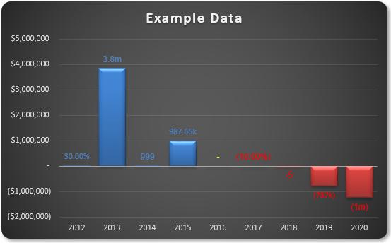
Do you see the need for supposed conditional formatting in the chart? I require positive values to be blue, zeros to be yellow and negative values to be in red – both labels and fill colours. It is possible, but I need to break the task down into various steps.
Essentially, there are several steps:
- Understand how I can create multiple number formats in Excel, never mind in a chart data label
- Create the basic chart
- Create the formatting in the data labels, realising custom number formatting will not work and conditional formatting may not be applied
- Make the solution robust enough to cope with saving the file and re-opening.
Last week, I looked at step 3, where I almost solved everything . This week I move onto step 4, where I ensure my solution is robust. It looks good so far, but there is a problem…
Step 4: Make the Solution Robust
I try closing and saving the file, then re-open. If I make all of the input values (50.00%), I see the following chart:
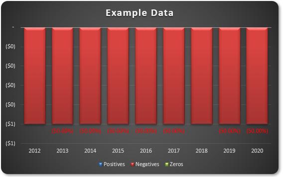
Some of my labels have gone missing! Similarly, if I type ‘123’ into all the inputs I get:
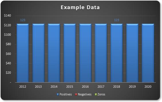
Now I have the missing labels, but the rest have gone instead. Not good!
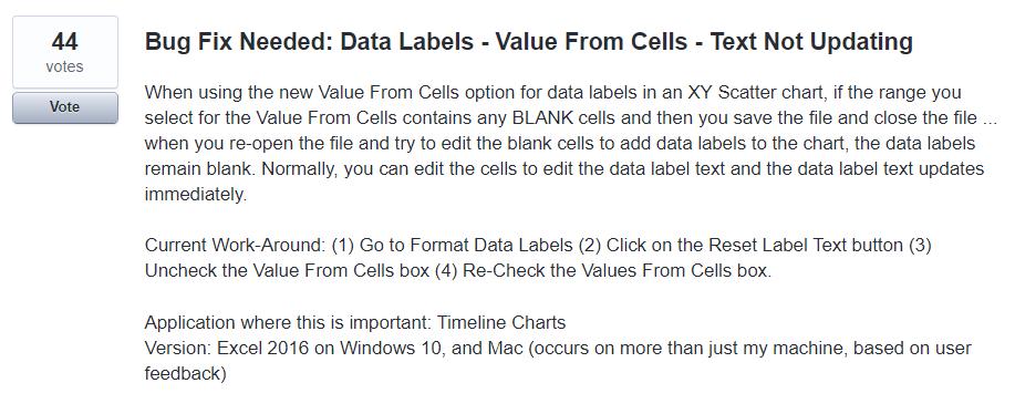
This is soooo frustrating! This is a bug in Excel. It is still prevalent in Excel 2019 and Excel 2021, plus the latest versions of Microsoft 365. A quick consultation with my favourite search engine tends to lead me to ideas such as saving the chart as a chart template, and creating a macro on opening that will re-apply the chart. Thank you very much; that’s not for me.
It’s not often on these challenges that I cheat quite like I will be doing this time. For this problem, there is a common free, third party add-in that appears to come to the rescue, namely past Excel MVP Rob Bovey’s XY Chart Labeler (sic) located at
http://www.appspro.com/Utilities/ChartLabeler.htm
If your IT administrator will allow you, downloading this add-in allows you to add ‘XY chart labels’ – and these seem to stick. It’s easy to use – all you have to do is add the chart labels and reference the text values using the add-in rather than Excel’s tools.
With no disrespect, maybe eventually Excel will get its own data labelling house in order though:
I look forward to writing a blog announcing that this is fixed!
That’s it for this week. Come back next week for more Charts and Dashboards tips.

