
Charts and Dashboards: Conditional Donut Chart – Part 1
12 March 2021
Welcome back to this week’s Charts and Dashboards blog series. Over the next few weeks, we will build a “conditional donut chart”.
You might be wondering what in the world is a donut chart (or maybe not). However, donut charts are a non-edible variation of a pie chart, except that it has a round hole in its centre and is the reason why it looks like a doughnut. The problem is Microsoft named it and they can’t spell. A donut chart can be quite useful to show proportions for categorical data of a string field, along with numbers or ratios. Also, the empty space in the middle allows us to add desirable aggregation labels such as average, count, maximum or minimum.
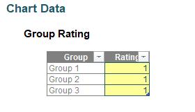
Let me start of by introducing an example. Our data contains three different groups that are rated from one (1) to five (5) as shown below:
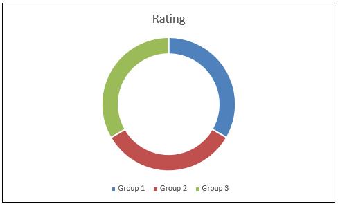
Currently, if I insert a donut chart, it would look similar to the one below.
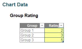
If I change the rating to
the chart would appear like this:
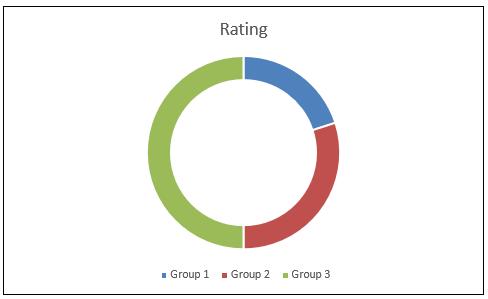
This is a “static” donut chart, insofar that it uses the same colours as were created in the chart initially. The colours in the donut segments are based on the three different groups and not on the rating. In case we want the colour to reflect multiple dimensions, creating a straightforward donut chart will have this limitation. In order to solve this problem, we start by creating a multiple value table for each individual group (here, Group 1, Group 2 and Group 3) against all possible scores (in this instance, from one [1] to five [5]). The table should reflect the rating from the original data table shown above.
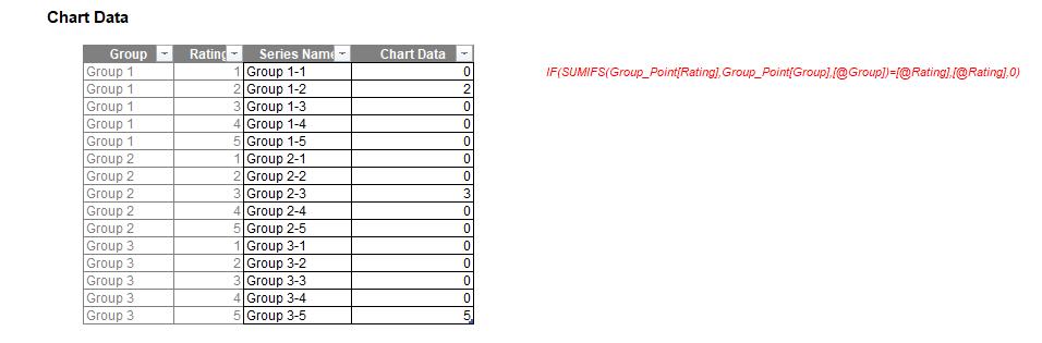
Assuming the data has been placed in an Excel Table called Group_Point, the formula used to calculate the Chart Data column is
=IF(SUMIFS(Group_Point[Rating],Group_Point[Group],[@Group])=[@Rating],[@Rating],0)
The reason I have added a zero [0] is to ensure that no value other than the original data will appear on the donut chart.
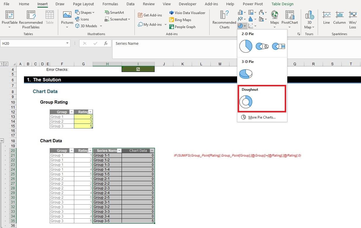
Now that the table is prepared, highlight the columns Series Name and Chart Data, and navigate to the Insert tab on the Ribbon and select a donut chart (in my Regional Settings, this displays as ‘Doughnut’ – yay!):
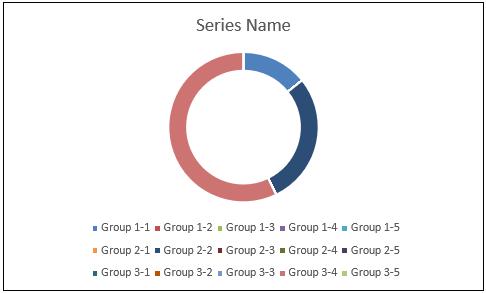
There it is: problem solved! Our basic donut chart is prepared that shows different colours for different ratings throughout and we have ensured that any series value that are the equivalent of zero do not appear.
You may wonder about the convoluted legend on the bottom: we will need to get rid of that and add conditional formatting to the chart. But that’s for next week…