Charts and Dashboards: Customised Chart Shapes – Part 1
15 January 2021
Welcome back to this week’s Charts and Dashboards blog series. This week, we consider adding customised shapes to charts.
When creating charts in Excel, we only get the default shapes, e.g. quadrilateral or round shapes. There is sometimes a good reason we want our charts to be uniquely customised to users’ needs.
For this example, let us consider a dataset of house sales (in $m) in the 12 months of 2020:
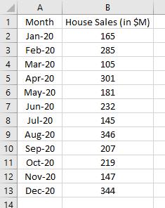
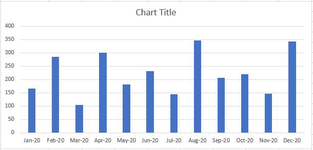
First and foremost, highlight the range A2:B13, navigate to the Insert tab on the Ribbon and select a column chart, or else, hold the ALT + F1 keys to create the initial column chart like the one below:
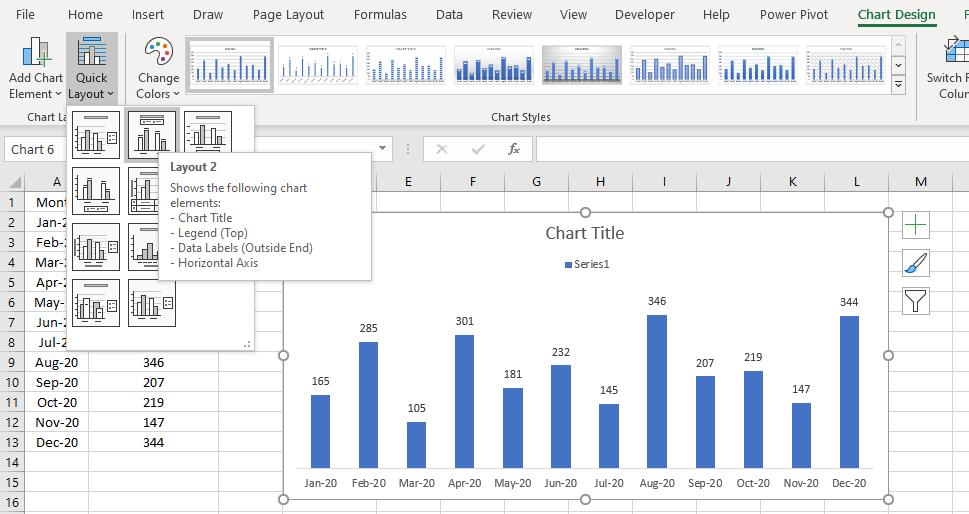
Next, go to the ‘Chart Design’ contextual tab, point to the ‘Quick Layout’ and choose a layout to get the data labels, removing the vertical axis and gridlines.
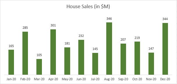
The series legend is not necessary, so, click on it and hit Delete. Click on the Chart Title and point it to cell B1 for a dynamic chart title. I also want to change the colour of the data series, so I click on them, go to the Format contextual tab and change the ‘Shape Fill’ colour to my likings.
Now, I want the data series to draw the shape like a roof of a house to make my chart more relatable and memorable. I go to the Insert tab, choose the ‘Arrow: Pentagon’ shape, draw it somewhere on the sheet, rotate it by 90 degree and change the shape colour to exactly the same colour as my chart’s data series.
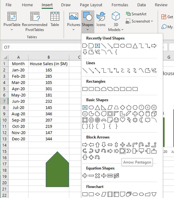
To get this pentagon shape to my chart, I click on the shape and press CTRL + C keys to copy, then click on my data series
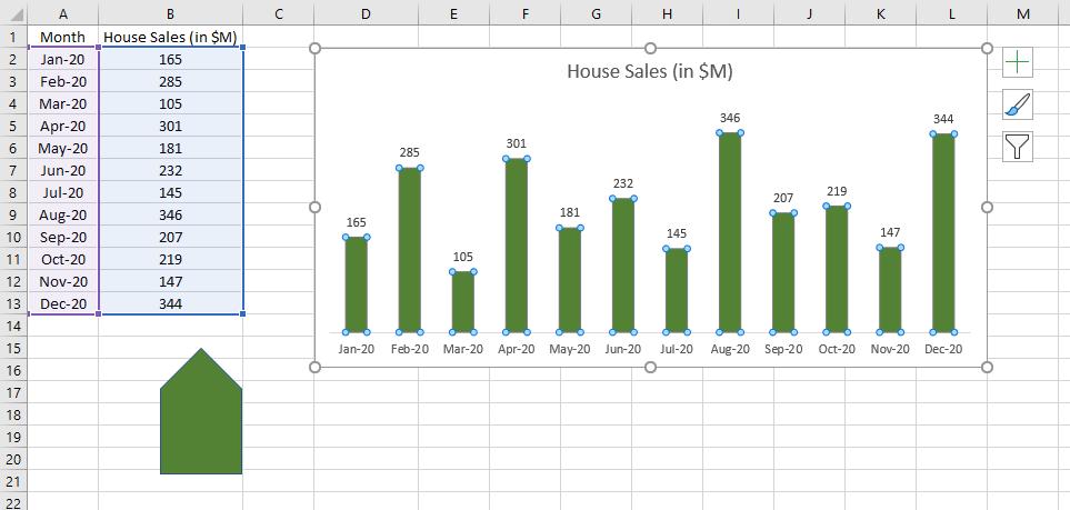
and hold the CTRL + V keys to paste.
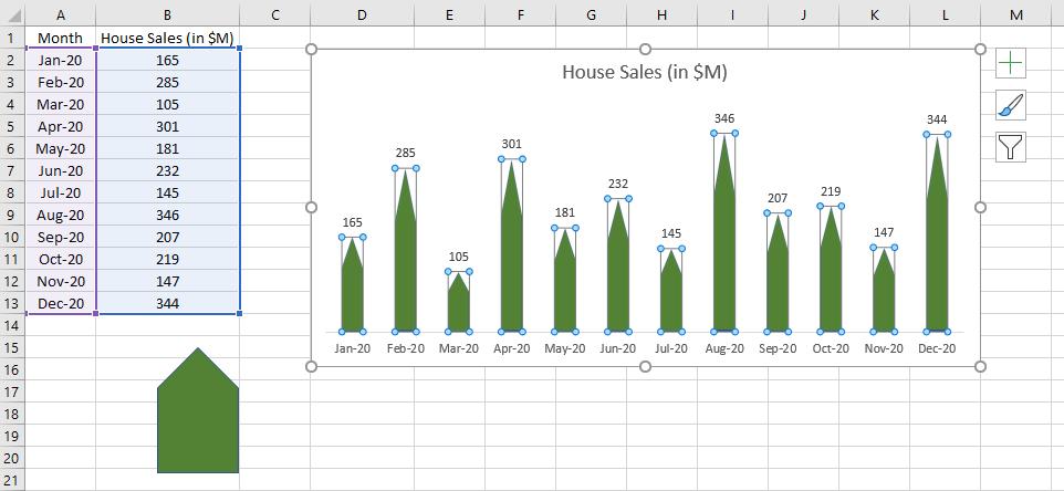
My chart data series now get the ‘roof’.
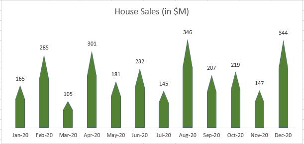
… Wait, do they look unequal? The higher the sales, the more the shape stretches and the pointier the roof is. I need to fix this, but that’s for next time…
That’s it for this week. Check back next week for more Charts and Dashboards tips.

