
Charts and Dashboards: Great Gantt - Part 2
23 July 2021
Welcome back to our Charts and Dashboards blog series. This week, I format the Gantt chart created last week.
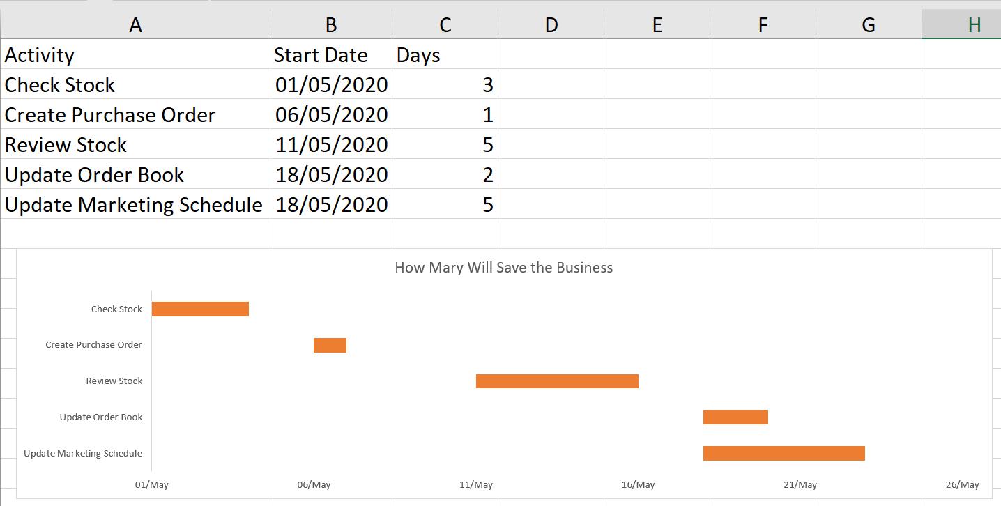
As a reminder, Mary, one of my best imaginary salespeople, has a list of tasks to complete so that we can update our tent business.
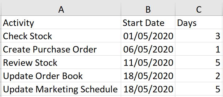
I want to present this in a Gantt chart. Last time, I entered all my data and I ended up with this:
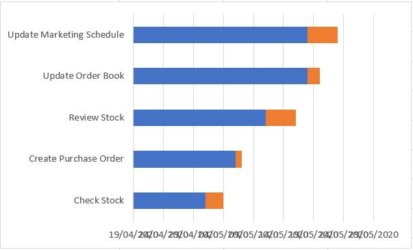
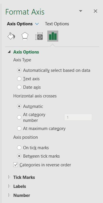
I have some formatting to do. There are a few problems with the way the data is displayed; I will start by looking at Activity since the activities are clearly in reverse order. To change this, I right-click on the vertical axis and choose to access the ‘Format Axis’ pane. In the ‘Axis options’, I can select ‘Categories in Reverse Order’:
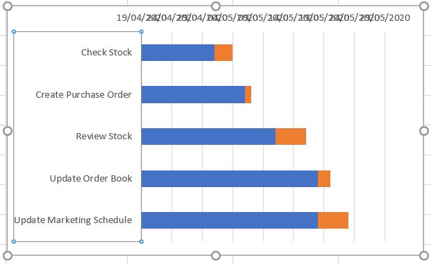
This has the desired effect.
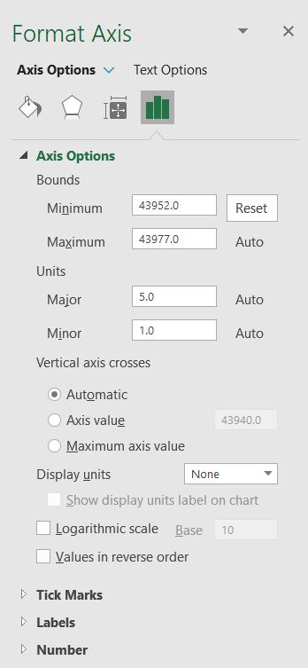
The dates are not clear. They overlap, and the format is ambiguous. I right-click on the horizontal axis choose to ‘Format Axis’ again. In the ‘Axis Options’ I set the Minimum to be 1 May 2020 (the date the first activity starts). This is translated to a number by Excel.
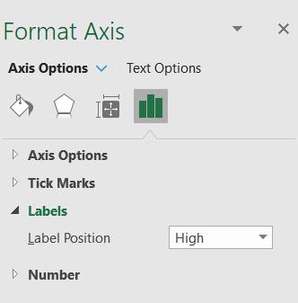
I also change the ‘Label Position’ to High in the Labels section:
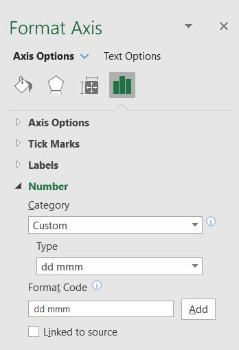
I also change the date format in the Number section so that the labels are smaller and Date is clear to users of any date format.
I also enlarge my chart; this is starting to take shape.
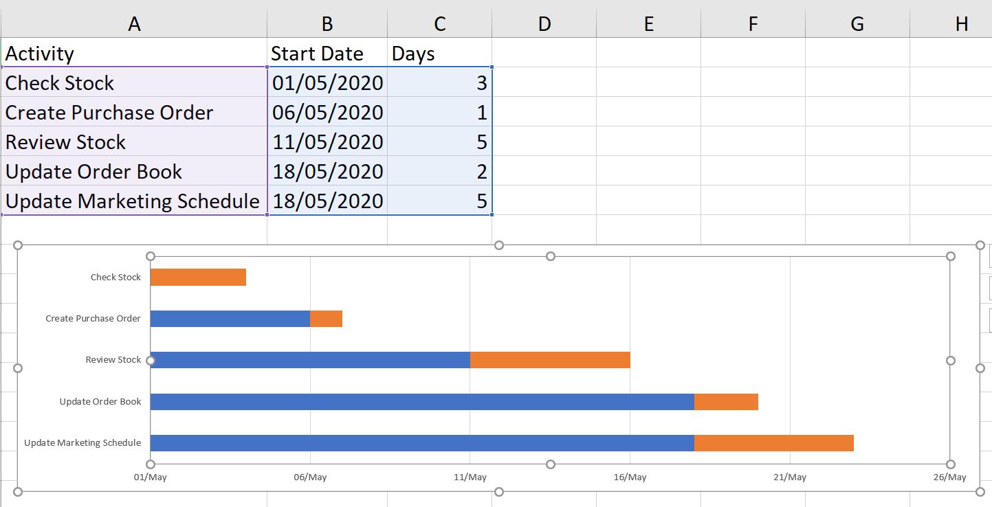
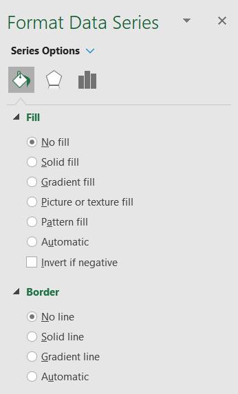
I need to format the blue bars. I select any blue bar and right-click to access the ‘Format Data Series’ pane, where set Fill to ‘No Fill’ and ensure that ‘No Line’ is selected in the Border Section.
I give my chart a title, by using ‘Add Chart Elements’ on the ‘Chart Design’ tab, and it’s ready to present to Mary.
That’s it for this week. Come back next week for more Charts and Dashboards tips.