
Charts and Dashboards: More Target Practice
18 June 2021
Welcome back to our Charts and Dashboards blog series. This week, I look at another way to create a presentation of actual sales vs. target sales.
In last week’s blog, I looked at a way to represent the actual and target sales on a chart.
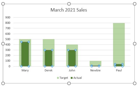
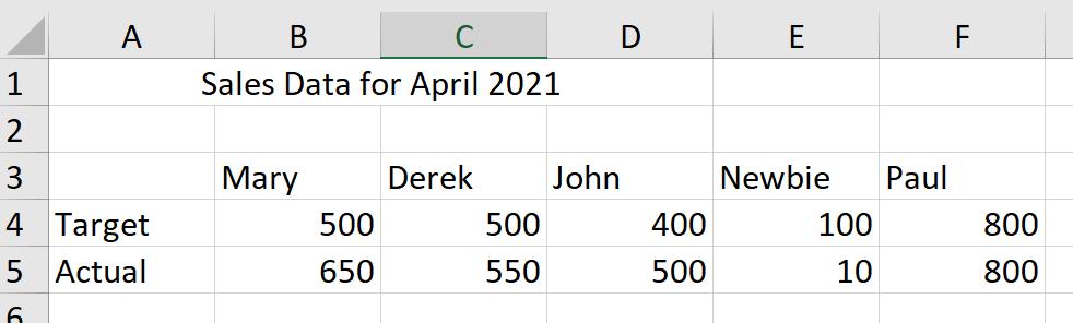
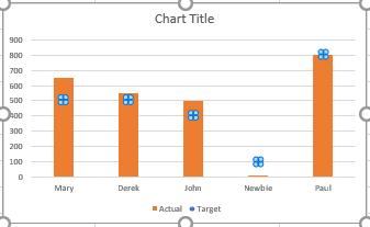
In April, my imaginary salespeople did much better (on the whole).
This time I am going to present the data in a slightly different way. I will start the same way as last week, by selecting my data and pressing ALT + F1.
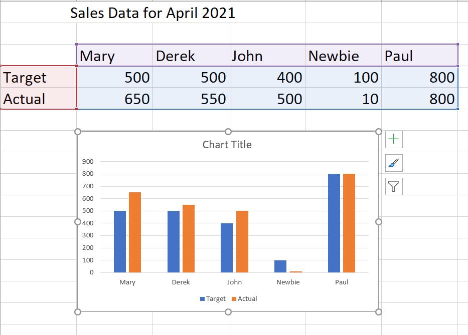
A column chart is inserted in the sheet, and I can click on a bar from either of the data series and right click to access the menu. This time, I select ‘Change Series Chart Type’.
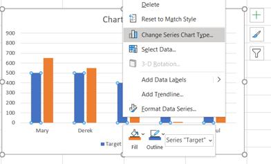
A dialog box appears:
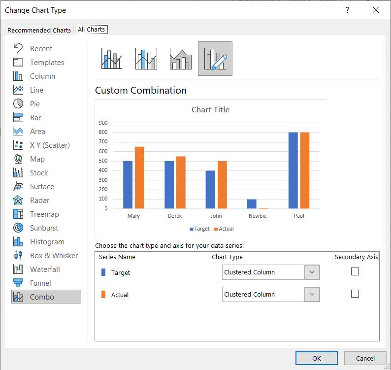
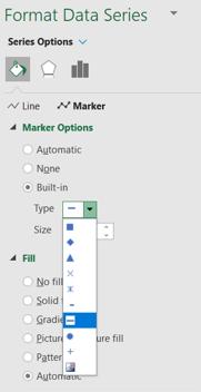
I change the Target data series to ‘Line Chart with Markers’.
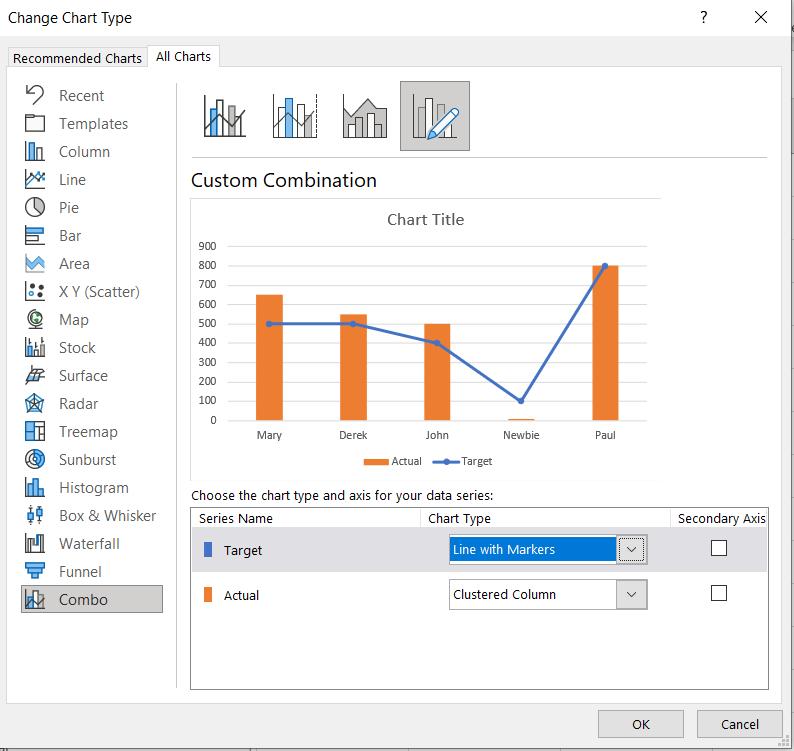
So far, this doesn’t appear to make anything clearer, but I have more changes to make. I click ‘OK’ and select the Target line, and right-click to access the ‘Format Data Series’ pane.
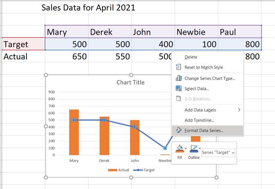
In the ‘Fill and Line’ tab, I select ‘No Line’.
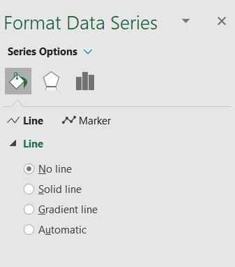
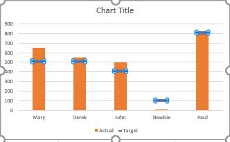
This replaces the line with markers.
Next, I need to format the Markers on the ‘Format Data Series’ pane. I select ‘Built-in’ and pick the long horizontal line. I set the size of the line to 20.
This changes the look of my chart.
I can now change the colours in the ‘Format Data Series’ pane for each series and edit the chart title.
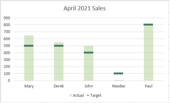
Now I can quickly see who is exceeding their targets. Time for a chat with Newbie!
That’s it for this week. Come back next week for more Charts and Dashboards tips.