
Charts and Dashboards: Moving Chart Labels – Part 2
7 May 2021
Welcome back to this week’s Charts and Dashboards blog series. This week, we will continue to discuss about the moving chart labels.
In Part 1, we took actual and budget sales data in a financial year,
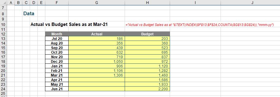
to create a line chart. We then added the data labels to the end points of each chart series, viz.
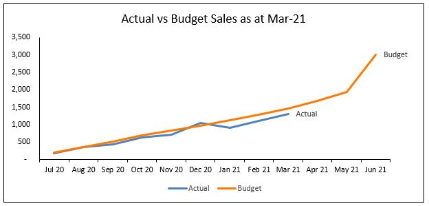
However, when we added more data to the chart, the labels were not moving and were overwritten by their respective series lines, because we had been adding data labels for a single point in each series. In summary, the data labels were not dynamic yet.
Guess what we are going to do this week!
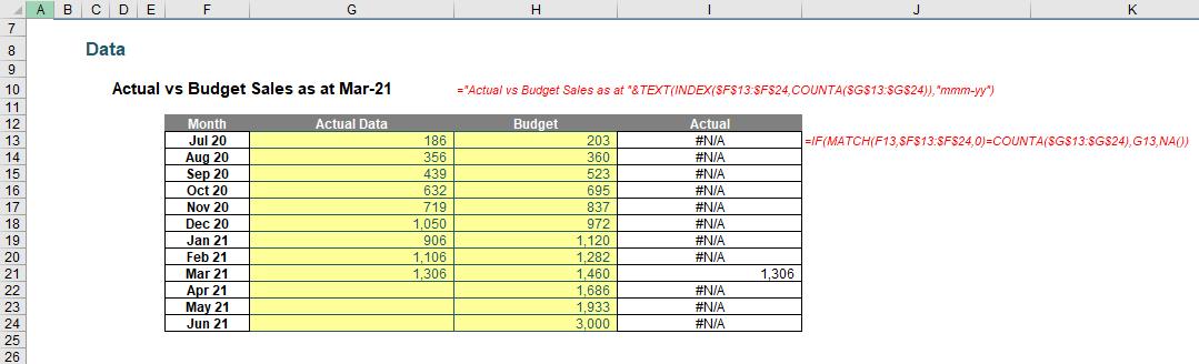
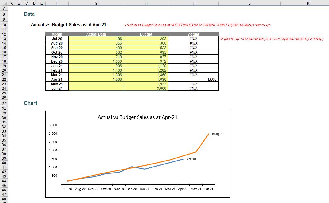
To fix this, we will need a helper series which plots only the last actual data point. In cells I13:I24, we will add a series call ‘Actual’ – which will be used as the label later – and use the formula as shown below to get only the last actual data point. We will also need to rename the existing ‘Actual’ series to ‘Actual Data’ to distinguish with the new series. All other data point with #N/A errors will be hidden. The #N/A errors are deliberate, as they prevent the points being plotted on a line chart. You can read more about hiding chart data here and here. We have used the formula
=IF(MATCH(F13,$F$13:$F$24,0)=COUNTA($G$13:$G$24),G13,NA())
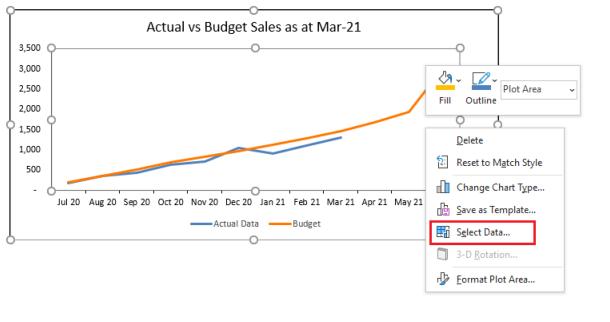
Next, let’s remove the ‘Actual’ data label, and then right-click on the chart area and choose ‘Select Data…’:
In the ‘Select Data Source’ dialog, under ‘Legend Entries (Series)’, click Add.
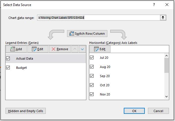
Select cell I12 to be the Series name and cells I13:I24 to be the Series values and click OK.
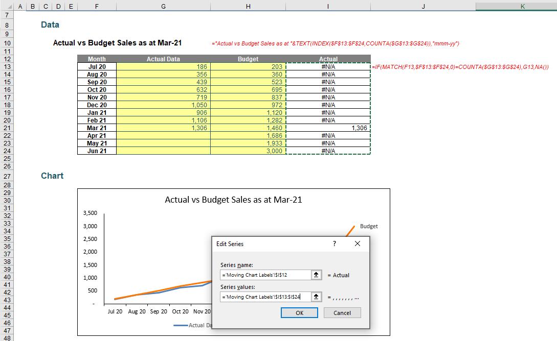
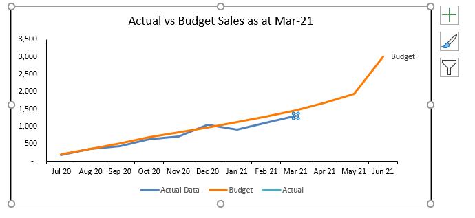
The chart now looks like the one below. A new ‘Actual’ series is added, with only one data point overlapped by the ‘Actual Data’ series (making it difficult, if not impossible, to see).
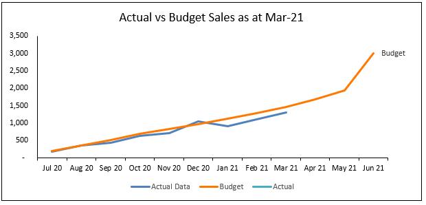
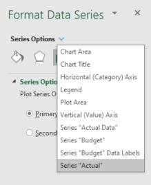
To format the Actual series only, right-click on the chart and select ‘Format Data Series’. In the ‘Format Data Series’ panel, under ‘Series Options’, choose ‘Series “Actual”’.
The data point is highlighted, right-click on it and choose ‘Add Data Label’.
Again, right-click on the label, select ‘Format Data Label’ and tick ‘Series Name’.
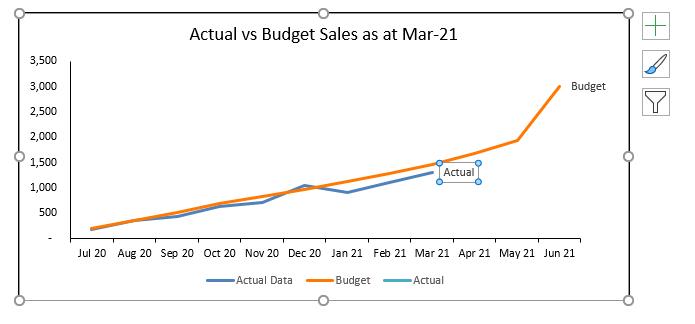
We won’t need the legend, hence, click on it and hit Delete. We may also need to resize the plot area. The chart now looks like this:
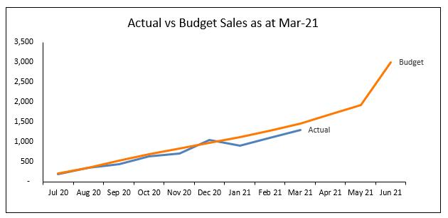
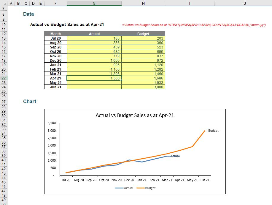
Now, if we add more actual data, the chart title changes and the label moves along with the series!
That’s it for this week. Come back next week for more Charts and Dashboards tips.