Charts and Dashboards: Pie Charts
24 January 2020
Welcome back to this week’s Charts and Dashboards blog series. This week, I will treat you with a Pie…
I am browsing the ‘Excel store’ for this yummy pie…

…and Excel offers me a Pie Chart!
As one of the few charts that do not have an axis, a Pie Chart is useful for showing the proportion of a group of numbers to their total. Excel also provides the standard 2-D and 3-D Pie Chart, whereby each value in the series is allocated a segment of the circle based on its ratio of the total.
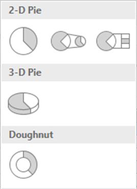
Note that the two 2-D Pie Charts on the right are referred to as ‘Pie of Pie’ and ‘Bar of Pie’, and these allow for some of the values in the selected series to be shown as either another Pie Chart or a series of blocks which in total represent one segment of the main Pie Chart. The final option is a Donut (sic), which is basically a Pie Chart with a hole in the centre. However, there is one key difference between the four Pie Charts and the one Donut Chart: the Pie Charts can only graph one series, whereas the Doughnut Chart allows for multiple series to be mapped.
Let’s start by taking the 2017/18 income table again:

I am considering a Pie Chart that shows the distribution of total income by customer and a separate Pie Chart of income type by activity. To start, I highlight the table excluding the heading on the top line, then go to the ‘Insert’ tab on the Ribbon, click on the ‘Pie Chart’ icon and choose the top left Pie Chart variation. Here is my initial pie:
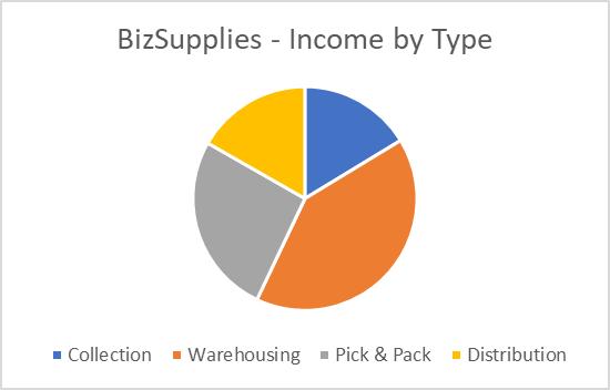
My chart only shows the income type breakdown for BizSupplies, because a Pie Chart can only map one series, but the table I highlight could be interpreted as either four series going across the table or five series vertically. Therefore, Excel defaults to selecting the first vertical column as the series for the Pie Chart. Given that I want the data to be breakdowns of total income, I need to develop data labels to reflect what I want in the charts.
Below is an example of what the data tables would need to look like and their respective Pie Charts:
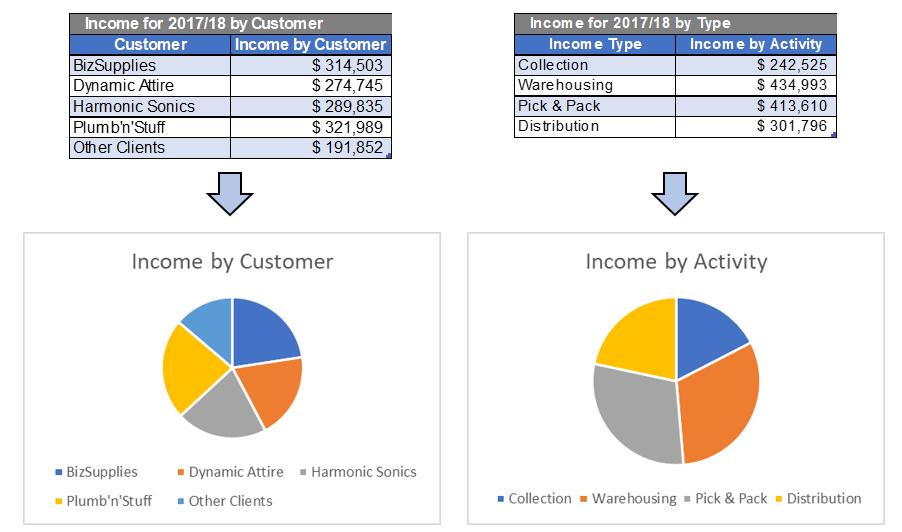
When I take a closer look at the ‘Income by Customer’ pie, I see little information except that ‘Other Clients’ and ‘Plumb ‘n’ Stuff’ appear to be the largest wedges. Meanwhile, the ‘Income by Activity’ chart provides more information about the key activities bringing in the majority of income.
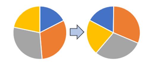
Note that a Pie Chart starts plotting the slices from the upper most point, so it draws a line from the centre to the top and then plots each segment going clockwise. Therefore, Collection is first, then Warehousing, etc. However, I would like to have Warehousing as the first wedge. One solution is to alter the data table and put the Warehousing line first, but this would rearrange the series itself, affecting the Legend. A better option may be to simply rotate the Pie Chart.
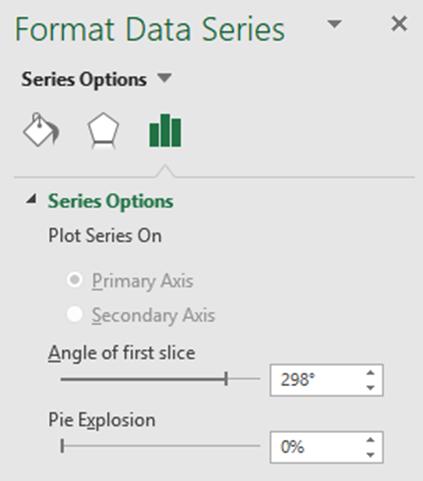
To do this, I click on the Pie Chart so the segments are highlighted, then I right click and choose ‘Format Data Series’. Under ‘Series Options’, I set the ‘Angle of the first slice’:
The Pie chart will reflect the change in real time:
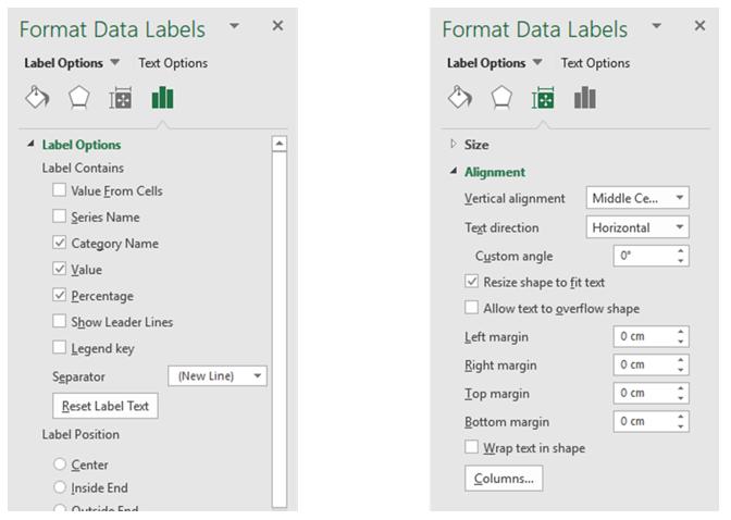
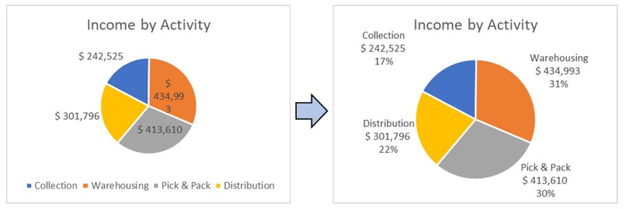
Next, it would be nice to display data information on the Pie Chart against each segment, which helps communicate statistics to the reader. I right-click on the Pie Chart and choose ‘Add Data Labels’. Excel will automatically place the values from the source data next to each segment on the chart, but there are a range of choices I can use for data labels. To see them, I right-click on the data labels just added, and choose ‘Format Data Labels’, then apply ‘Category Name’, Value and Percentage. Then, I set the following text options under ‘Size & Properties’:
Since I have the categories in the data labels, I no longer need the Legend, so I click on the Legend and delete it.
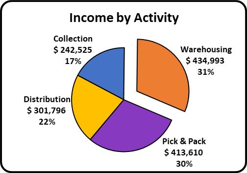
It can be clearly seen from the chart that Warehousing is the activity that generate the majority of income, so, I want to make it stand out. I double click on the Warehousing wedge, hold and pull it outwards then release the mouse. I do some further formatting and here is the pie I’ve made:
That’s it for this week; check back next week for more Charts and Dashboards tips.

