
Charts and Dashboards: PivotChart – Part 1: Creating a PivotChart
15 May 2020
Welcome back to this week’s Charts and Dashboards blog series. This week, let’s talk about PivotChart.
PivotCharts are complimentary visual representations of data in PivotTables. They display any data currently in a PivotTable in a chart, with that they also inherit the flexibility and interactivity of PivotTables.
When PivotChart is created, it will inherit the filters and sort abilities that are also available in the complimenting PivotTable. Changes made in the PivotChart will also be reflected in the PivotTable and vice versa.
The key benefit for a PivotChart is that it is able to summarise raw data or tabular data. Data that has not been analysed what so ever. We would be able to use a PivotChart just as we would a PivotTable to analyse data.
Below are a few differences between PivotCharts and ordinary charts:
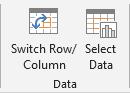
- Row/Column Orientation: switching the rows and columns around in a PivotChart can’t be done through the ‘Switch Row/Column’ button on the Ribbon.
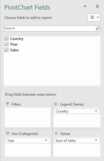
It has to be done through switching the fields from the Rows and Columns area in the PivotChart fields side panel.
- Chart Type Limitations: PivotCharts can’t be produced for XY (scatter charts), stock, or bubble charts
- Source Data: PivotCharts draw data from their underlying PivotTable’s data source whereas standard charts are linked directly to worksheet cells.
- Formatting: Most formatting elements in a PivotChart are preserved when a PivotChart is refreshed, however be wary that trendlines, error bars, trendlines and changes to data sets are not preserved.
Let’s move on to an example, imagine creating a bar chart with the following data:
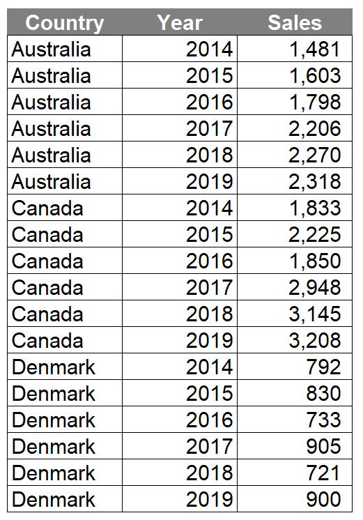
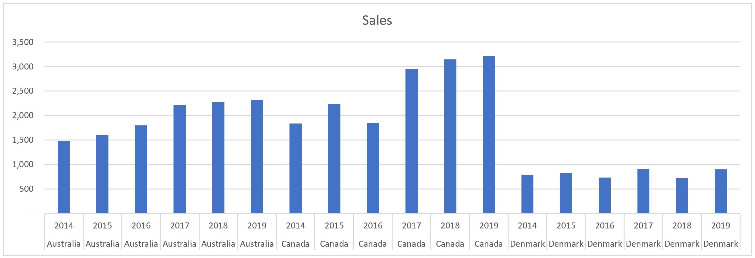
I created the following chart with the data above:
Let’s try again with a PivotChart:
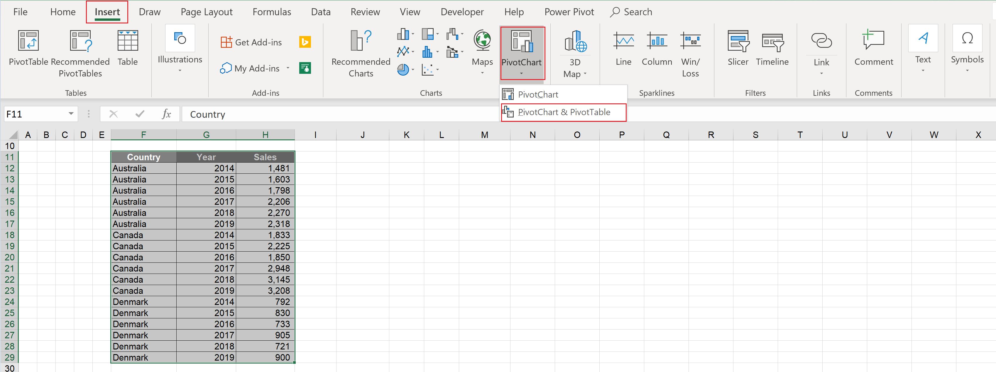
To create a PivotChart, highlight all the data and go to Insert – PivotChart – PivotChart & PivotTable
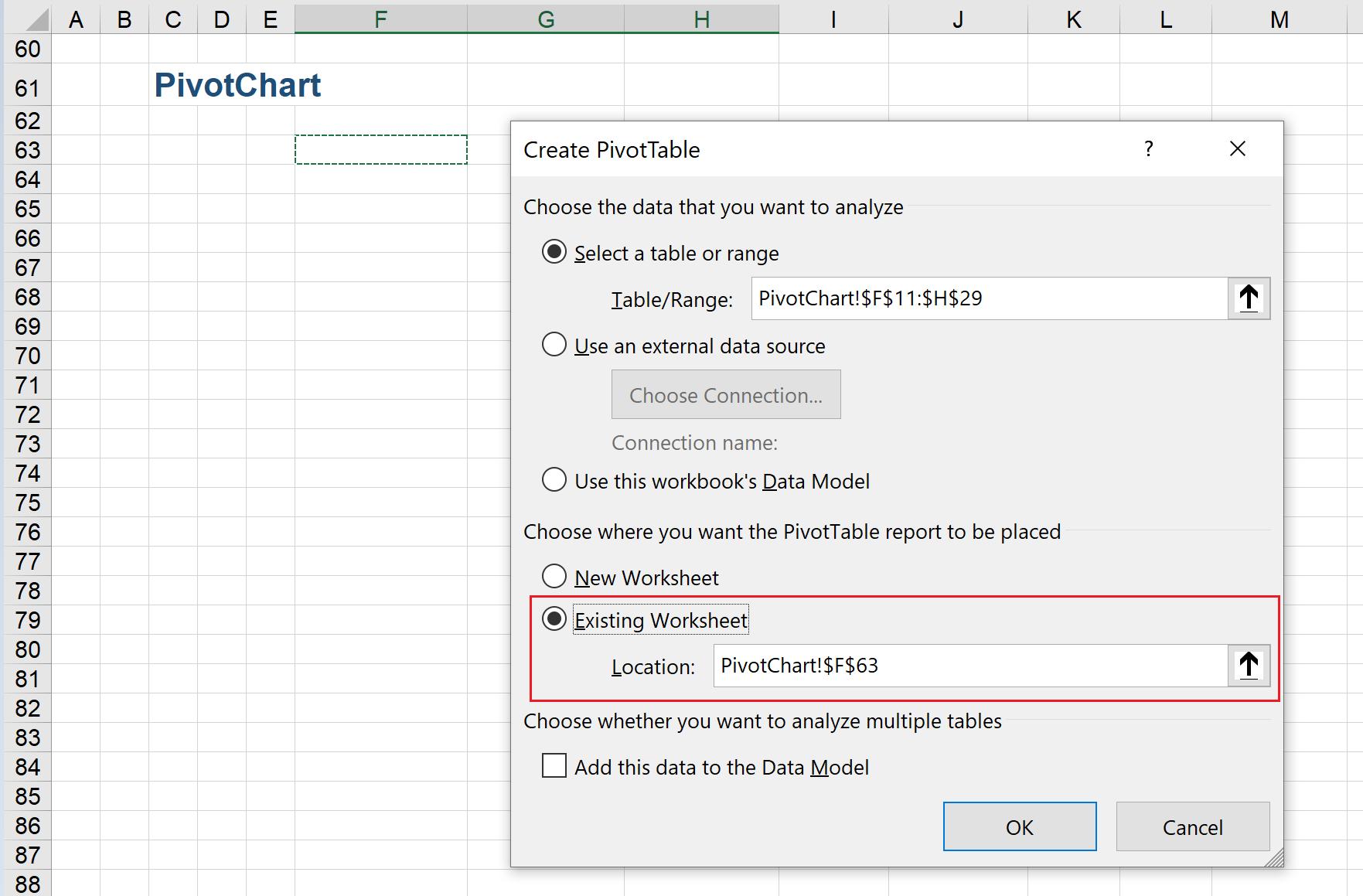
A ‘Create PivotTable’ dialog will appear, here I can choose where to place the PivotTable report, to a new worksheet or in the existing worksheet. In this example, the PivotTable report will be loaded to cell F63 in the current worksheet:
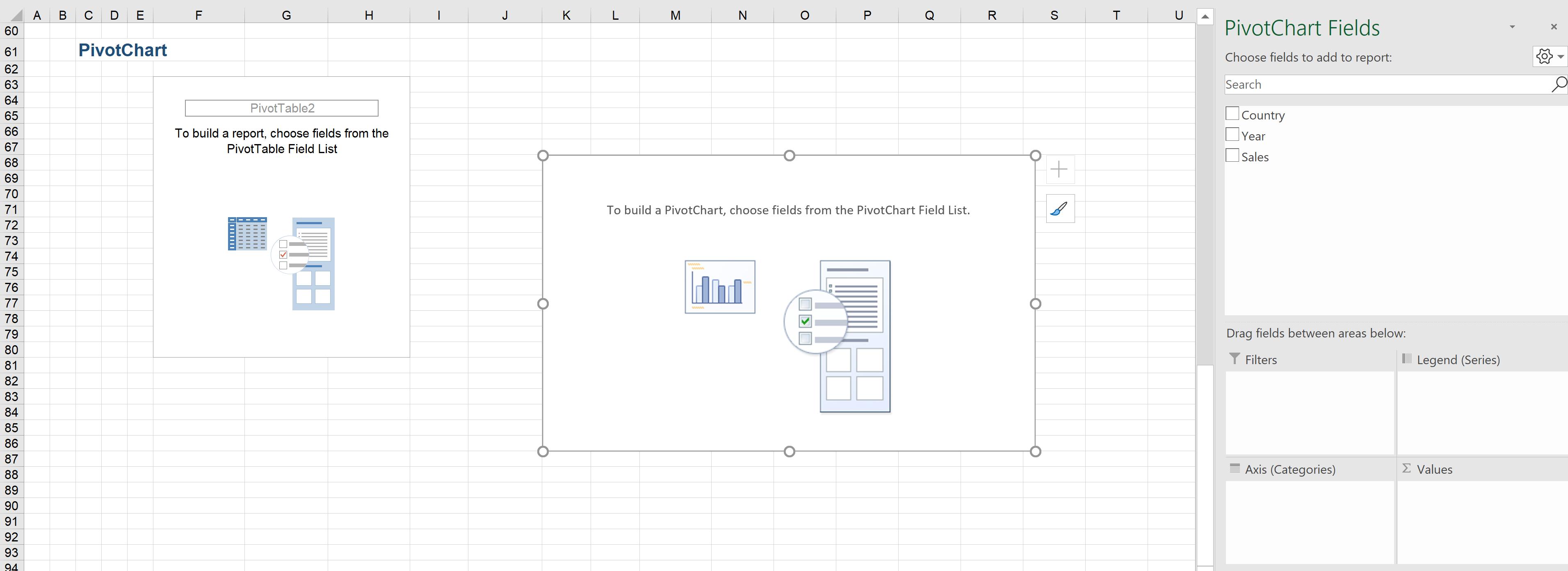
Clicking OK and the PivotChart interface will be loaded:
Dragging the fields to their relevant areas and the initial PivotChart and PivotTable will be displayed:
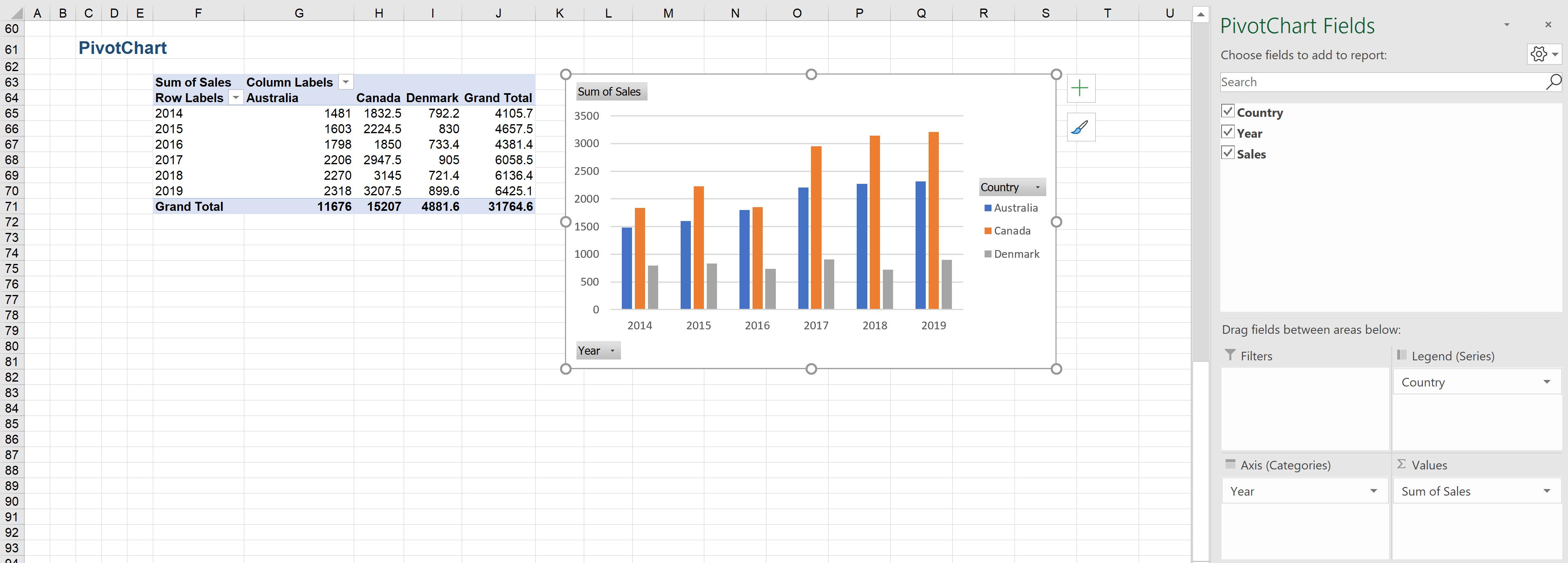
The PivotChart is able to produce a visual that easily summarises the data in an easily comprehendible way without much manual adjustments.
That’s it for this week, check back next week for more Charts and Dashboards tips.