Charts and Dashboards: Presentation Pitfalls Part 1
4 February 2022
Welcome back to our Charts and Dashboards blog series. This week, I look at what can happen when the chart is inappropriate for the data.
Consider the following chart, which purports to show what proportion of completed sales each of the salespeople in the company achieved last year:
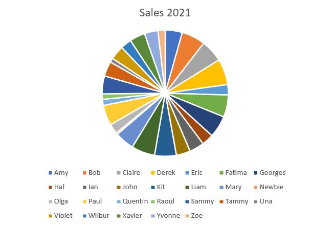
This is not going to help anyone understand the figures! When there are so many different salespeople to represent, we need a better way to compare the data.
I can change the chart type from the ‘Chart Design’ tab, which has a ‘Change Chart Type’ option:

This brings up the ‘Change Chart Type’ dialog:
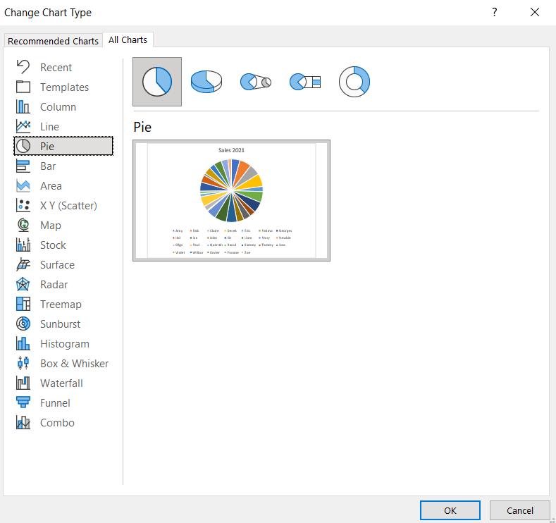
Excel has some inbuilt algorithms to help me pick the best chart to use. I can view these in the ‘Recommended Charts’ tab:
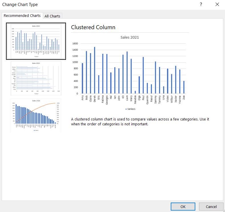
There are three [3] suggested chart types:
1. Clustered Column chart:
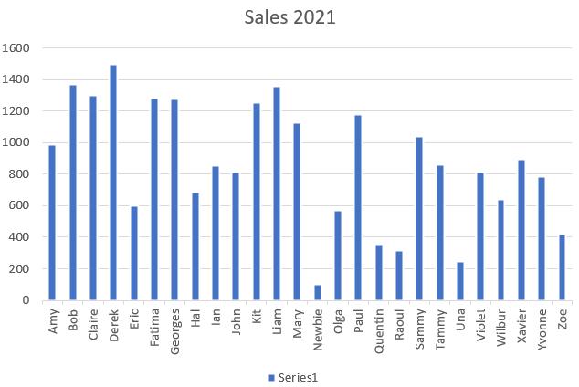
This is easier to read than the Pie chart, but I’d need to change the Horizontal Axis label as the names are not easy to read.
2. Clustered Bar chart:
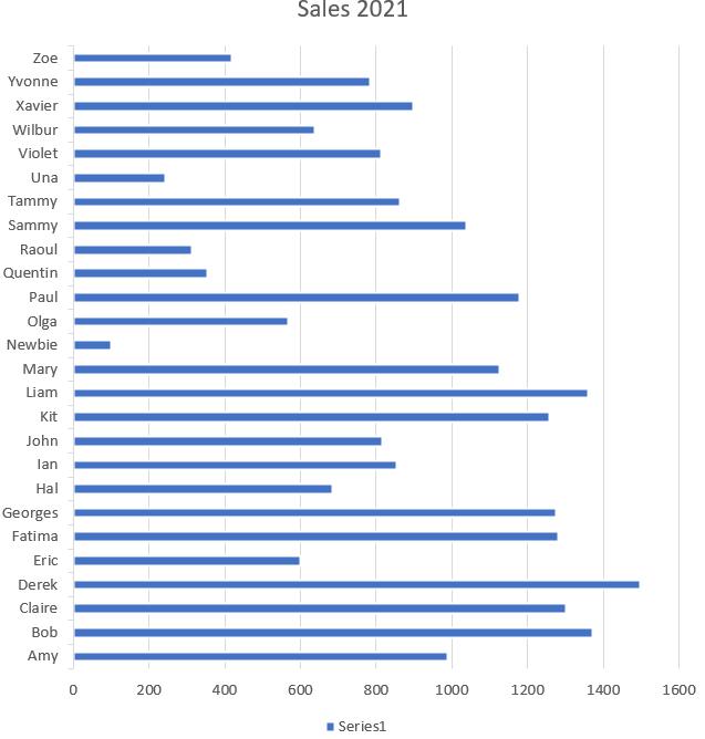
Although it is similar to the Clustered Column chart, I prefer this format as it is more focused on the salespeople.
3. Pareto chart:
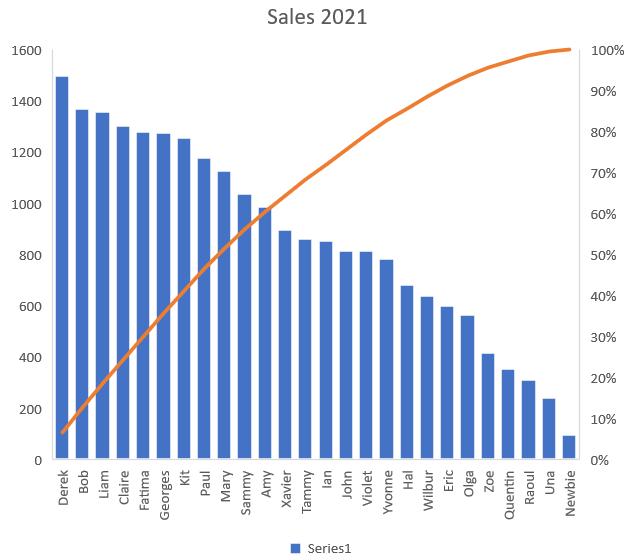
I covered Pareto charts in detail in Charts and Dashboards: Problem Solving with Pareto Charts. Although I would need to adjust the labels on the Horizontal Axis to make the names easier to read, I have more information on this chart. The cumulative line shows me that 70% of the Sales were achieved by ten [10] salespeople. I also prefer having the data in order of the most successful employee.
Having checked out the ‘Recommended Charts’ I have decided to go with the Pareto chart, which is available from Excel 2016 onwards. If this option had not been available, and I didn’t want to spend time creating my own, then I would have chosen the Clustered Bar chart, though I would have sorted the data into order first:
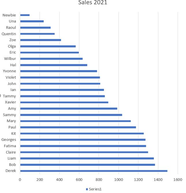
What’s important is not to add a chart that actually makes it harder to work out what the data is showing! I’ll look at more potential pitfalls when creating charts next time.
That’s it for this week. Come back next week for more Charts and Dashboards tips.

