Charts and Dashboards: Radar Charts
21 February 2020
Welcome back to this week’s Charts and Dashboards blog series. This week, let’s look at Radar Charts.
A Radar Chart, also known as a Spider Chart or Web Chart, shows movements in data relative to both a central point and to the other data points. Where a Line Chart has a horizontal axis, this axis in a Radar Chart is effectively wrapped around so that each category becomes like a spoke on a wheel. The length of each spoke which extends from the centre of the chart to the outermost point on the chart represents the vertical axis of a Line Chart.
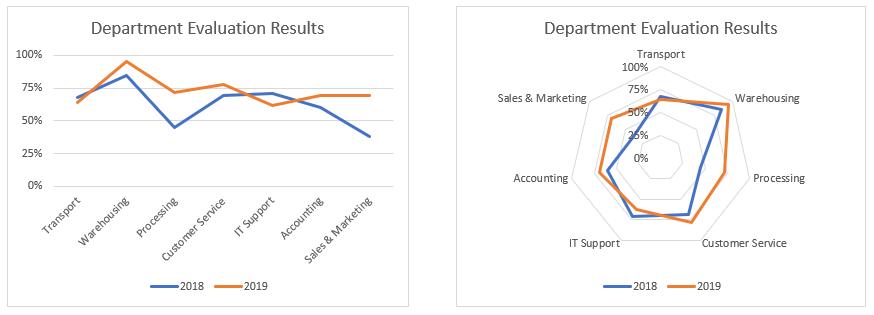
Let’s imagine that a company management were asked to provide input about the performance of the company’s departments at the end of the 2018 and 2019 financial years. This information was collated to produce a score for each department expressed as a percentage. The more satisfied management were with a particular department, the higher the percentage. This data could quite easily be used to produce a Line Chart, Bar Chart or Column Chart, but using a Radar Chart gives a different perspective on the results. Below is an example of how the same data would look on a Line Chart versus a Radar Chart:

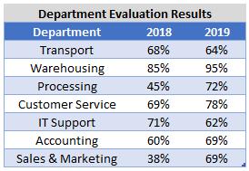
So how do I produce a Radar Chart? First, I prepare the data table. In the case of my example, I list each department with their evaluation percentages for 2018 and 2019:

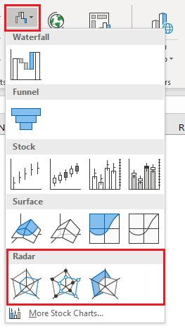
Then, I highlight the data and the column headings (do not select the table heading) and go to the Insert tab on the Ribbon. The Radar Chart is under the last small icon along the top of the Charts section. Alternatively, I can click on the ‘Recommended Charts’ icon or the small arrow in the bottom right of the Charts section, and then go to the ‘All Charts’ tab to locate the Radar Chart. There are just three variations for the Radar Chart:
- the first plots the data series using lines only
- the second variation maps the data series with lines and markers
- the third chart option fills the area within the shape created by each data series.

Please be aware of the limitations of using the filled Radar Chart. It is possible that the area covered by one data series on the Radar Chart might overlap data points from another series, meaning you cannot see the data points underneath and therefore part of the area occupied by the second series. If you are using the filled Radar Chart, it is highly recommended that you make the area partially transparent so you can see any data points and area underneath each data series. Transparency is found by selecting the data series, right click and choose ‘Format Data Series’, go to the Marker section and under Fill there is an option to set the Transparency.
Also, it is important to note that by joining the data points with lines, it can be interpreted that these data points may relate to each other, but this may not be correct. With my example for instance, while the data points representing the evaluation rating for each department are joined together by lines, the score for one department has no bearing or relationship to the score of the adjacent departments on the chart.
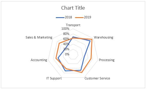
Using the department performance result data, our Radar Chart initially looks like the following:

There are some changes I need to make:
- I want to move the legend below the chart by selecting the legend, right clicking and choosing ‘Format Legend’, then specifying that I want the legend position to be at the bottom of the chart
- I also like to see the 50% line on the graph. To achieve this, I select the axis labels (by clicking on one of the 0% to 100% labels), right-click and choose ‘Format Axis’, then under the ‘Axis Options’, change the Major setting under Units to 0.25 instead of 0.2. This will set the chart units to be 0%, 25%, 50%, 75% and 100%
- Also, still within ‘Format Axis’, under the ‘Fill & Line’ area (the bucket icon), I can add spoke lines by changing the lines to be solid and assigning a colour to them
- The “rings” in the chart are the equivalent of the horizontal gridlines of the Line Chart. To change the formatting for these gridlines, I simply click on one of the “rings”, right click and choose ‘Format Gridlines’, and proceed to change the colour, width, type, etc.
Once I have applied all the formatting, the final chart looks something like this:

That’s it for this week, check back next week for more Charts and Dashboards tips.

