Charts and Dashboards: Sunburst Charts
6 March 2020
Welcome back to this week’s Charts and Dashboards blog series. This week, let’s look at Sunburst Charts.
The Sunburst Chart is an advanced version of the Doughnut (Donut) Chart, which enables the mapping of hierarchical data. The innermost ring of a Sunburst Chart represents the data at the top of the hierarchy, and each ring outside of it depicts the next level down and therefore a breakdown of the previous inner ring.
To create a Sunburst Chart, the first stage is obviously to organise the source data. The number of columns I will need is determined by the number of levels in my data hierarchy plus one extra column on the right for the values. If I have three levels of hierarchy, then I will need four columns, as an example below:
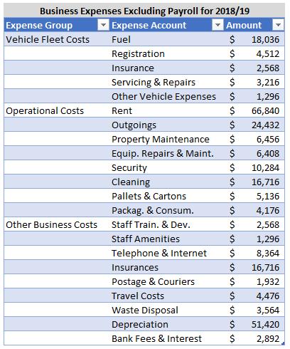
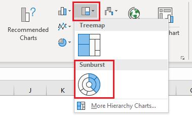
With the data table organised, I can then proceed to create the Sunburst Chart. As usual, I select the source data and the column headings, excluding the table heading, and go to the Insert tab. Then, I select the Sunburst Chart from the small middle icon across the top row of the Charts section or through the ‘Recommended Charts’ icon or the small arrow in the bottom right corner or the Charts section. Unlike all the other charts we’ve reviewed so far, there is only one type of Sunburst Chart available in Excel.
The chart initially appears like this:
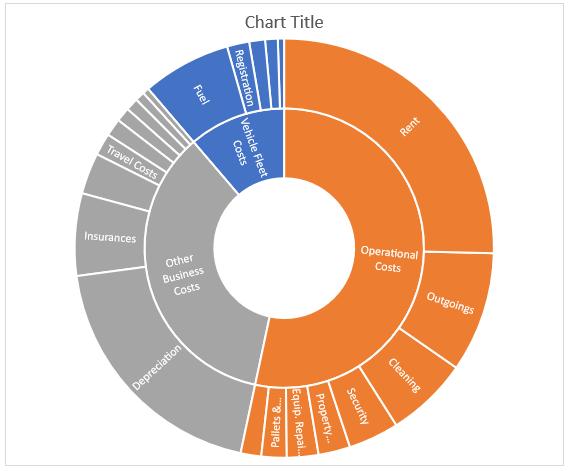
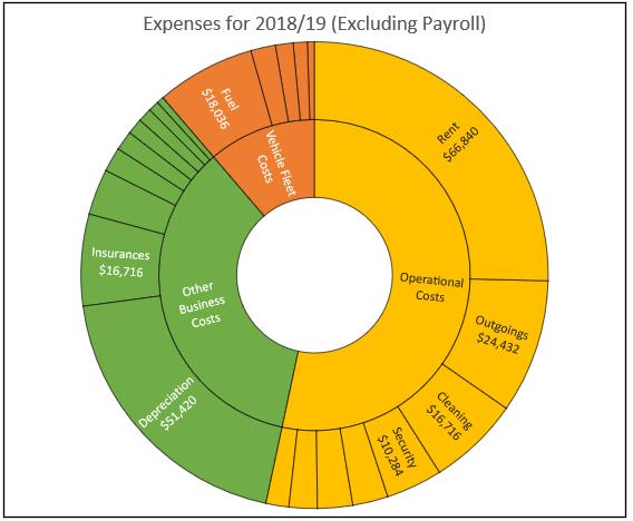
Depending on the physical size of the chart, the size of the segments and the length of the data labels involved, Excel will do its best to fit as many labels as it can onto the chart. As you can see, for the Vehicle Fleet Costs, only the Fuel and Registration are labelled as the other slices are too small and / or the labels are too long for Excel to fit the text inside the segments.
You should also note that Excel automatically ordered the categories and the expense accounts within each category from highest to lowest before plotting the information. Like a Pie Chart, the first segment commences from the highest point of the chart with the segments ordered clockwise. As Operational Costs is the biggest expense group, it was mapped first, followed by the Other Business Costs and lastly the Vehicle Fleet Costs. Also, looking at the outer ring, Rent was the biggest item in Operational Costs, followed by Outgoings then Cleaning, etc.
Most of the standard formatting options available in other charts are applicable to Sunburst Charts. However, due to Excel automatically sorting categories, the order of the segments in this chart cannot be changed. Also, I cannot choose the angle for the first slice or “explode” out any pieces of the Sunburst Chart.
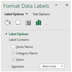
I can add amount labels to the segments by clicking on the data labels, right-clicking and choosing ‘Format Data Labels’, then ticking the Value box and changing the Separator to be ‘New Line’.
Unfortunately, where the data labels do not fit in the chart segments, you won’t see the figures associated with them either. Also, only the lowest level of the data hierarchy, being the outermost ring of the chart, will display values. The higher level categories / inner rings do not show sub-totals or totals.
Finally, I would set the fonts and lines to black, enter a Chart Title and format the Chart Area to complete the chart:
That’s it for this week, check back next week for more Charts and Dashboards tips.

