
Charts and Dashboards: Thermometer Chart Part 1
22 October 2021
Welcome back to our Charts and Dashboards blog series. This week, I start to create a Thermometer chart.
The results have come in for last year’s sales for three of my imaginary salespeople.

I would like to be able to see at a glance how well they are doing against their targets. There are several ways I could do this, but I have chosen to create a Thermometer chart for each salesperson.
I start by adding two new rows. I will add a row for the percentage of the Target achieved and one which simply holds the maximum achievable, which is always 100%. For my scenario, I know that no-one has exceeded their target.

I will start by creating a chart for Mary. The data I am using for my chart is in $A$18:$B$19. I select this data and go to the Insert tab, where I find the ‘Insert Column or Bar Chart’ dropdown and choose a ‘Clustered Column’ chart.
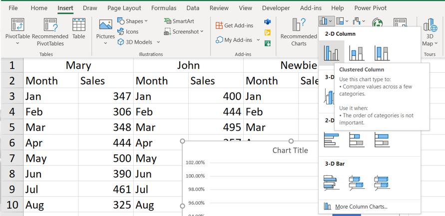
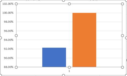
This creates a simple Clustered Column chart with only two columns.

I start by removing the Chart Title by selecting and deleting it. Next, I am going to swap the columns and the rows. To make the effects of this step clearer, I will first select my chart and right-click to access the ‘Select Data’ option.

The resulting dialog has a button to ‘Switch Row/Column’:

When I do this, instead of having one Series and two Axis Labels, I have two Series, which each have one column which I will be combining into one column for both Series.

I can then edit the % Target and % Max Data Series separately:
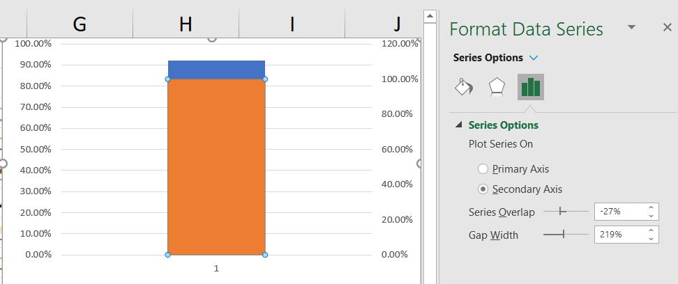
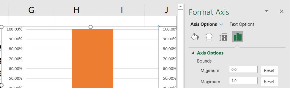
I right click on the second column (which is the maximum percentage), and select ‘Format Data Series’ to access the ‘Format Data Series’ pane. I can then select ‘Secondary Axis’:
This overlays the columns, and gives me two axes. I right-click on the right-hand axis and select ‘Format Axis’ to access the pane:
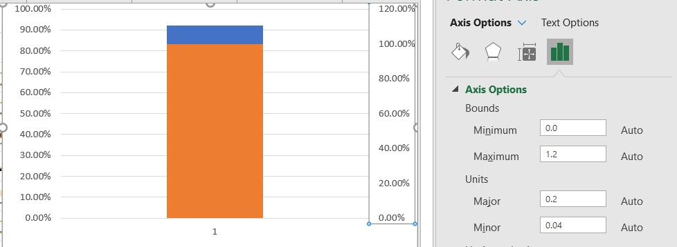
I change the Minimum Bound to zero [0] and the Maximum Bound to one [1]. Note that even if the values are already set to this, they should still be entered as I am removing the ‘Auto’ value:
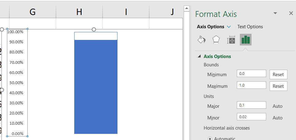
I no longer need the right-hand axis, so I select it and delete it. Next, I right-click on the column and select ‘Format Data Series’ to access the pane.

I change Fill to ‘No fill’ and Border to ‘Solid line’ which I make blue. This will reveal the column underneath:

I can now delete the Chart Elements I don’t want: the gridlines and the legend. I also right-click on the left-hand axis and change the range shown.
I resize the chart to make it look more like a thermometer.
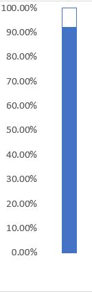
The chart doesn’t quite look like a thermometer, but it is taking shape, which is a clue to how I will enhance it next time!
That’s it for this week. Come back next week for more Charts and Dashboards tips.