
Charts and Dashboards: The Bubble Pie Chart - Part 3
8 September 2023
Welcome back to our Charts and Dashboards blog series. This week, we’re going to finish constructing our Bubble Pie chart.
The Bubble Pie chart
In part 1 we started to look at how to construct a chart that might look like the following:
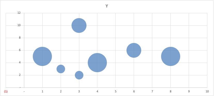
We began with this Excel file here. From the data within this workbook, we created a Bubble chart:
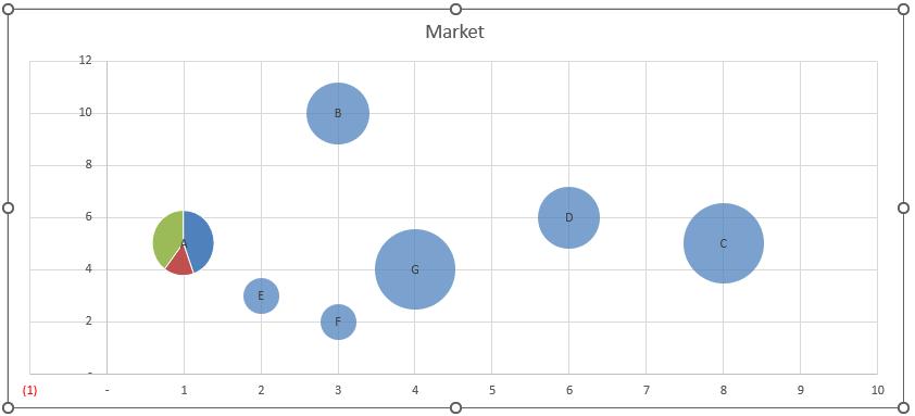
Next, we created a Pie chart for Market A only, removing the title, legend and making the chart area transparent, removing the border as well.
We then copied this as a picture, added data labels to our Bubble chart and pasted the Pie chart on to the Bubble for Market A:
We are now at a stage where we can populate the other Bubbles with images by making a Pie chart for each Bubble and copying and pasting them to the correct Bubble. Better yet, we may simply employ the assistance of VBA to automate this process.
VBA
In this instance, we will go to the Pie chart we made for Market A and name it ExamplePie in the Name box (ALT + F3). Then, we go to the VBA Editor (ALT + F11) and create a new module and paste in the following code:
Sub PieMarkers()
' Declare variables
Dim pieChart As Chart
Dim mainChart As Chart
Dim pointIndex As Long
Dim rowRange As Range
' Disable screen updating to improve performance
Application.ScreenUpdating = False
' Get reference to pie chart
Set pieChart = ActiveSheet.ChartObjects("ExamplePie").Chart
' Get reference to chart that pie markers will be applied to
Set mainChart = ActiveSheet.ChartObjects(1).Chart
' Process each row of pie chart data
For Each rowRange In Range("Data[[Agriculture]:[Services]]").Rows
' Assign new values to pie chart
pieChart.SeriesCollection(1).Values = rowRange
' Copy pie chart image
pieChart.Parent.CopyPicture xlScreen, xlPicture
' Paste image to appropriate data point
pointIndex = pointIndex + 1
mainChart.SeriesCollection(1).Points(pointIndex).Paste
Next
' Release objects
Set pieChart = Nothing
Set mainChart = Nothing
' Re-enable screen updating
Application.ScreenUpdating = True
End Sub
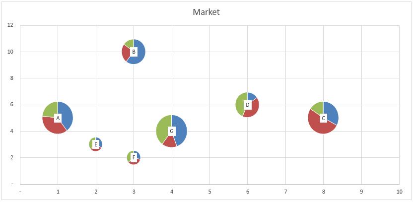
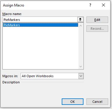
This macro creates a Pie chart for each market and then copies and pastes the appropriate picture into the relevant Bubble. The next step is to then create a button which will update all the Pie images into the Bubbles for us by simply using ‘Assign Macro’ to a button or shape that you like:
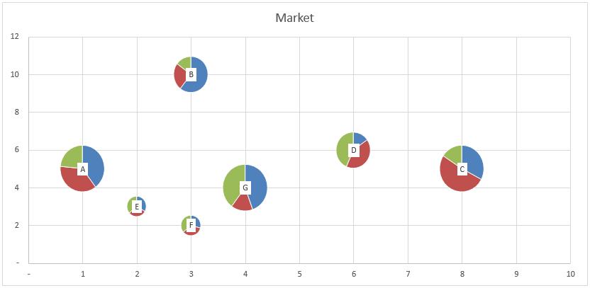
Et voila! We have the Bubble Pie chart:
Word to the Wise
If you want more segmentation in the Bubble images, simply add more columns to the Data table and update this part of the code to update the correct column headings:
For Each rowRange In Range("Data[[Agriculture]:[Services]]").Rows
You can download the complete Bubble Pie chart here.
That’s it for this week. Come back next week for more Charts and Dashboards tips.