Charts and Dashboards: Charting Example – Extended Case Study Part 2
16 September 2022
Welcome back to our Charts and Dashboards blog series. This week, we continue to take a look at an example of a chart, covering
some of the intricacies behind the scenes with its workings. This week, we consider custom number
formatting.
Hopefully, you remember last week’s chart.
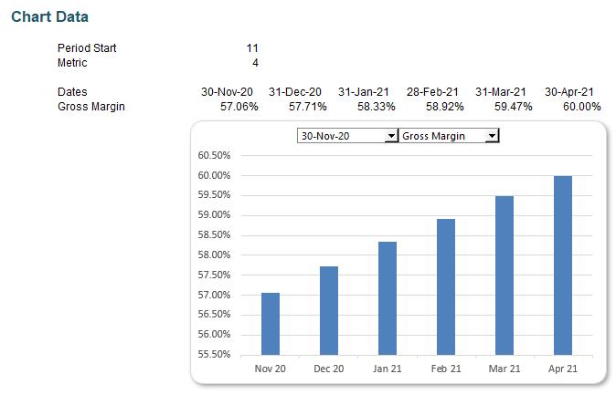
This was supported by the following assumptions and underlying data:

This week, let’s consider the formatting we’ve used here. The formatting of numbers within charts and dashboards is very important. It is essential to make sure end users know what they are looking at unambiguously.
Here, we’ve ensured that inputs (cell G10, together with rows 12 and 13) are formatted differently to any calculations so that even at a glance you can spot the difference between the assumptions driving the calculations and the calculations themselves. Whilst sometimes it is recommended that calculations are kept separate from inputs, it can be useful to have certain calculations alongside inputs to allow sense checking of the inputs as they are entered. When this is the case it is very useful to be able to tell the difference immediately.
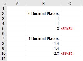
Now let’s consider number formatting. It’s important to note that this only changes the appearance, not the underlying value, of a cell. For example, if cells B3 and B4 had the number ‘1.4’ typed in both times but were formatted to zero decimal places, then the formula in cell B5 = B3 + B4, would present 1 + 1 = 3 (well, 1.4 + 1.4 = 2.8 anyway), viz.
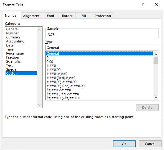
Excel has many built-in number formats that are fairly easy to understand, e.g. Currency, Date and Percentage. The default format is ‘General’ where Excel will endeavour to provide the most appropriate format for the contents. For example, typing ‘3 3/4’ into a cell will result in Excel selecting a mixed format.
This may be seen by Home -> Format -> Format Cells…(CTRL + 1):
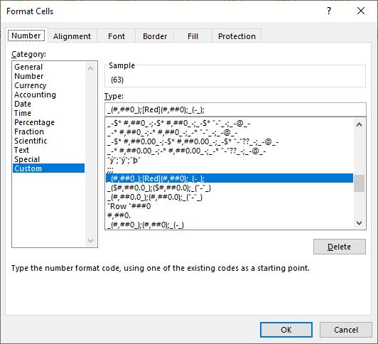
Here, we have used custom number formatting in rows 12 to 14.
All clear? Excellent. If not, then let’s dive into the wonderful world of Excel custom number formatting.
The ‘Type’ input box here allows up to four aspects of formatting to be specified in a cell. These aspects are referred to as sections and are separated by a semi-colon (;). To ascertain what is contained in each section depends on the total number of sections used, viz.
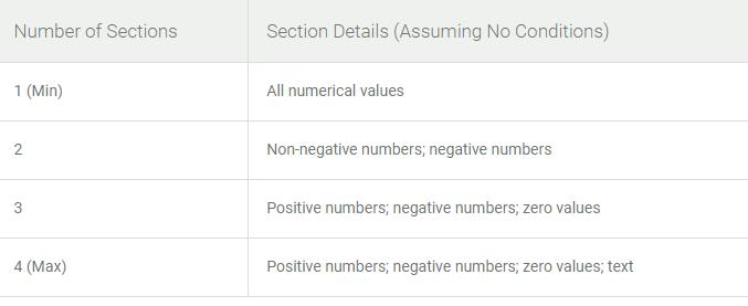
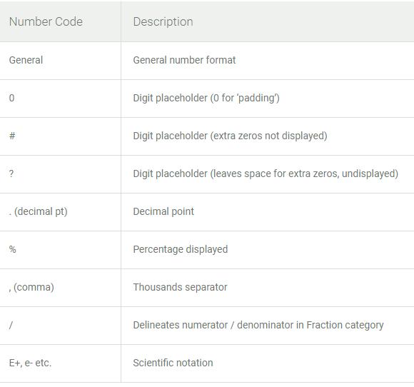
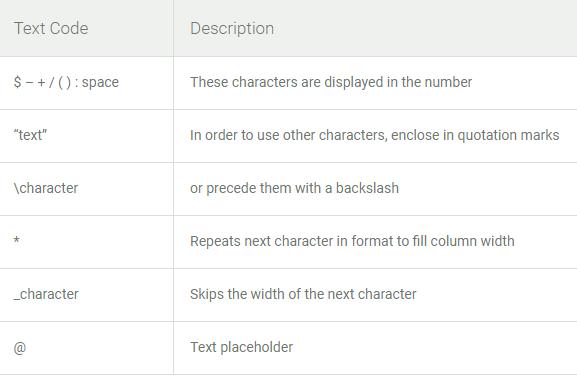
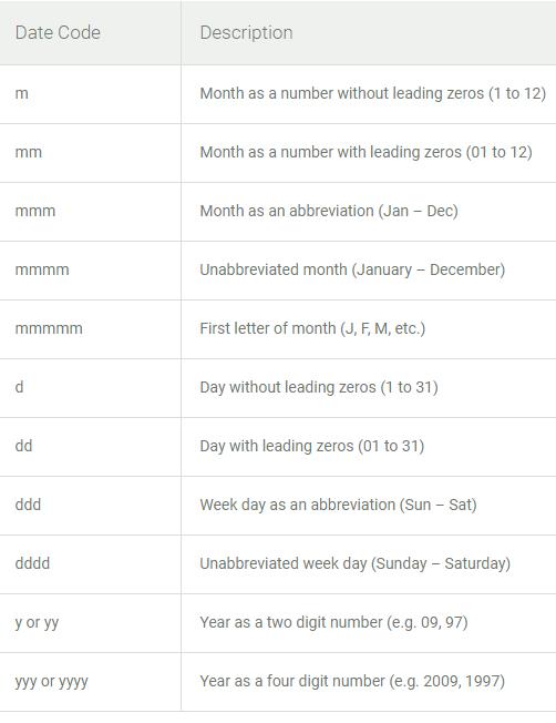
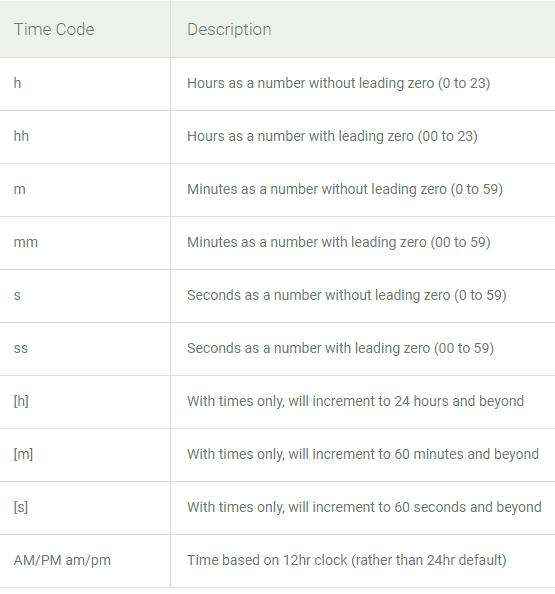
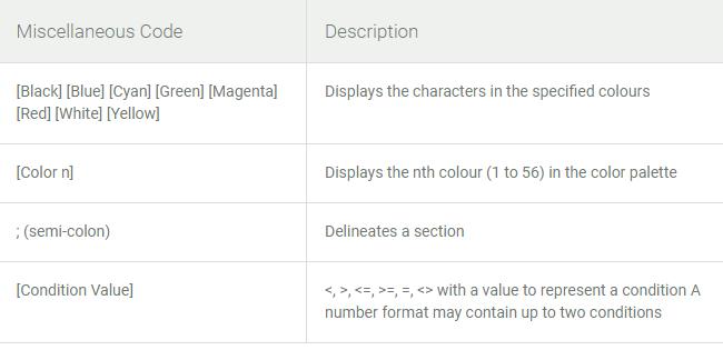
We’ve used all four sections in our formatting of the metrics, so the first set of characters is for positive numbers, the second for negative numbers, the third for any zero values and the final is for text. But what exactly do all of these characters mean? The following tables from Microsoft help us to understand these.
For numbers:
For text:
For dates:
For time:
Or for miscellaneous:
In our example, the custom number formatting is as follows:

_(#,##0_);[Red](#,##0);_(-_);
We’ll want to look closely at some of the Number, Text and Miscellaneous formatting code:
- as discussed above, the first section, _(#,##0_), specifies the formatting for positive numbers
- in this case, positive numbers will be formatted to display no decimal places, showing thousand separators where necessary. Note the use of _( and _) around the number formatting. This is not necessary, strictly speaking, but ensures there is space made for an open and close bracket, even though there is no such character shown. It is done so that positive and negative numbers will still be aligned, making visual comparison easier. #,##0, ensures positive numbers contain thousand separators (where needed) and display the number to the nearest whole number
- the next (second) section, [Red](#,##0), specifies the formatting for negative numbers. It is similar to the first section, but colours the number red and encloses it in brackets
- the third section, _(-_), specifies the formatting for zero values. This will use a dash to denote zero. Using a dash to denote exact zero values is useful as it will distinguish them from something which is approximately zero
- finally, the fourth section denotes how text is to be displayed. In this example, we’ve left it blank as text is not expected in these cells and thus should not be displayed.
Using appropriate number formatting will help make your charts and dashboards easier to understand and read.
That’s it for this week. Come back next week for more Charts and Dashboards tips.

