Charts and Dashboards: Custom Axes – Part 3
2 December 2022
Welcome back
to our Charts and Dashboards blog series. This week, we
complete this method of customising our axes as we format the Error Bars to
create customised gridlines.
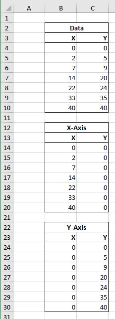
Consider the following data:

These are X and Y values to be plotted on a Scatter chart. Sounds simple enough, right?

There we have it. But already we can see some issues. It’s hard to discern the exact value of each point as they sit between the gridlines. Let’s create custom axis to make these values easier to determine.
In Part 1, we created two new data series, one to act as the x-axis of our chart and one to act as the y-axis.

We plotted them on our chart:

After changing the colour and adding and formatting the data labels, we were ready to customise the gridlines:

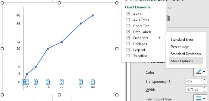
Last week, we removed the default gridlines and created ‘Error Bars’.

This added error bars in both the x and y-directions:

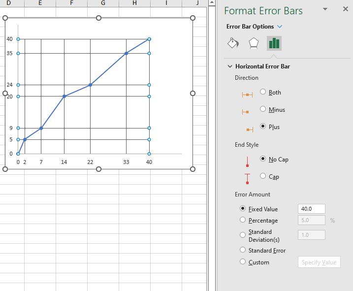
This week, we will format the ‘Error Bars’ to create our custom gridlines. For the x-axis, we only want these to extend in the y-direction. We can select the Error Bars along the x-axis and delete them. We can then format the remaining Error Bars:

We want these to extend only in a positive direction (Plus), with ‘No Cap’ to a ‘Fixed Value’ equal to the maximum value of our data. We can then repeat this process for the y-axis:

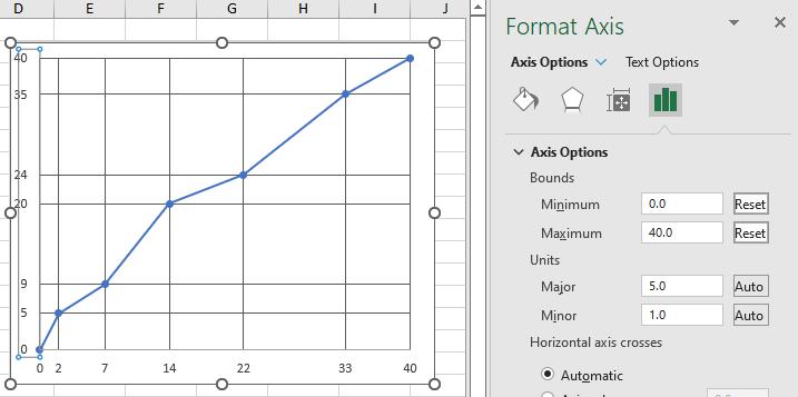
The graph is looking a little skewed within the Chart Area as the default axis Minimum and Maximum are still set to Auto, we can manually set the Minimum and Maximum of both axes to zero [0] and 40 respectively:

We have achieved our goal: we have custom axes and gridlines to make the data easier to interpret:

That’s it for this week. Come back next week for more Charts and Dashboards tips.

