Charts and Dashboards: Gauging Success – Part 2
14 April 2023
Welcome back to our Charts and Dashboards blog series. This week, we complete a Gauge chart.
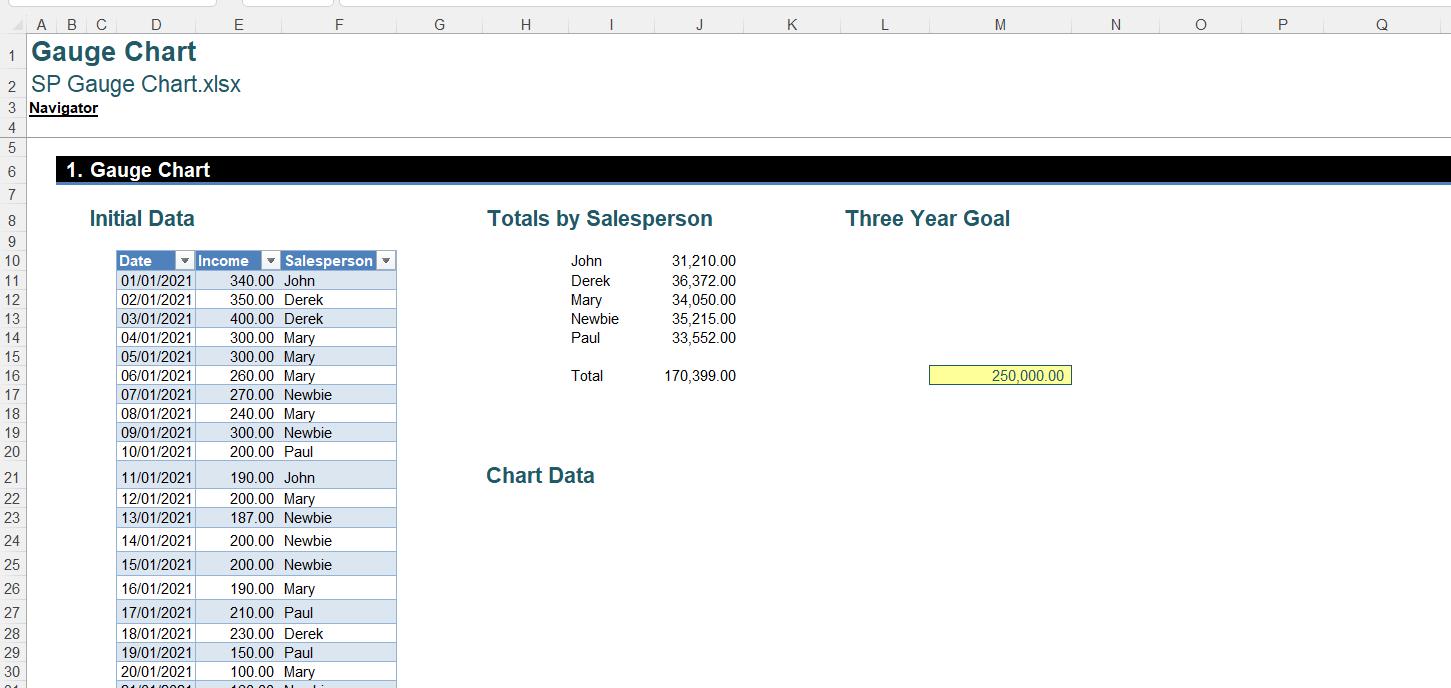
We have some sales data:
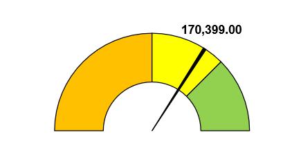
The manager would like an eye-catching way to show the progress towards our three-year sales goal. We are going to create a Gauge chart like this:
In order to show our data in this format, we need a few more calculations:
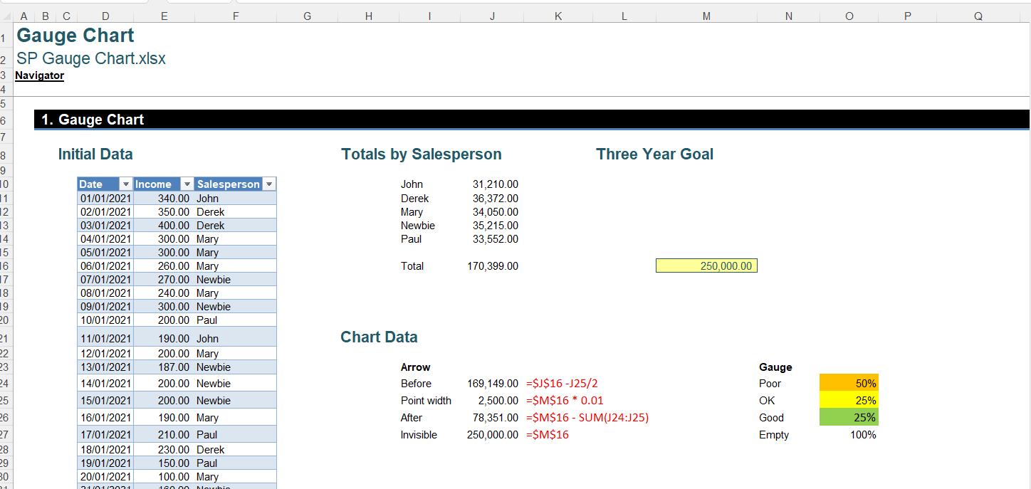
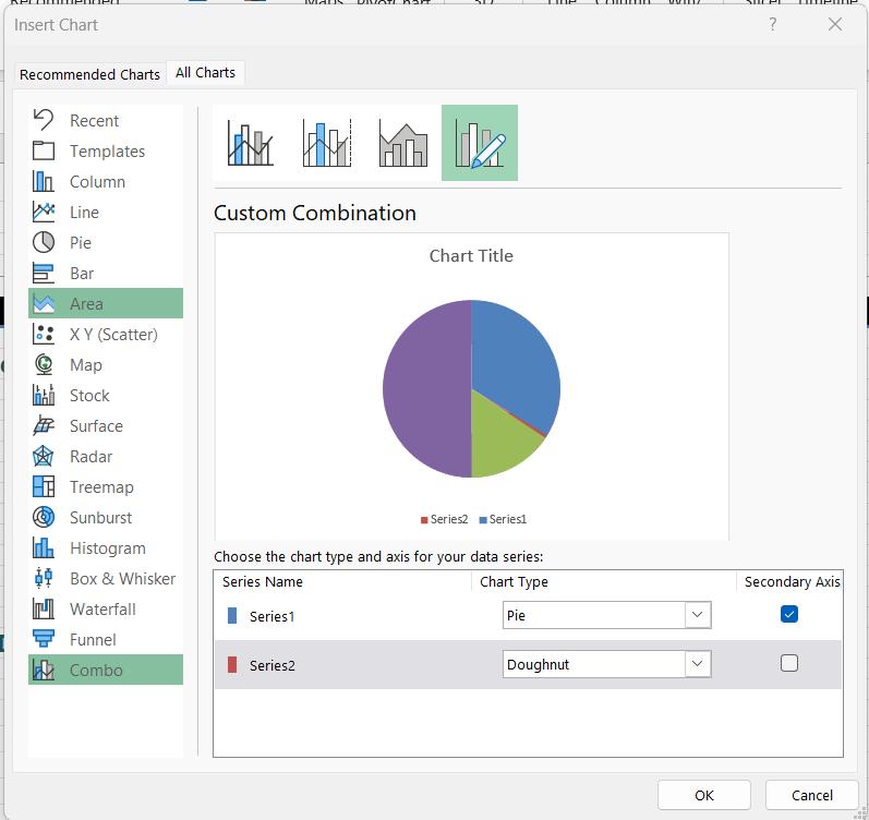
Last week, we explained our calculations and selected the data in J24:J27 (the arrow) and O24:O27 (the gauge). We created a Combo chart:
We then formatted the Pie chart, leaving us with this Combo chart:
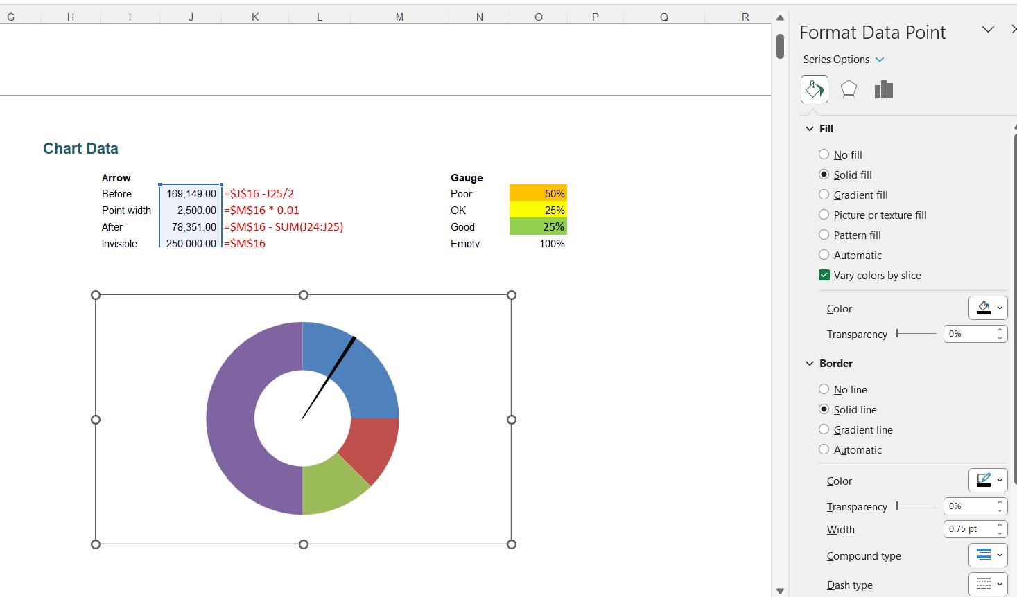
This week, we will format the doughnut chart, and add the finishing touches to our Combo chart.
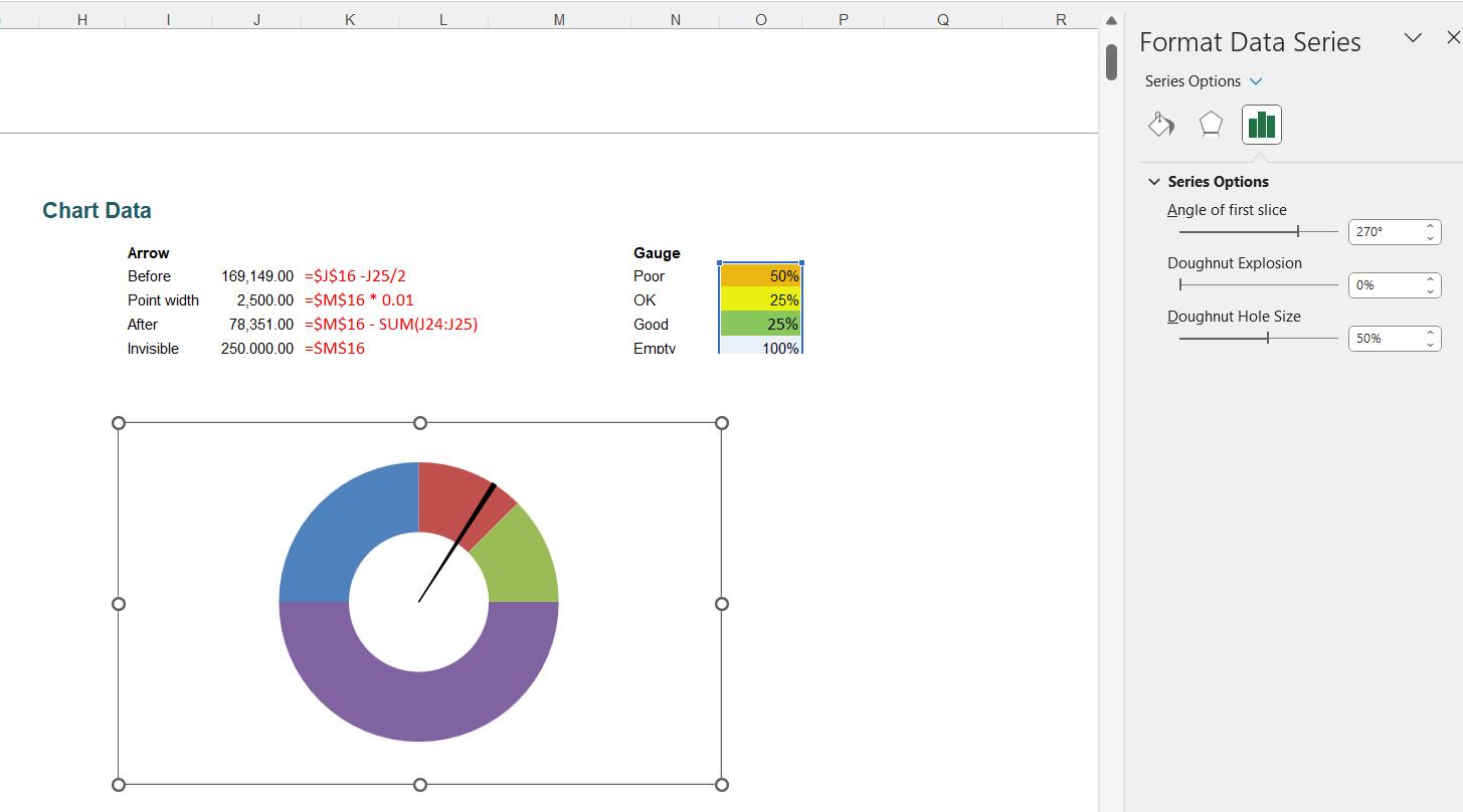
The next step is to rotate the Doughnut chart (Series 2) as we did for the first series.
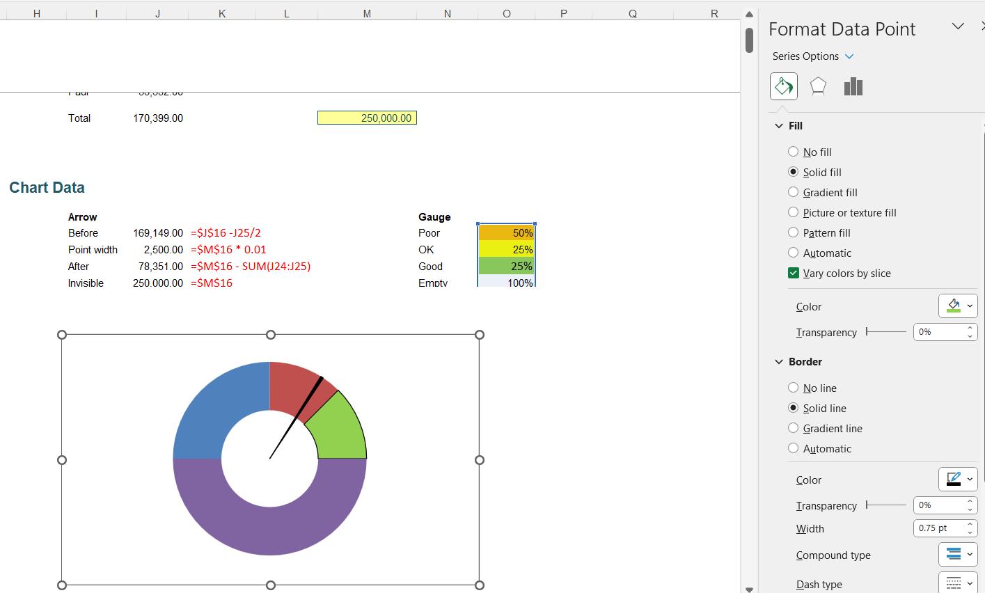
Next, we will format the data points for Series 2. In this case we want to use the same colours as our highlighted cells, and a black border for the first three [3] points. For example, Point 3 should be green:
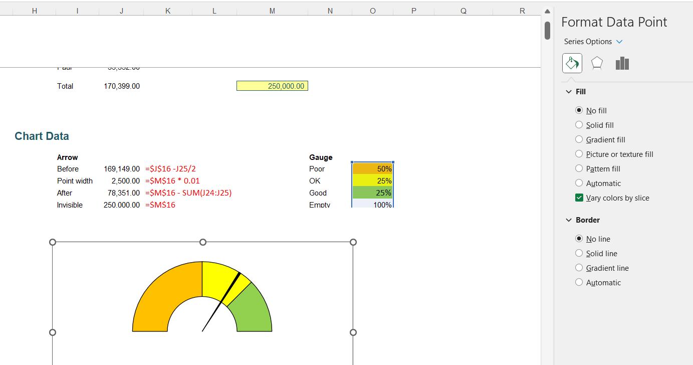
To make the bottom point invisible, we select ‘No fill’ and ‘No line’ in the Border:
Finally, we will add a label for the pointer. To do this, we go to the Text dropdown on the Insert tab, and choose to create a ‘Text Box’:

We place the text box in the chart area, and enter the cell $J$16 as the formula, so that we are linking it to the total sales:
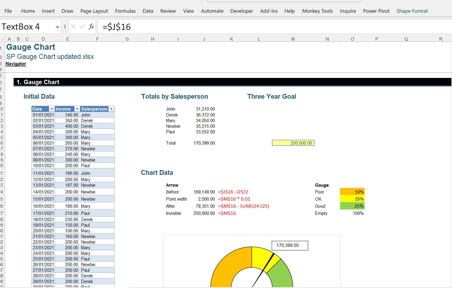
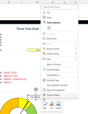
We can then right-click on the text box and choose ‘Format Shape’:
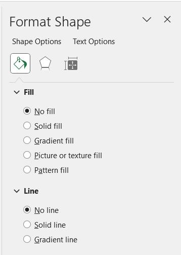
We can choose ‘No line’ and ‘No fill’, so that the text box will not overlap the chart:
Finally, we change the font of the text to make it stand out more, and tidy up the sheet:
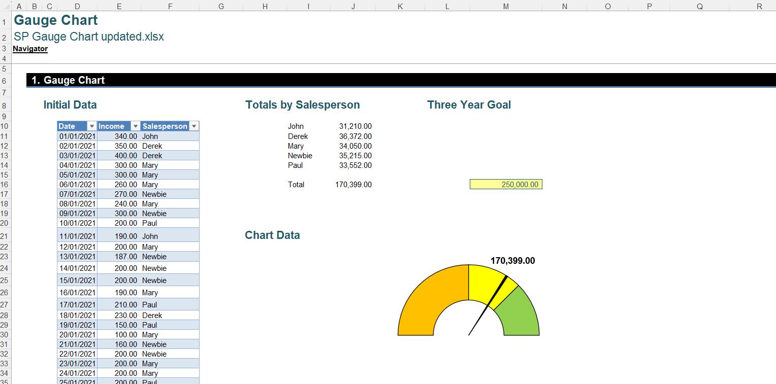
Here, we have selected ‘No line’ for the chart area. We have then placed the chart over the chart data section. We can test the chart to see what happens if we reduce the ‘Three Year Goal’:
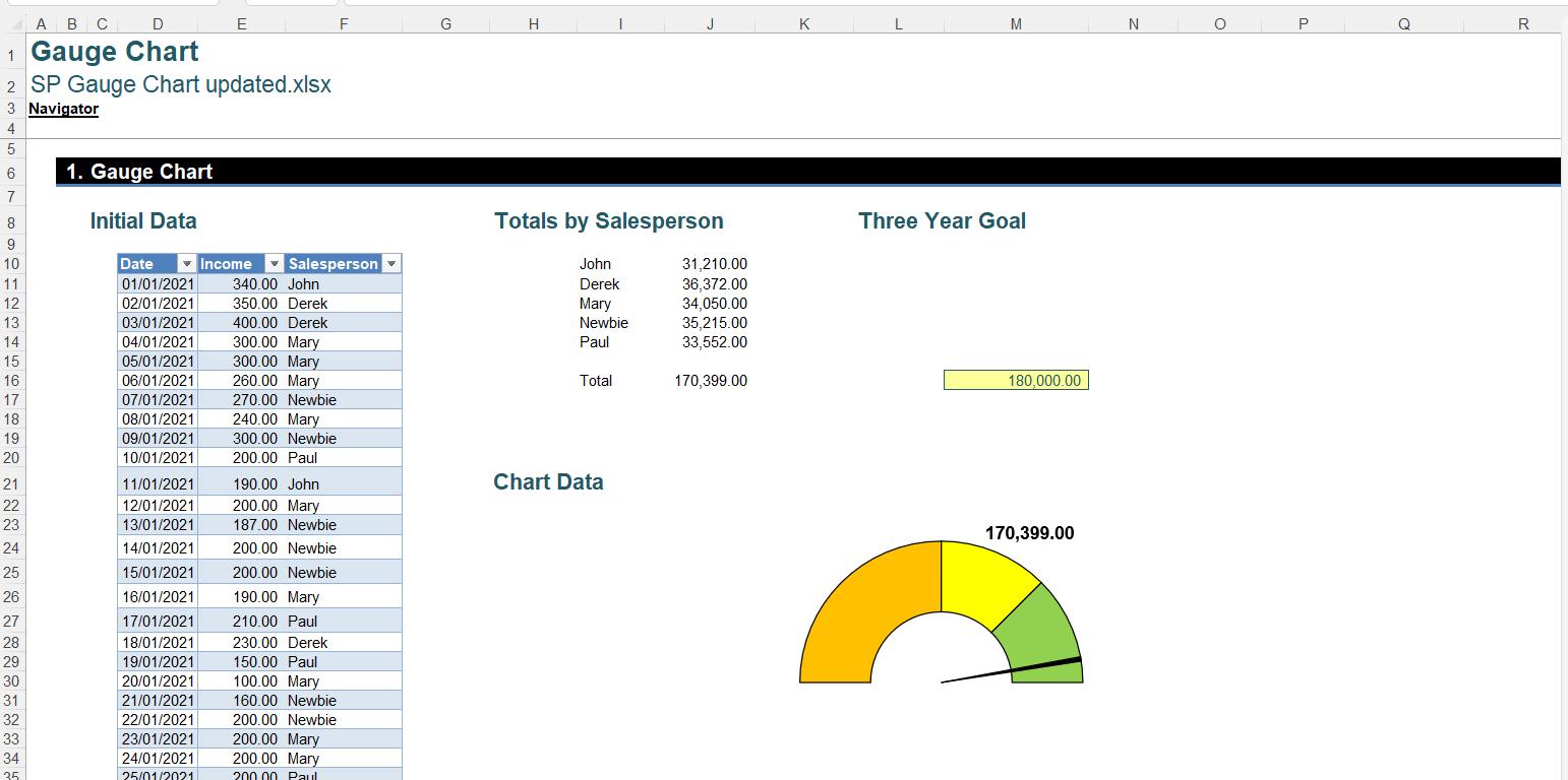
The pointer has moved, showing we are looking much more likely to achieve this goal!
You can find the solution we created here.
That’s it for this week, come back next week for more Charts and Dashboards tips.

