
Charts and Dashboards: Surface Charts
8 July 2022
Welcome back to our Charts and Dashboards blog series. This week, I look at surface charts.
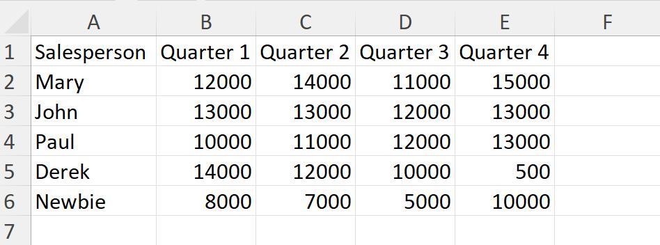
The results are in for last year’s sales:
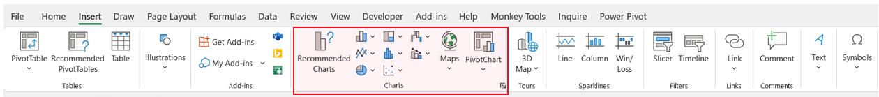
I am going to illustrate these sales with a Surface chart. Surface charts need at least two data series, and the categories (quarters here) and series (sales) should be numerical. I select the data and go to the Insert tab, where I look at the Charts section.
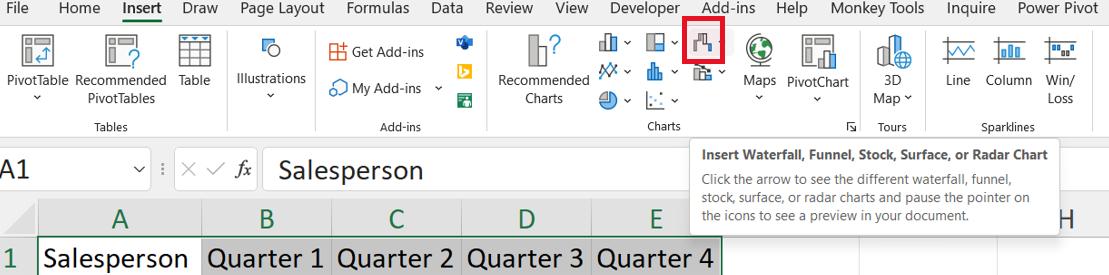
I choose the icon to the top left of the globe:
In the dialog, I can see Surface charts:
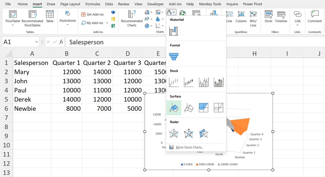
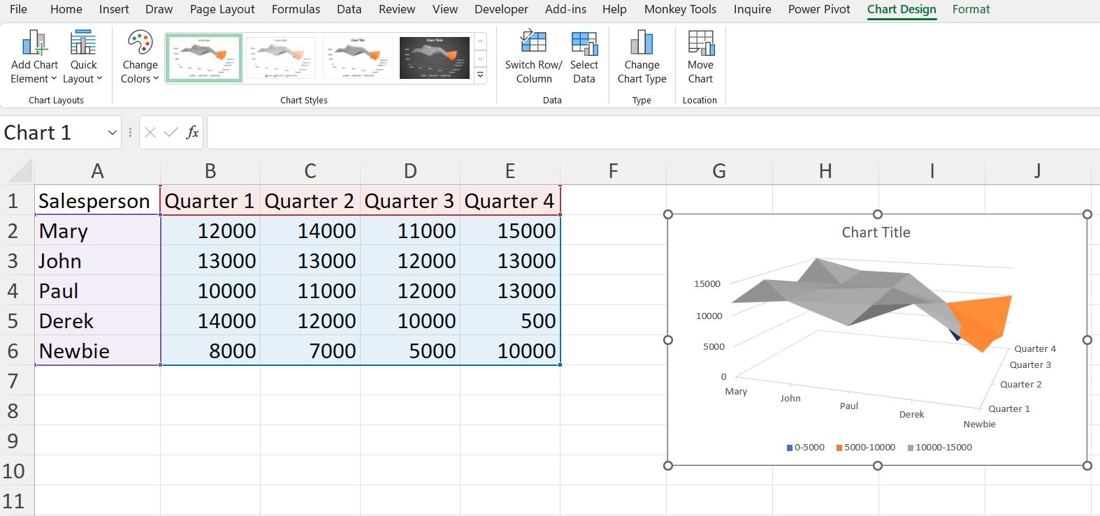
The preview is not well positioned! I click on the first option in the Surface section:
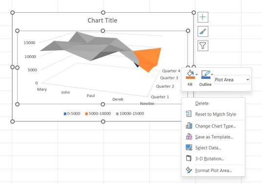
There are a few changes I would like to make. I can see the options available by right-clicking in the chart.
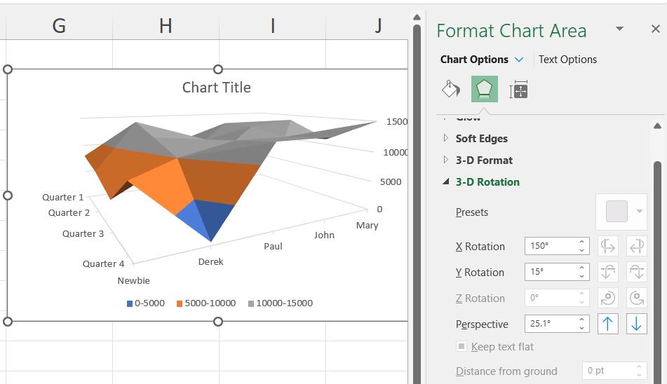
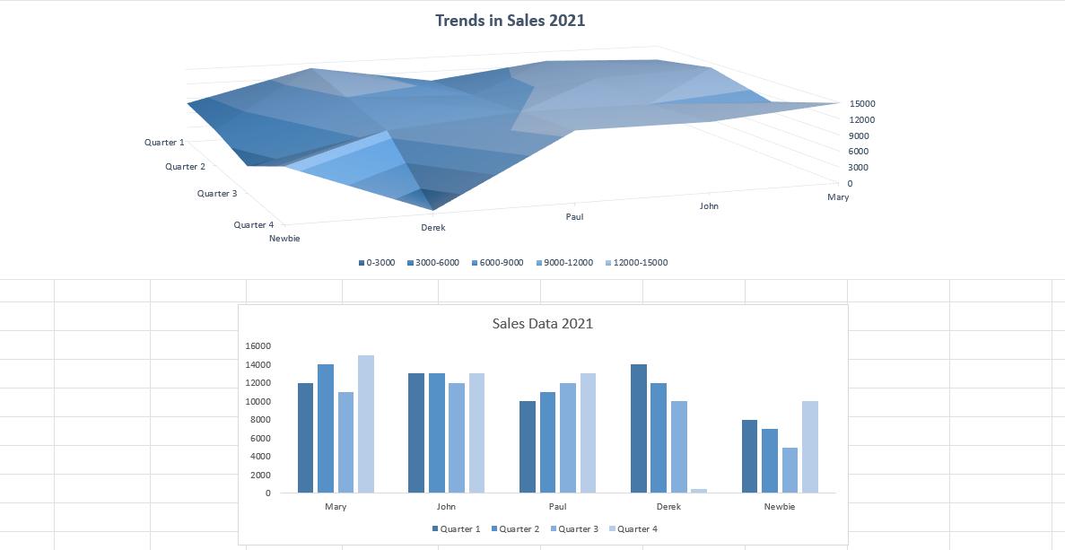
I start by changing the ‘3-D Rotation…’. I can rotate the X-axis so that Derek’s results for Quarter 4 are highlighted:
I can also adjust the bands on the Y-axis (the Major Units) to highlight the highest achievements.
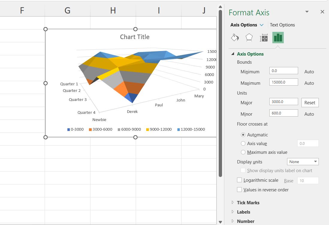
The way I choose to format the surface chart will depend on the aspect of the chart that is being emphasised. Whereas the previous chart was focused on Derek’s performance in the final quarter, this version also shows that Newbie is improving. The colour scheme has also been changed, though this should correspond the other colours in the dashboard for consistency. I would use this chart to emphasise particular trends in a dashboard that included other charts showing the figures in detail, such as a clustered column chart.
That’s it for this week. Come back next week for more Charts and Dashboards tips.