Charts and Dashboards: The Horizontal Raincloud Chart – Part 2
10 November 2023
Welcome back to our Charts and Dashboards blog series. This week, we continue to show you how to make a bespoke Horizontal Raincloud chart, by creating a Stacked Column chart to show the percentile analysis.
The Horizontal Raincloud chart
Are you looking for a new way to present your data? This week, we continue looking at the Horizontal Raincloud chart. If you are unfamiliar with this concept, the Horizontal Raincloud chart might look like the following image:
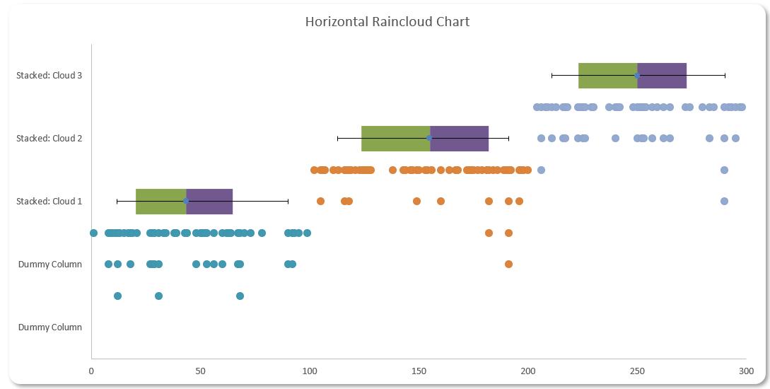
You can download the starting Excel file here to build this chart with us.
Our Excel file contains two [2] workings sheets, one named ‘Horizontal Raincloud – 1 Cloud’ and the other ‘Horizontal Raincloud – 3 Clouds’. We will illustrate our example in the ‘Horizontal Raincloud – 1 Cloud’ sheet.
Let’s break down the charts we used here to make this design:
- a Scatter chart for our data point distribution
- a Stacked bar chart for percentile analysis
- a Scatter chart for our error bar.
We will illustrate how to construct each of these charts and later merge them together to create the Horizontal Raincloud chart.
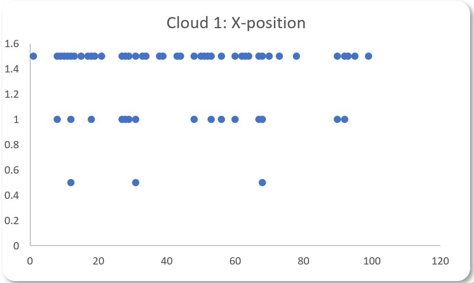
Last week, we created a Scatter chart for our data point distribution:
This week, we create a Stacked Column chart to show the percentile analysis. To create this chart, we will use the following two [2] tables:
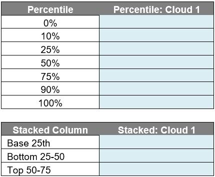
The top table is called Percentile_Table and the bottom table is called Stacked_Bar. In the Percentile_Table, we will enter the following formula in the ‘Percentile: Cloud 1’ column to return the percentiles of the data:
=PERCENTILE(Cloud[Cloud 1], [@Percentile])
This will return the percentile values for 0%, 10%, 25%, 50%, 75%, 90% and 100% of our data in Cloud 1. Next, we will be using this table to calculate the Stacked_Bar table:
- for the ‘Base 25th’ row, it will be equal to the 25th percentile of Percentile_Table
- for the ‘Bottom 25 -50’ row, it will be equal to the 50th percentile less the 25th percentile from the Percentile_Table
- for the ‘Top 50-75’ row, it will be equal to the 75th percentile less the 50th percentile from the Percentile_Table.
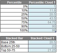
We will have the following table after we have finished our calculations:
Before plotting this, we will add two [2] dummy columns in the Stacked_Bar table. This will help our ‘Scatter chart for our data point distribution’ components by having more space for the plot. Another reason why we add dummy columns is that the Stacked Bar graph and Scatter graph do not share the primary axis like the Stacked Column graph and Scatter graph. Hence, scaling the axis to make every component fall into the correct position will be a nightmare without the help of the dummy column. Thus, we will have the following table for the Stacked_Bar:

We select whole Stacked_Bar table and we go to the Insert -> Charts -> 2-D Column -> Stacked Bar.
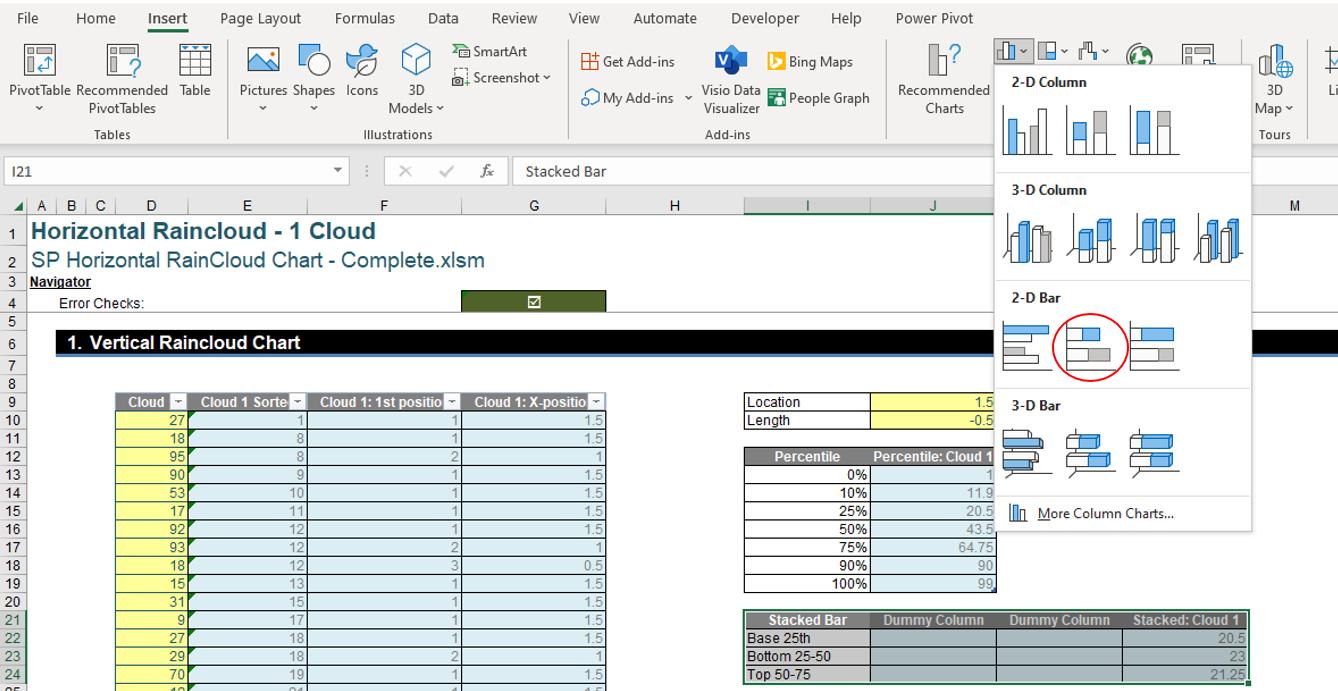
After selecting that we will have the following visual:
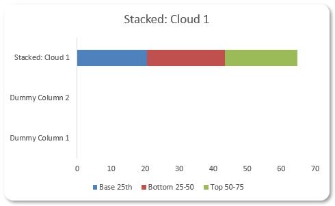
This is where this week’s instalment ends, next time we will create a Scatter chart (of sorts) for our error bar.
That’s it for this week, come back next week for more Charts and Dashboards tips.

