
Charts and Dashboards: The Horizontal Raincloud Chart – Part 3
17 November 2023
Welcome back to our Charts and Dashboards blog series. This week, we continue to show you how to make a bespoke Horizontal Raincloud chart, by creating a Scatter chart for our error bar.
The Horizontal Raincloud chart
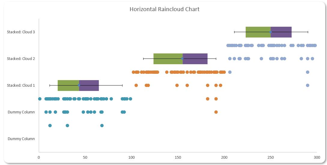
Are you looking for a new way to present your data? This week, we continue looking at the Horizontal Raincloud chart. If you are unfamiliar with this concept, the Horizontal Raincloud chart might look like the following image:
You can download the starting Excel file here to build this chart with us.
Our Excel file contains two [2] workings sheets, one named ‘Horizontal Raincloud – 1 Cloud’ and the other ‘Horizontal Raincloud – 3 Clouds’. We will illustrate our example in the ‘Horizontal Raincloud – 1 Cloud’ sheet.
Let’s break down the charts we used here to make this design:
- a Scatter chart for our data point distribution
- a Stacked bar chart for percentile analysis
- a Scatter chart for our error bar.
We will illustrate how to construct each of these charts and later merge them together to create the Horizontal Raincloud chart.
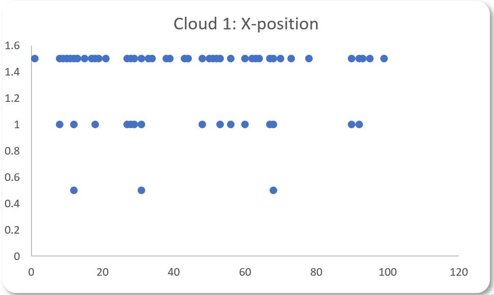
In Part 1, we created a Scatter chart for our data point distribution:
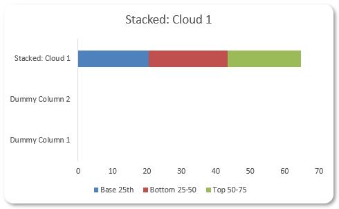
Last week, we created a Stacked Column chart to show the percentile analysis.
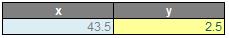
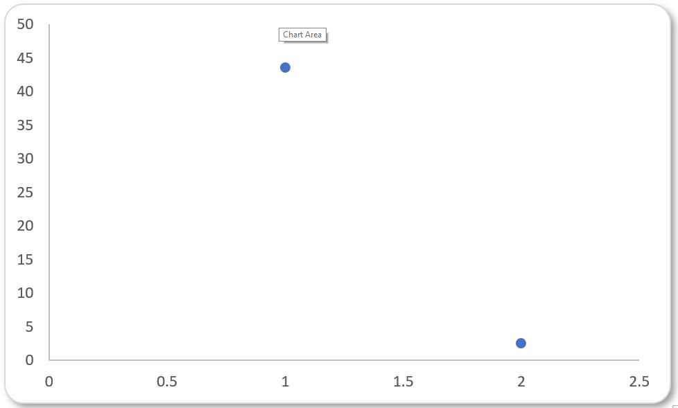
This week, we create the last element for our Horizontal Raincloud chart: a Scatter chart for our error bar. To construct an error bar, we will need an xand y position for the error bar and positive and negative lengths of the error bar. For the y position of the error bar, we will enter a value of 2.5. This is because this will put the error bar in the middle of our stacked column chart. For the x position of the error bar, we will use the value of the 50th Percentile from the Percentile_Table, which is 43.5 in this instance. We will then have the following table below:
We select whole table and select Insert -> Charts -> Scatter -> Scatter:
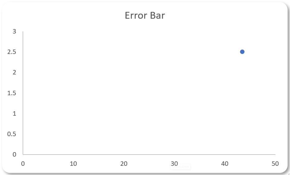
This is not what we want here so we select Chart Design -> Data -> ‘Switch Row/Column’, which will result in the following chart:
Next, we select the chart and click the plus sign on the right-hand side of the chart, select ‘Error Bars’ and select ‘More Options’:
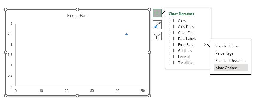
This will give us two [2] error bars as below:
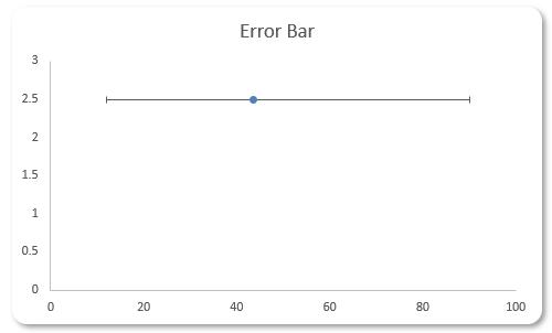
Now, since our chart is a Horizontal Raincloud, we do not need the vertical error bar, so we click on it and delete it. This will result in the following:
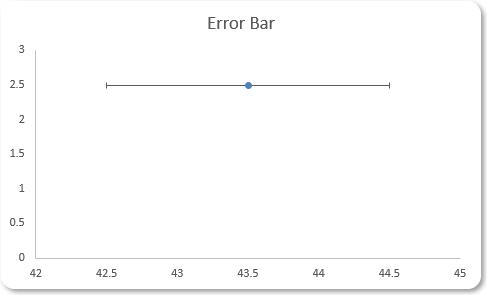
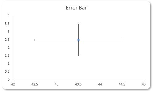
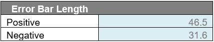
At this stage, we have almost finished the error bar. What we need now is to specify its length. We use the following table to help calculate this:
The size of the error bar comes down to personal preferences. If we want to include all the data points here, we can choose the 0th and 100th percentile to construct our error bar. If you want to exclude 10% of the lower tail and 10% of the upper tail (i.e. present the inter-decile range), we can select the 10th percentile and 90th percentile to construct our error bar. In this example, we will demonstrate the latter. But how do we calculate the Positive and Negative here? For the Positive length of the error bar, we take the 90th percentile minus the 50thpercentile and for the Negative length, we take the 50th percentile minus the 10th percentile. This gives us the following values:
On the chart, we double-click on the error bar of the chart, to bring up the ‘Format Error Bars’ options:
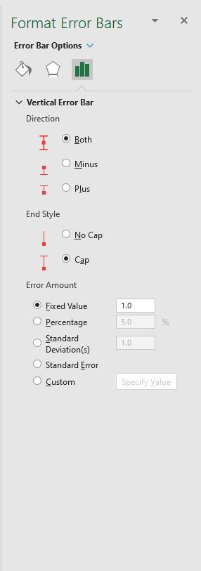
Here we select Custom -> Specify Value. The ‘Custom Error Bars’ dialog will then appear:
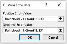
Here, we refer to the Positive and Negative values in our table. After clicking OK the previous chart will be changed as follows:
We have created the elements we need for the Horizontal Raincloud chart, now all we need to do is to merge all three [3] charts together, which is where we will continue next week.
That’s it for this week, come back next week for more Charts and Dashboards tips.