
Charts and Dashboards: The Marimekko Chart – Part 2
6 October 2023
Welcome back to our Charts and Dashboards blog series. This week, we continue to “Mari-make” a Marimekko chart by building a raw chart.
The Marimekko chart
The Marimekko chart is a visualisation of data from two [2] categorical variables. The name came from its resemblance to some Marimekko prints, and it is also known as the Mekko chart, the Mosaic plot or sometimes the Percent Stacked Bar plot.
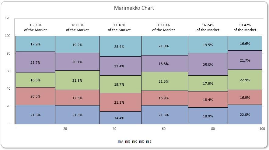
Each tile in the chart represents a cross-category of the two [2] variables and stacking them together makes it very easy to compare the relative sizes, and hence to compare the relative quantities.
To start building the chart, you can download our Excel file and follow the instructions. You can also use this link to download the complete file.
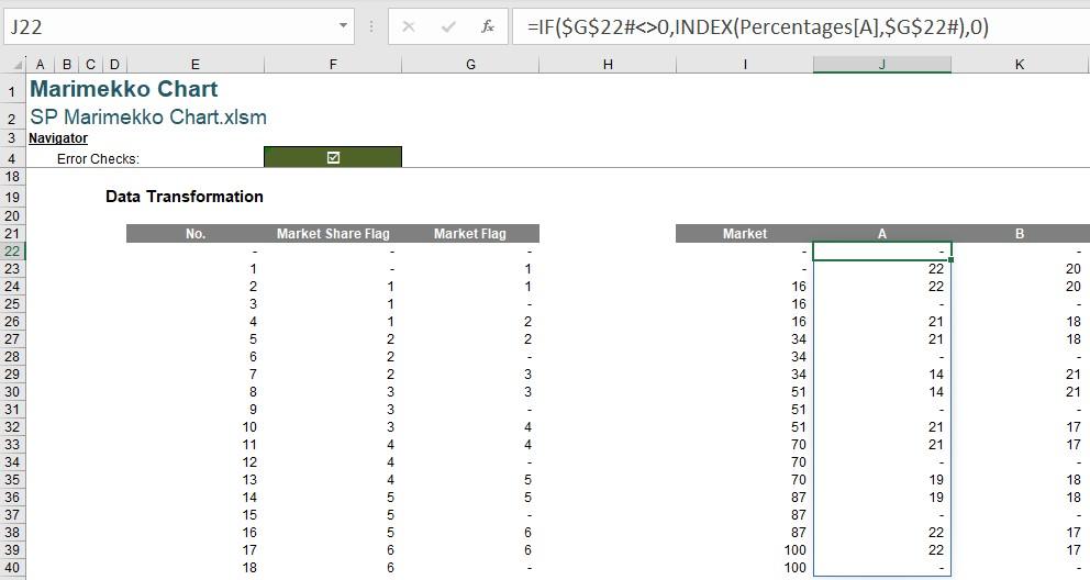
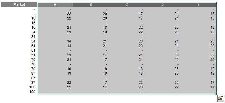
Last week, we prepared the data for the raw chart:
Having obtained the table, we can produce the first chart. We will be using a Stacked Area chart with the first column Market as the horizontal axis. First, we select the product columns with headings to insert a Stacked Area chart, in Insert -> Insert Line or Area Chart -> Stacked Area.
Then, in Chart Design -> Select Data -> Horizontal (Category) Axis Labels, we click Edit and select the column Market without heading:
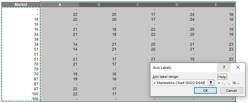
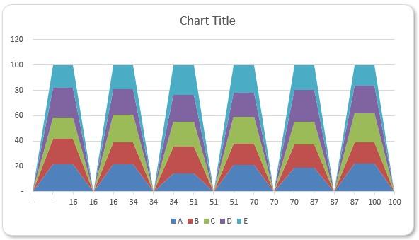
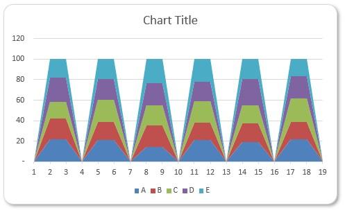
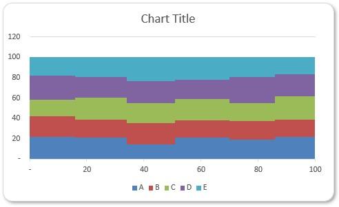
As mentioned last week, the column Market is being treated as a list on the horizontal axis, instead of a quantitative scale. Changing the horizontal axis to Date axis amends that and transforms the trapezoids to a series of stacked tiles:
We change the axis by going to Chart Design -> Add Chart Element -> Axes -> More Axis Options and then Horizontal (Category) Axis -> Axis Options -> Axis Options -> Axis Type and selecting Date axis:
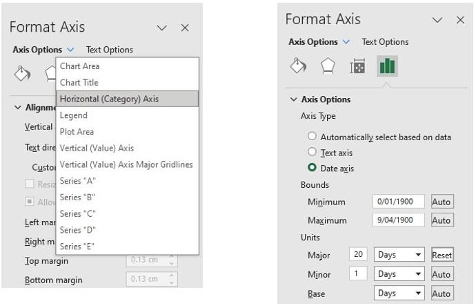
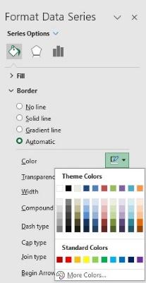
Still within Horizontal (Category) Axis -> Axis Options -> Axis Options, we change Units -> Major to 20 days (as pictured), so the horizontal axis doesn’t list all numbers from zero [0] to a hundred. Now there are only jagged colour strips in the chart, and we need to paint the borders manually for each product. Selecting one [1] product series on the chart, we go to Format Data Series -> Border -> Color and select a suitable colour, e.g. black:
We repeat this for all product series. Then the chart displays mosaic tiles, which are of appropriate sizes representing the percentages:
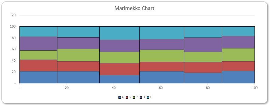
Our raw chart is complete. Next time, we will construct an auxiliary chart which will allow us to add labels to the raw chart.
That’s it for this week, come back next week for more Charts and Dashboards tips.