
Charts and Dashboards: The Marimekko Chart – Part 4
20 October 2023
Welcome back to our Charts and Dashboards blog series. This week, we complete our series showing how to “Mari-make” a Marimekko chart.
The Marimekko chart
The Marimekko chart is a visualisation of data from two [2] categorical variables. The name came from its resemblance to some Marimekko prints, and it is also known as the Mekko chart, the Mosaic plot or sometimes the Percent Stacked Bar plot.
Each tile in the chart represents a cross-category of the two [2] variables and stacking them together makes it very easy to compare the relative sizes, and hence to compare the relative quantities.
To start building the chart, you can download our Excel file and follow the instructions. You can also use this link to download the complete file.
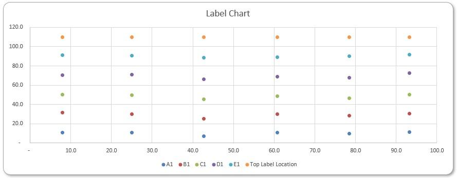
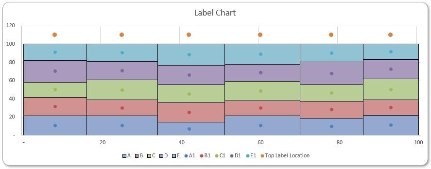
Last time, we created a label chart:
This week, we will combine the charts we have created so far, to make our Marimekko chart.
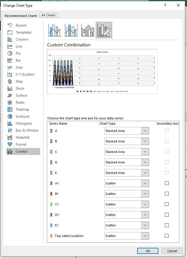
We can copy the Scatter chart over to the raw Marimekko chart. After copying, in Chart Design -> Change Chart Type -> Combo, we specify the series from the raw Marimekko chart to the type Stacked Area, and specify the series from the auxiliary Scatter chart with label coordinates to the type Scatter. Also, we unselect the option Secondary Axis for all series.
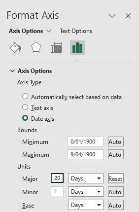
Again, in Chart Design -> Add Chart Element -> Axes -> More Axis Options and Horizontal (Category) Axis -> Axis Options -> Axis Options -> Axis Type, we select Date axis, and in Units -> Major we enter 20 days to clean up the x-axis labels:
Now, we have scatter dots centred in the tiles and an extra row of dots for captions:
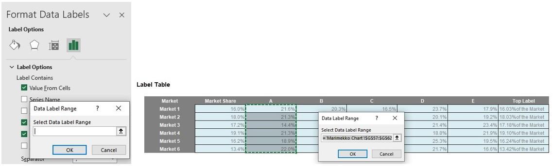
We can select the percentages from our Label Table as Data Label for each product. We do that by first clicking on a series of label points, going to Chart Design -> Add Chart Element -> Data Labels -> More Data Label Options and Format Data Labels -> Label Options -> Label Options -> Label Contains, selecting Value From Cells and selecting the corresponding columns from Label Table. For example, for product ‘A’:
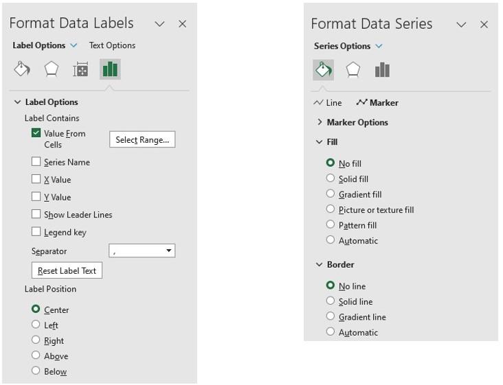
At the end, we hide the scatter points and centre the Data Labels. We centre the Data Labels by selecting Center at Format Data Labels -> Label Options -> Label Options -> Label Position. We hide a series of scatter points by first double-clicking a point, and in Format Data Series -> Fill & Line -> Marker -> Fill, we select No fill. In Format Data Series -> Fill & Line -> Marker -> Border, we select No line.
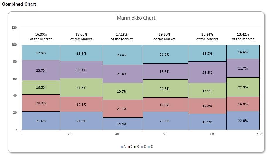
We repeat this for all products and do the similar for Top Label to include captions.
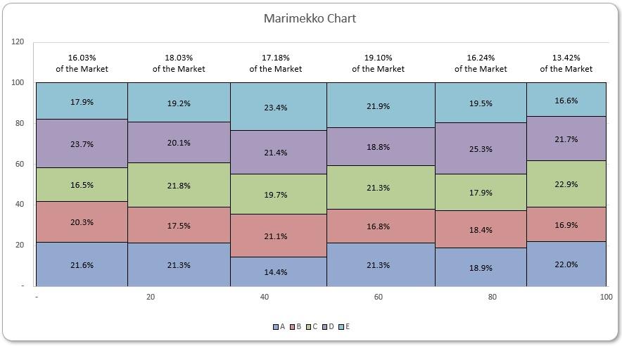
Concluding with some chart formatting, we now have a Marimekko chart of five [5] products across six [6] markets with labels and captions:
Legacy Excel
We have another file specifically formulated for Legacy Excel users. It could be downloaded with this link. The complete file built up as explained above with dynamic array formulae can be downloaded with this link.
That’s it for this week, come back next week for more Charts and Dashboards tips.