
Charts and Dashboards: The Point and Figure Chart – Part 1
14 July 2023
Welcome back to our Charts and Dashboards blog series. This week, we’re going to look at how to make a bespoke Point and Figure chart.
The Point and Figure chart
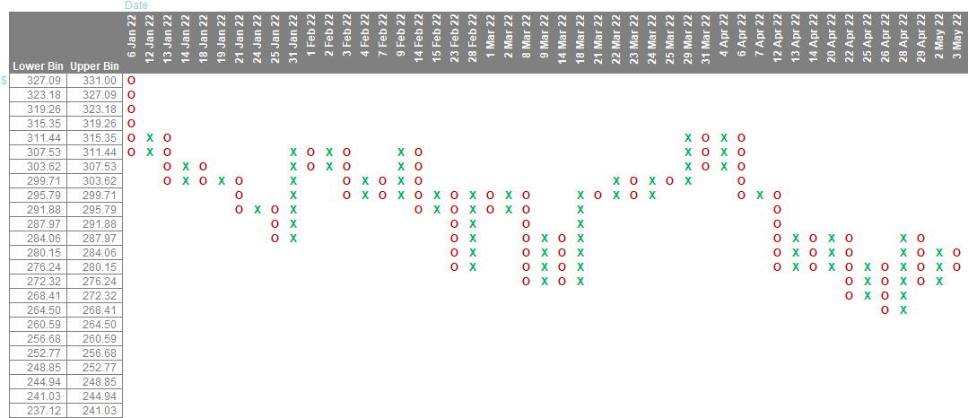
A Point and Figure chart is a way of displaying price fluctuations without taking time into account. This type of chart is useful for tracking the price changes of stocks, bonds, commodities, or futures. Below, we’ve included an example of what a Point and Figure chart can look like, based on Microsoft's stock price from January 3, 2022, to January 27, 2023.
To start building the chart, you can download the Excel file provided here and follow the instructions. The Excel file contains two sheets: "Data" and "PnF-CSE". The first step is to summarise and then transform the data on the "Data" sheet.
Summary Data
When we open the Data sheet, the following will appear:
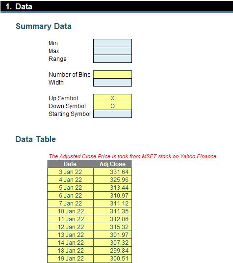
The data table showed the Microsoft stock price from 3 January 2022 to 27 January 2023. Before continuing with the data transformation, we should conduct some descriptive statistics. we should look for the maximum, minimum, and range of the data set by applying the following formulas:
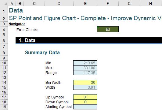
=MAX(Data[Adj Close])
for the maximum value and
=MIN(Data[Adj Close])
for the minimum value.
We may notice that these maximum and minimum cells have the names Max and Min. we should also assign the name Range to the range cell and enter the following calculation:
= Max - Min
We should name the Number of Bins cell as Number_of_Bins and input the desired number of bins to display. For this example, we will enter 30 in this cell.
The Width is the distance between two [2] bins. We will use the following formula to calculate the width and name this cell as Width:
=Range/Number_of_Bins
The last three [3] items are symbols. We will name the cell of up symbol as Up_Symbol, the down symbol as Down_Symbol, and the starting symbol as Starting_Symbol. The up symbol represents the increase in price, and the down symbol represents decrease in price, while the starting symbol is just a calculation cell to determine which symbol goes first.
In this example, we will use ‘X’ for Up_Symbol and ‘O’ for Down_Symbol. we will come back to write the formula for the Starting_Symbol later. After that, we will have our first table fill out like this:
Next time, we will look at how to prepare the data.
That’s it for this week. Check back next week for more Charts and Dashboards tips.