
Charts and Dashboards: Working Capital Adjustment Chart in Detail – Part 4
23 June 2023
Welcome back to this week’s Charts and Dashboards blog series. This week, we complete our series on the Working Capital Adjustment Chart, by looking at how we create the chart from the data we have calculated.
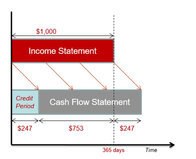
When modelling working capital adjustments, a chart is useful to help us visualise the cash flow figures against existing profit and loss projections. We looked at an overview of this in Working Capital Adjustment Chart, and we are returning to the topic by popular demand to look in more detail at the data behind the chart.
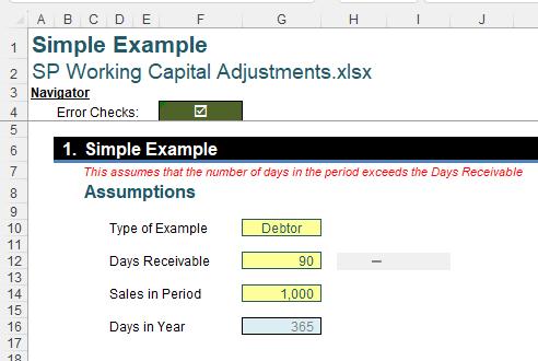
We will look at how we can take the following data:
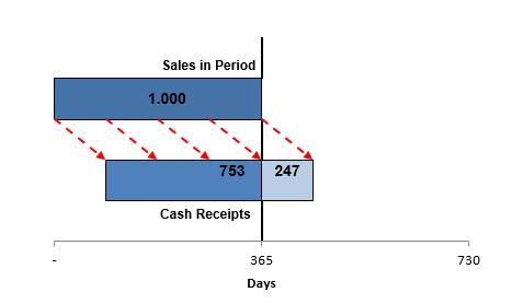
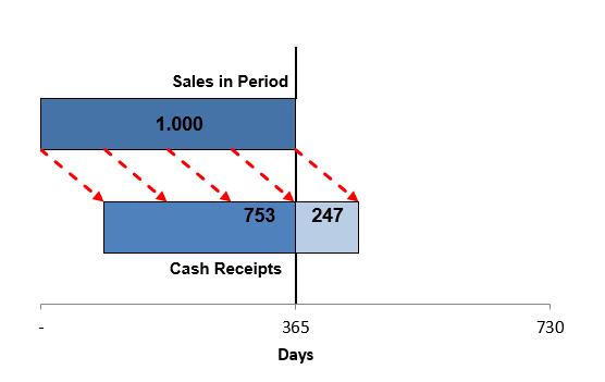
and create a dynamic chart like this:
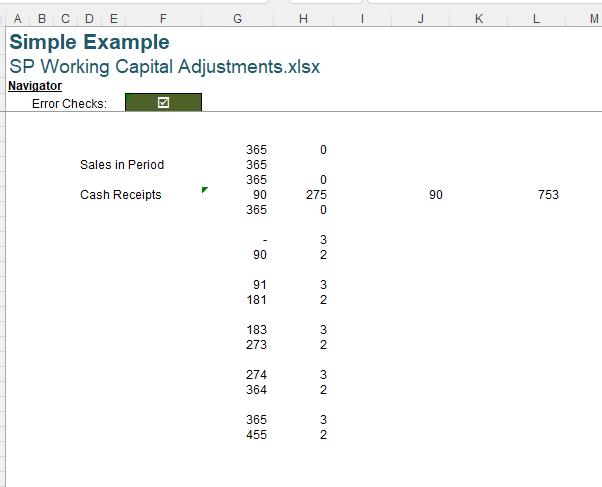
Last time, we looked at the final Chart Data section:
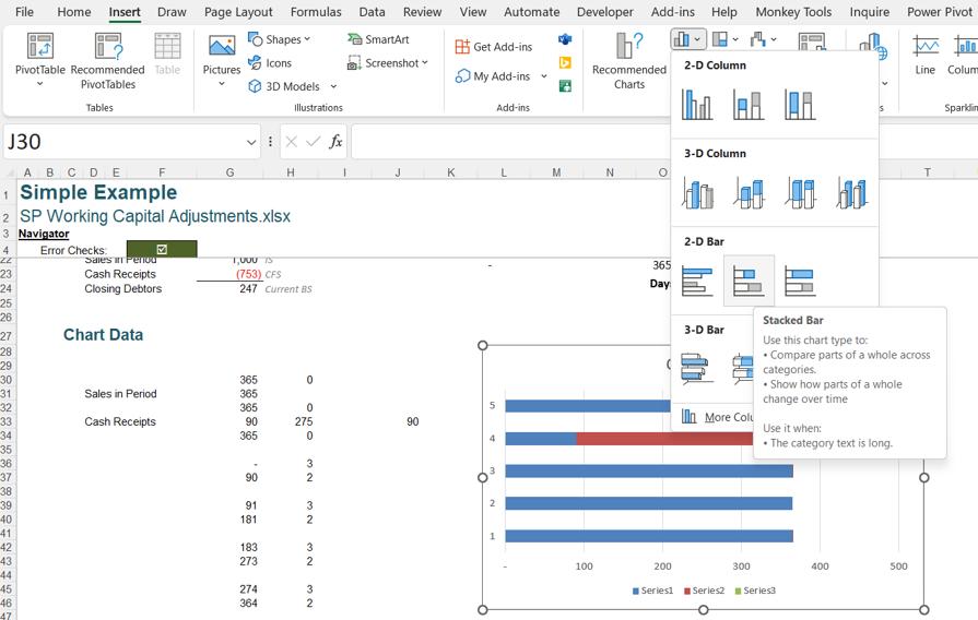
When creating the chart, we don’t add all the data at once. We start by highlighting G30:H34 and then J30:J34. On the Insert tab, we choose to create a ‘Stacked Bar chart’.
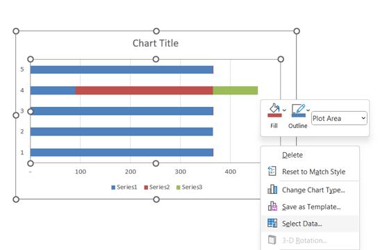
Now we can add the other data. We right-click on our chart and choose ‘Select Data’:
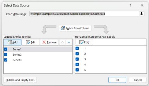
In the dialog, we want to Add data:
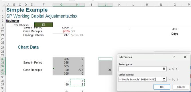
In the ‘Series values’, we select H36:H37:
Before we add the next data, we need to change the chart type of the series we just added:
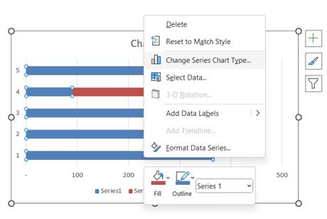
We can do this by selecting any of the data series, and right-clicking to choose ‘Change Series Chart Type’:
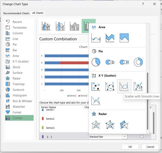
In the dialog, we leave the first three [3] series as a ‘Stacked Bar’ and change the fourth series that we just added to be a ‘Scatter with Smooth Lines’:
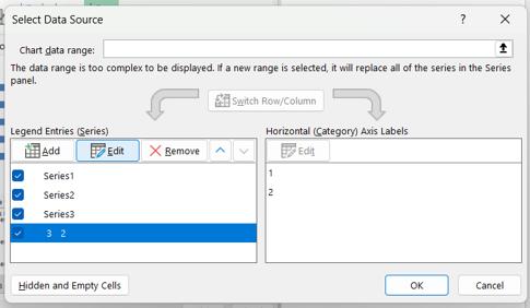
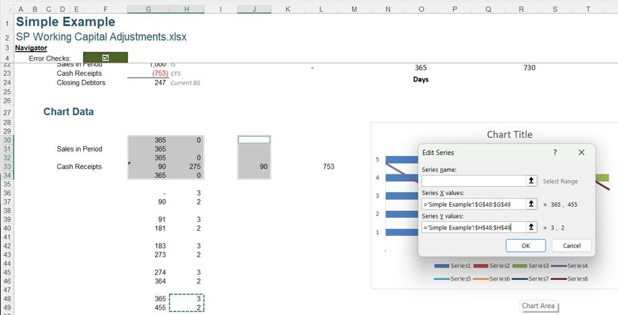
We then access the ‘Select Data Source’ dialog as we did before, and Edit the fourth series:
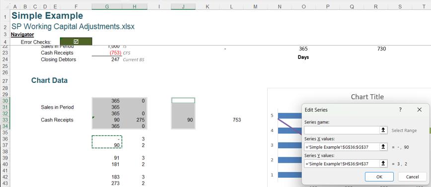
We now have ‘Series X values’ and ‘Series Y values’, therefore we can use the values in G36:G37 as the X values:
We may now add more data, and since we have the options to add ‘Series X values’ and ‘Series Y values’ available to us now, we can add the following sets of X and Y values:
- G39:G40 and H39:H40
- G42:G43 and H42:H43
- G45:G46 and H45:H46
- G48:G49 and H48:H49
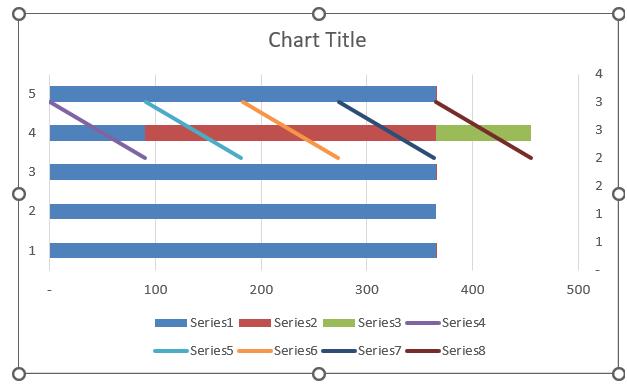
Our chart now looks like this:
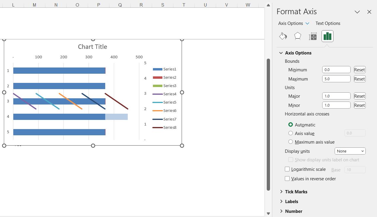
We change the colour of Series2 to blue, and Series3 to light blue. We need to change the secondary vertical axis, so that Series4,5,6,7,8 appear between the bars that we need to see on the final chart (we have moved the legend to the right for now; this is optional as we will be removing the legend):
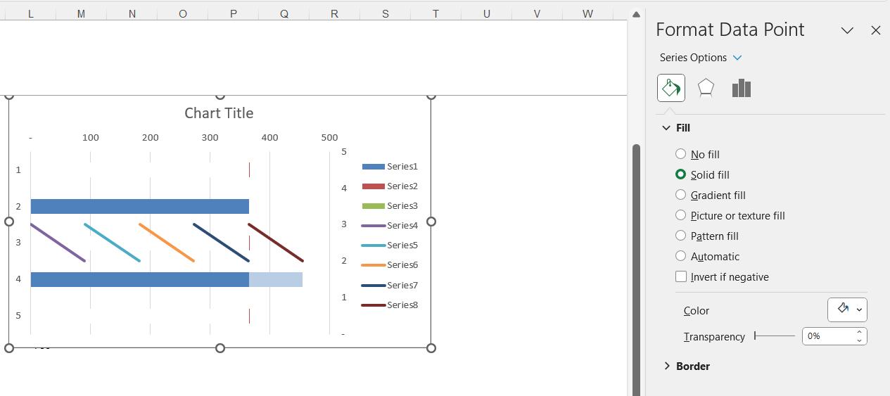
Now, we can change the colour of the first, third and fifth data points on Series1 to white:
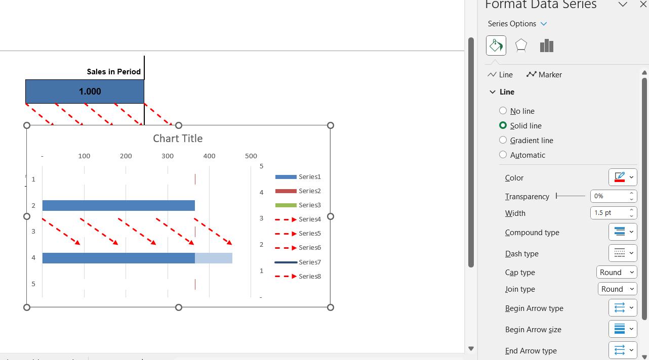
We right-click on Series4, and choose ‘Format Data Series’, where we can change the ‘Color’, ‘Dash type’ , ‘Begin Arrow type’ and ‘End Arrow type’ as shown in the next image. We repeat the same format settings for Series5, 6, 7 and 8.
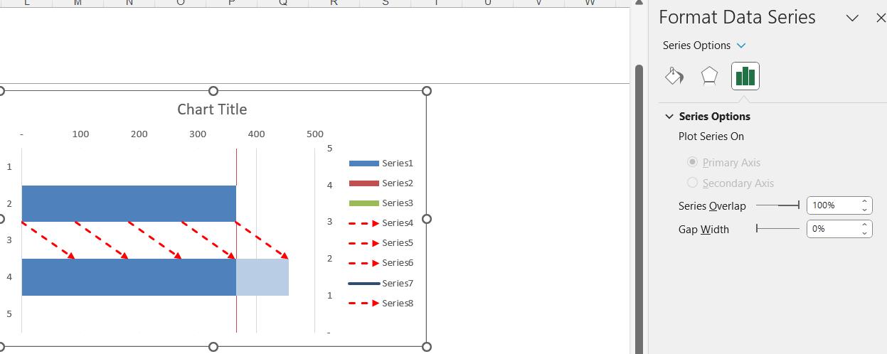
We also need to make the bars wider. We can do this by changing the ‘Gap Width’ for the series:
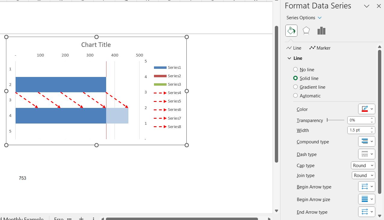
Series7 is not appearing correctly in the legend, so we format it again:
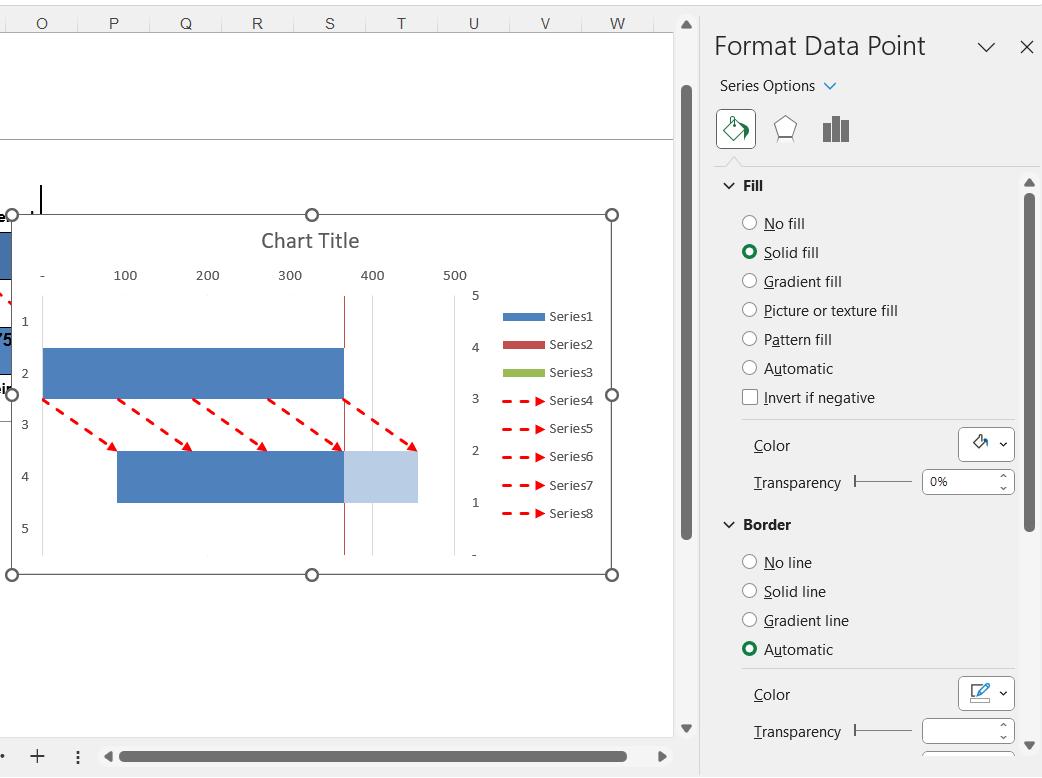
We also need to change the colour of Point 4 of Series1 to white:
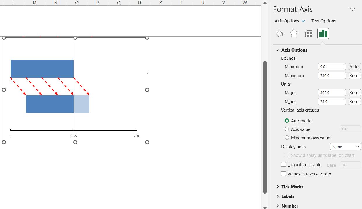
We have the basis of our chart. We can now remove the legend, chart title, gridlines, and the unwanted axes. We also format the remaining axis:
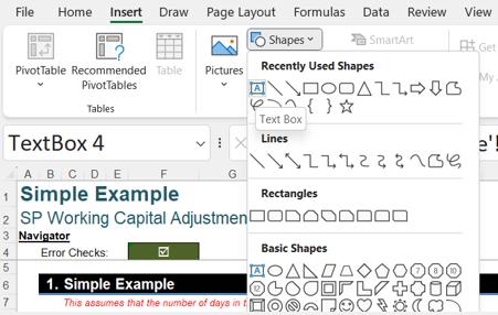
We can add dynamic labels and format them as we wish. We create a ‘Text Box’ from the Insert tab:
We insert text boxes for each of our dynamic labels into our chart and link them to the cells containing the pertinent information, for example, here we populate the title ‘Cash Receipts’ by linking to cell D23:
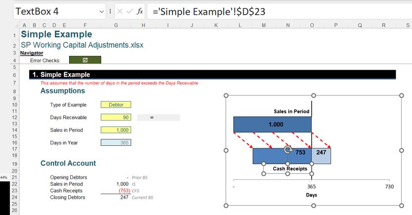
Our chart is complete:
That’s it for this week. Check back next week for more Charts and Dashboards tips.