Power BI Blog: Considering Mobile Layout
24 August 2023
Welcome back to this week’s edition of the Power BI blog series. This week, we look at the Mobile Layout.
There are some updates to the ‘Mobile layout view’ in Power BI Desktop in August. Previously, the user needed to go to View tab in order to access the 'Mobile layout view' from a dropdown. Now, we can select this directly on the Navigation Bar at the bottom left-hand corner of the screen:

Once we click the button, we are in the ‘Mobile layout view’.
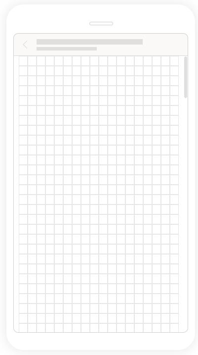
In the 'Mobile layout view', we have the ‘Mobile layout canvas’ which is where we put the visuals we have created. The gridlines will scale across phones of different sizes in order to make them consistent across different devices:

On the 'Page options' group of the ribbon we may easily toggle the Gridlines on and off, or make the visual 'Snap to grid':

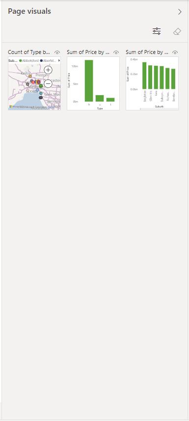
Power BI desktop also added a ‘Page visuals' pane, which makes it easier for the user to drag and drop the visuals that are included in the original report page:

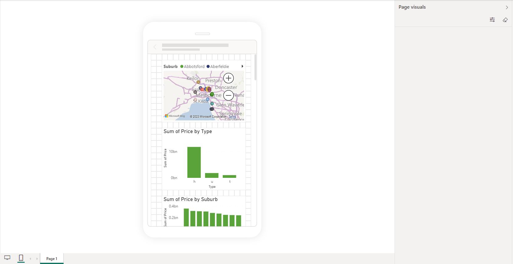
After dragging and dropping the visual in the canvas, the visual disappears from the ‘Page visuals pane’:

If we want to order the layering of the selected visuals, we can use View -> Show pane -> Selection to change the order of the layering.
Finally, we have the ‘Visualizations' pane which is on the right-hand side of the ‘Page visuals' pane. This pane allows us format the visuals.
That is all for the new update for mobile layout of Power BI.
In the meantime, please remember we offer training in Power BI which you can find out more about here. If you wish to catch up on past articles, you can find all of our past Power BI blogs here.

