
Power BI Blog: Labelling Growth on a Line Chart – Part 1
19 October 2023
Welcome back to this week’s edition of the Power BI blog series. This week, we start looking at a method of labelling growth on a chart.
Power BI visuals are an excellent tool when it comes to telling stories with our data. When we are analysing quantitative data, we often need to compare percentage differences. The most common example of this would probably be, “How much did the stock change today?”. However, how do we highlight that percentage change on a Power BI visual, e.g. on a stock price Line chart?
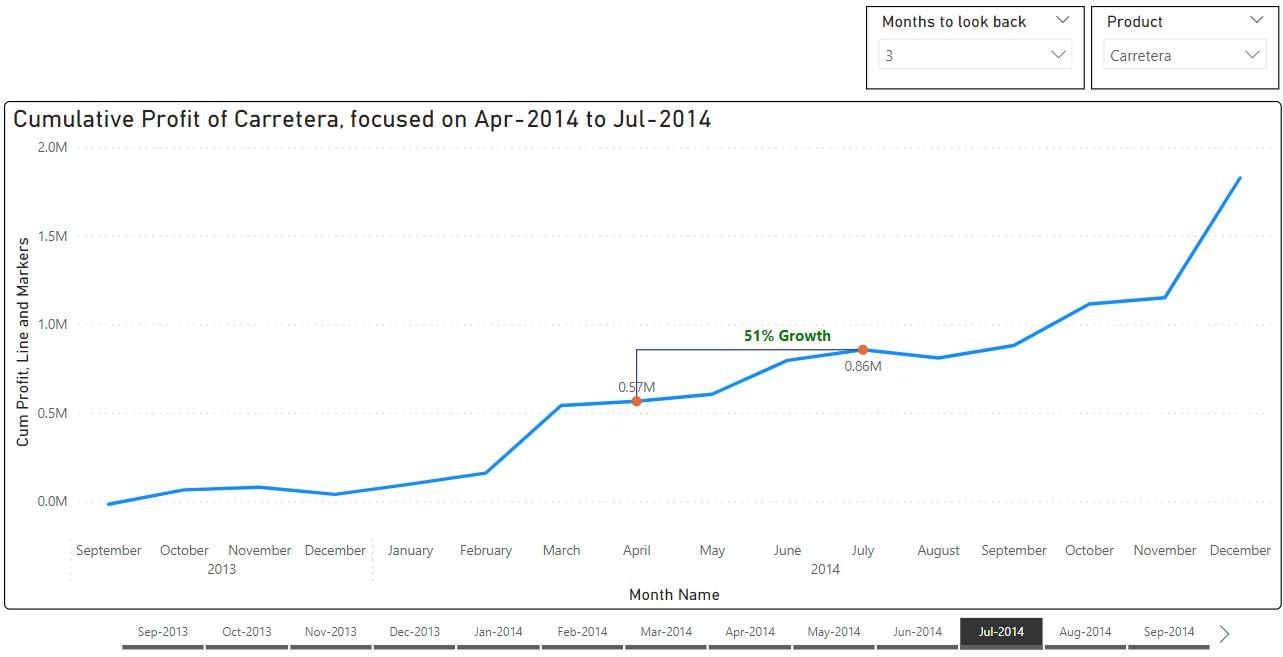
Above, we have created a custom visual to show cumulative profit, focussing on a specified interval. We have created a label to display the growth of cumulative profit and the current selection is from April to July. We can change the interval shown, by choosing an end month, and then specifying how many months to look back. The visual will not only display a label showing the growth, but it will also change colour automatically depending on whether the growth is positive or negative!
We will be using the Financials sample dataset in Power BI Desktop, and you can download our demonstration file with this link.
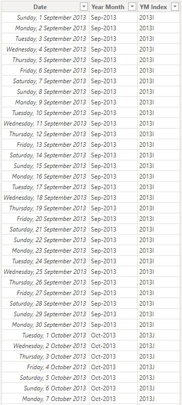
First, we prepare to create our visual by making a copy of the Calendar table.
Create a copy of Calendar
The figure used for demonstration here is a cumulative measure of Profit from the sample dataset, which we created using the following DAX formula:
Cum Profit = CALCULATE(SUM(Financials[Profit]), 'Calendar'[Date] <= MAX(Financials[Date]))
To be able to select and compare different periods on the visual without applying filters to the background Line chart, we need to make an unconnected copy of the Calendar Table, which we’ve named YearMonth Copy. Here, we are comparing values from different months, so we will be using Year and Month for matching and sorting. InYearMonth Copy, we create a label Year Month, where:
Year Month = FORMAT('YearMonth Copy'[Date], "mmm-yyyy")
and also an index YM Index:
YM Index = YEAR('YearMonth Copy'[Date]) & UNICHAR(MONTH('YearMonth Copy'[Date]) + 64)
We have used the UNICHAR function to convert the month numbers to capital letters so that we can sort the Year Month label.
We also create, using the same formula, a calculated column Year Month in the original Calendar Table.
To be able to choose how many months we want to look back, we create a Table Period Selection by clicking New table and then entering in the Formula bar:
Period Selection = GENERATESERIES(1, 12, 1)
Thus, we have created the options one [1] to 12, and then we create a measure Period Length:
Period Length = SELECTEDVALUE('Period Selection'[Period]) + 1
When we select three [3] months to look back, the measure Period Length will be four [4], i.e. length of the whole comparison period.
So far, we have created the options to choose from, i.e. the month to analyse and the number of months to look back. Next, we will define the assisting measures for plotting.
That’s it for this week, next time we show how to create the chart measures that we need.
Check back next week for more Power BI tips and tricks!