
Power BI Blog: Labelling Growth on a Line Chart – Part 2
26 October 2023
Welcome back to this week’s edition of the Power BI blog series. This week, we continue creating our custom visual by creating the chart measures.
Power BI visuals are an excellent tool when it comes to telling stories with our data. When we are analysing quantitative data, we often need to compare percentage differences. The most common example of this would probably be, “How much did the stock change today?”. However, how do we highlight that percentage change on a Power BI visual, e.g. on a stock price Line chart?

Above, we have created a custom visual to show cumulative profit, focussing on a specified interval. We have created a label to display the growth of cumulative profit and the current selection is from April to July. We can change the interval shown, by choosing an end month, and then specifying how many months to look back. The visual will not only display a label showing the growth, but it will also change colour automatically depending on whether the growth is positive or negative!
We will be using the Financials sample dataset in Power BI Desktop, and you can download our demonstration file with this link.
Last time, we prepared to create our visual by making a copy of the Calendar table.
This week, we create the chart measures that we will need to construct the custom visual.
We need two [2] measures to draw the lines connecting two [2] months, and one more measure to draw the markers. To construct these chart measures, we need to create date filters with the unconnected Tables YearMonth Copy, Period Selection and then apply on the main Tables. Let’s go through one of them in details.
We created a measure Line to draw the horizontal line above the chosen period, with the following formula:
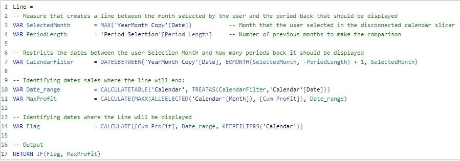
The above formula defines several intermediate variables. The first variable SelectedMonth is the end of the selected month in Table YearMonth Copy, and the variable PeriodLength is the measure defined in Table Period Selection, i.e. length of the comparison period. Then the variable CalendarFilter uses the function DATESBETWEEN to return all dates in the selected period from Table YearMonth Copy.
Next, we use the function TREATAS inCALCULATETABLE to apply the Table CalendarFilter as a filter on Calendar. The output variable Date_range is a snippet of Calendar. This way, we have selected the comparison period from Calendar, without directly applying filters on Calendar.
Then, we define a variable MaxProfitfor the height of the horizontal line:
= CALCULATE(MAXX(ALLSELECTED('Calendar'[Month]), [Cum Profit]), Date_range)
It calculates the maximum cumulative profit over the selected period. Lastly, we create the variable Flag which calculates cumulative profits over the selected period, where we are only using any non-zero [0] values from it as TRUEvalues for the IF function. Thus, the formula returns MaxProfit if Flag is not zero [0].
We define another measure End Pointsto draw the vertical lines and yet another measure Markers to add the custom markers, but before going into their DAX formulae let’s take a peek at how they will be used.
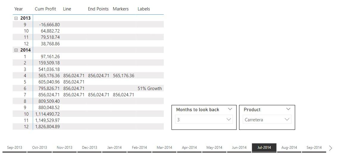
We’ve listed cumulative profit and the measures Line, End Points and Markers in the matrix above, and the slicers contain choices from Tables YearMonth Copy and Period Selection. Having selected ‘Jul-2014’ and three [3] months to look back, we are focusing on the period from April to July 2014. The measure Line finds the max cumulative profit over these four [4] months and repeats it for the whole period. The measure End Points finds the maximum but only outputs the value at the two [2] end points, and it will be used as Error bars to produce the vertical lines. The measure Markers returns the cumulative profit values but again only on the two [2] end points. It is created to highlight the end points and display Data labels.
To define the measure End Points we use the following formula.
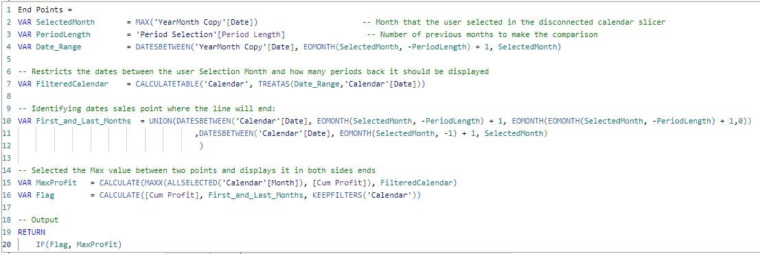
Similarly, we filter out the selected period and calculate the max cumulative profit over the period, in the variable MaxProfit. Using functions EOMONTH and UNION, we select dates from Calendar in the first month and the last month of the selected period and define the variable First_and_Last_Month. Thus, we define the variable Flag slightly different this time, that we only have non-zero [0] values for the first and the last months. This way, we return the max cumulative profit only at the two [2] end points.
The Marker measure can be created with one line of DAX code:
Markers = IF([End Points], [Cum Profit])
The reasoning being that it complies to the same filters as End Points, and when it outputs, we simply want the cumulative profit figures. Thus, we’ve used the measure End Points as a flag here.
That’s it for this week, next time we will build the measures we need to create the label.
Check back next week for more Power BI tips and tricks!