Power BI Blog: Easier Dynamic Heading Based on Time Slicer
11 February 2021
Welcome back to this week’s edition of the Power BI blog series. This week, we will discuss about an easier approach to dynamic heading based on time slicer selection.
A while ago, we talked about creating dynamic headings based on slicer selection and dynamic visualisation titles. In these blogs, we created a measure for the visualisation headings using the ISFILTERED function. We are going to demonstrate another way today.
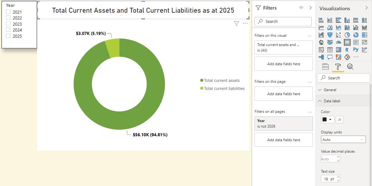
This time, we show another way to get our visualisation heading dynamic. In the example below, we have already created a chart with a Year slicer which has been extracted from the Calendar table. We have left a space at the top for the heading.
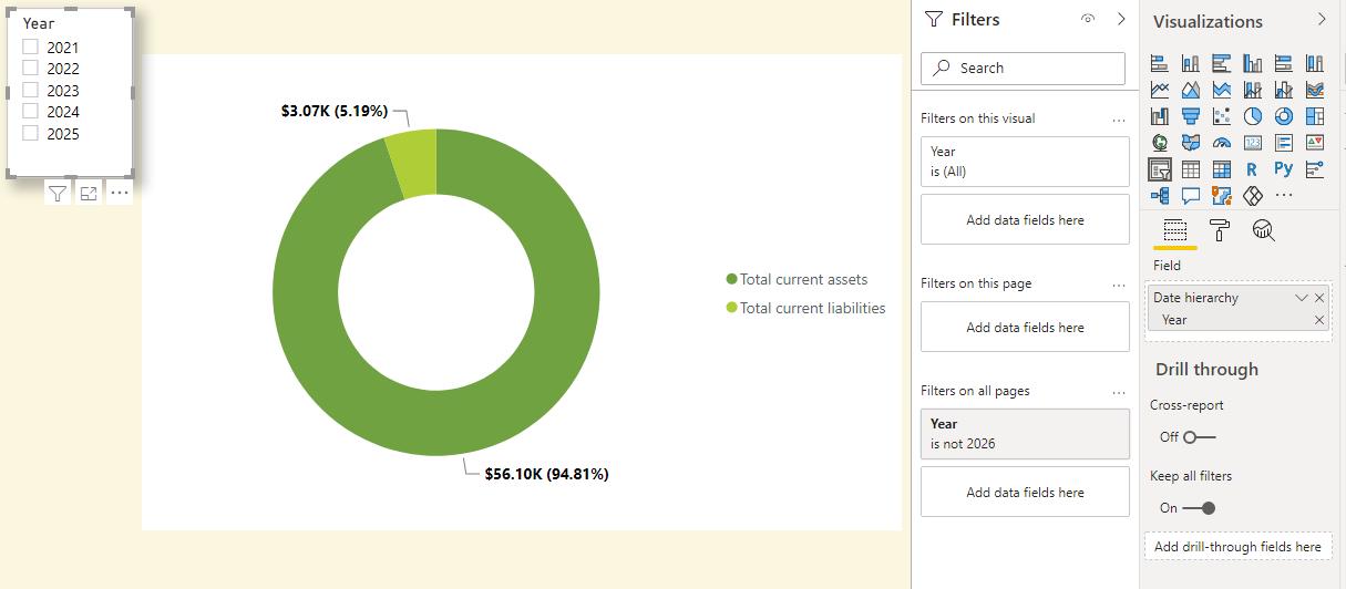
Now, we want the heading to indicate the year selected from the slicer. To do this, we need to create a measure.
Total current assets and current liabilities title = "Total Current Assets and Total Current Liabilities as at " & MAX('Calendar'[Year])
We are using the MAX function to get the value chosen from the Year slicer. If nothing is selected, the header and the visualisation will return the largest year in the slicer e.g. 2025.
To get this heading into our dashboard, we will create a card and drag the measure to the Fields.
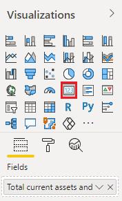
The heading card now looks like the one below.
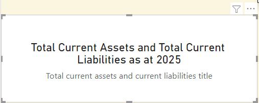
To get the card with only heading, navigate to the Format panel and turn off Category.
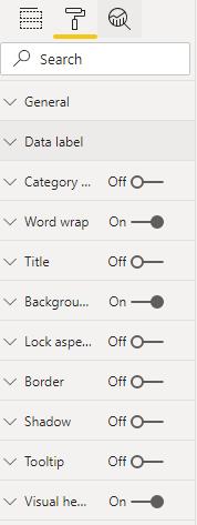
Then, we resize and align the card to the chart and slicer. Next, in the ‘Data label’ dropdown menu under the Format panel, we can reduce the ‘Text size’ and change the colour of the text heading if we wish to.
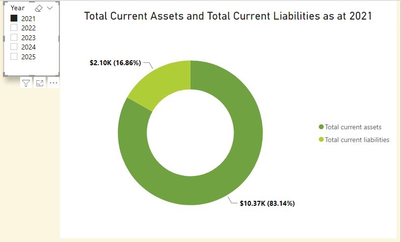
Now if we select ‘2021’ from the Year slicer, both the chart and the heading are updated.
That’s it for this week! Join us next week for more on Power BI.
In the meantime, please remember we offer training in Power BI which you can find out more about here. If you wish to catch up on past articles, you can find all of our past Power BI blogs here.

