Power BI Blog: Revisiting Built-In Gauge Charts
29 April 2021
Welcome back to this week’s edition of the Power BI blog series. This week, we will look at how to use the built-in Gauge visualisation in Power BI.
This week we are going to use the following simple dataset:

In one column, we have the Date and in the other we have the Tonnes of minerals collected. We will be using this dataset for our Gauge visualisation.
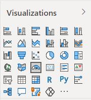
We can create a Gauge visualisation in Power BI as follows. The icon for the Gauge visualisation is found on the Visualizations area:
We can then insert the Tonnes field into the Values area of the visualisation:
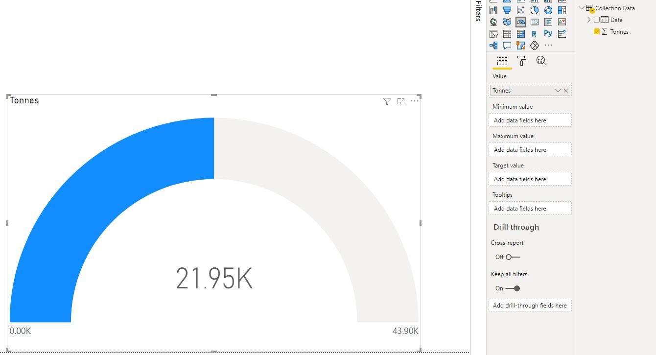
This will populate the Gauge visualisation. However, as it is right now, it is not highly informative. Let’s perform a few tweaks. The first tweak is to include a Date slicer:
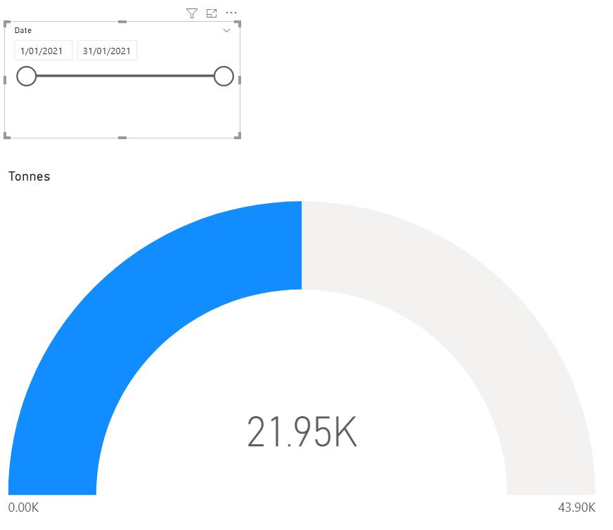
The Gauge visualisation will now update the total tonnage by the date slicer:
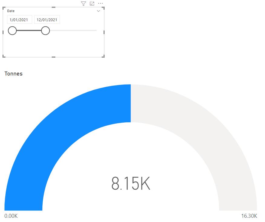
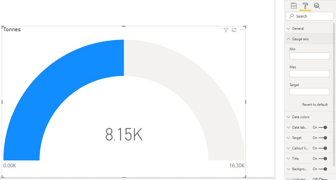
If we look at the screenshot above, changing the date slicer will result in a change in displayed tonnes, however this did not result in a visual change. This is because it has evaluated the gauge to fill to the mid-point of the visualisation. Looking closer, the maximum value on the Gauge chart has updated according to the slicer selected as well, causing the gauge to remain in the mid-point. We will have to specify a maximum value to remain static for the gauge chart.
With the Gauge chart selected, we navigate to the Format tab then expand the ‘Gauge axis’ options.
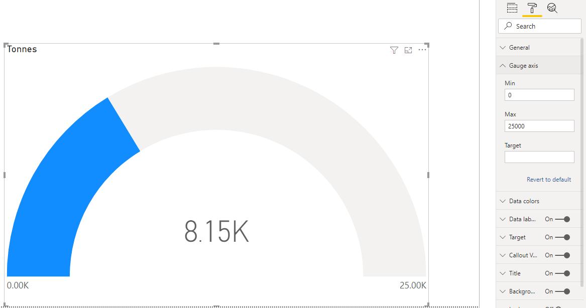
We have given the Gauge visualisation a maximum value of 25,000 and a minimum value of zero [0]. The Gauge visualisation will now look like this:
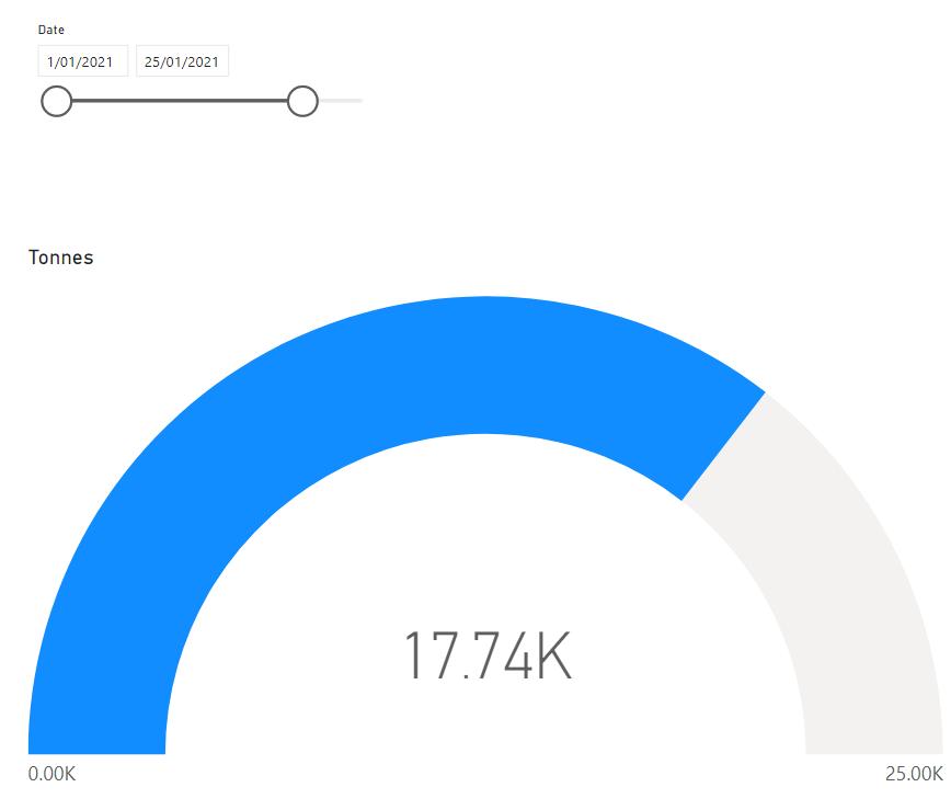
If we expand the date selection to include more days in the month of January, we can see the gauge ‘fill up’ towards the maximum value of 25,000.
Quickly going back to the ‘Gauge axis’ options, we can also add a Target value. For this example, let’s apply 20,000 as the target value.
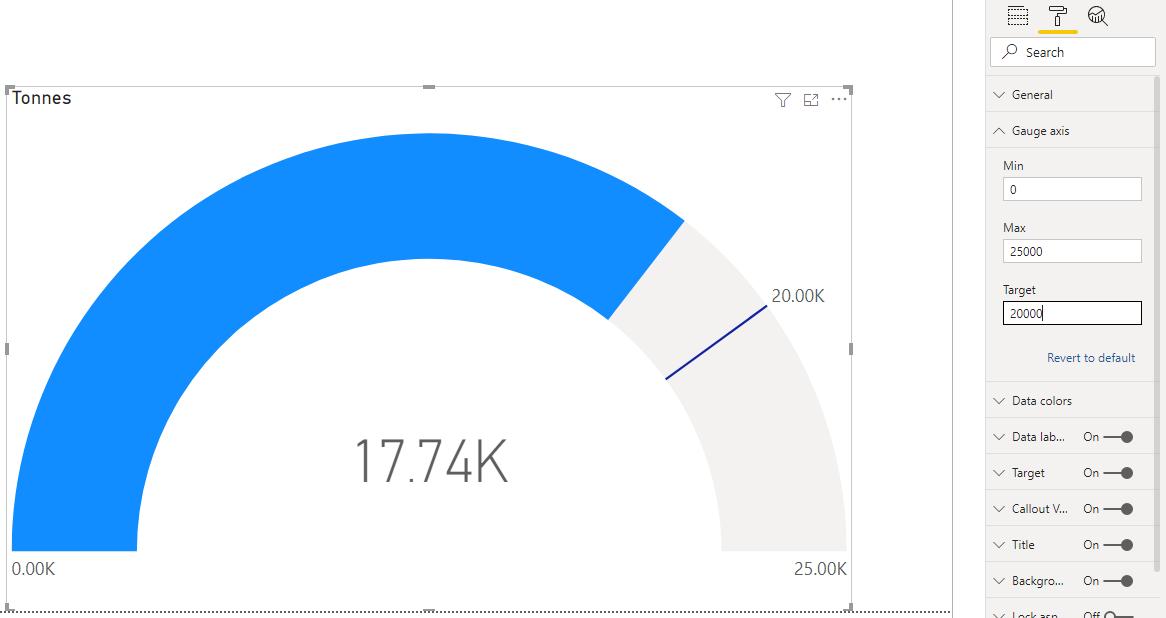
This will add a target line on the Gauge chart, so that the users can see how close we are to a specified target.
That’s it for this week! A quick and easy guide on how to add minimum and maximum lines to the Line Chart visualisation in Power BI. Join us next week for more on Power BI.
In the meantime, please remember we offer training in Power BI which you can find out more about here. If you wish to catch up on past articles, you can find all of our past Power BI blogs here.

