Power BI Blog: Combo Charts
9 January 2020
Welcome back to this week’s Power BI blog series. This week, we are going to look at how to create combo charts (Line and Clustered Column charts).
Again, we are going to use the data set we have now used for several blogs (image is incomplete):

We previously created measures to calculate the Total Cost, Total Sales and Profit. What if we want to now create a new measure to calculate the Profit Margin and have it displayed on a Line and Clustered Column chart?
As mentioned before, in our previous blog, we created the Total Costs, Total Sales and Profit measures. We may use two of these measures to help us create the Profit Margin measure, viz.
Profit Margin = [Profit]/[Total Sales]
Remember to format the measure as a percentage with the appropriate number of decimals:

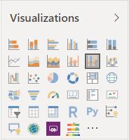
The next step is to create the ‘Line and Stacked bar’ chart:
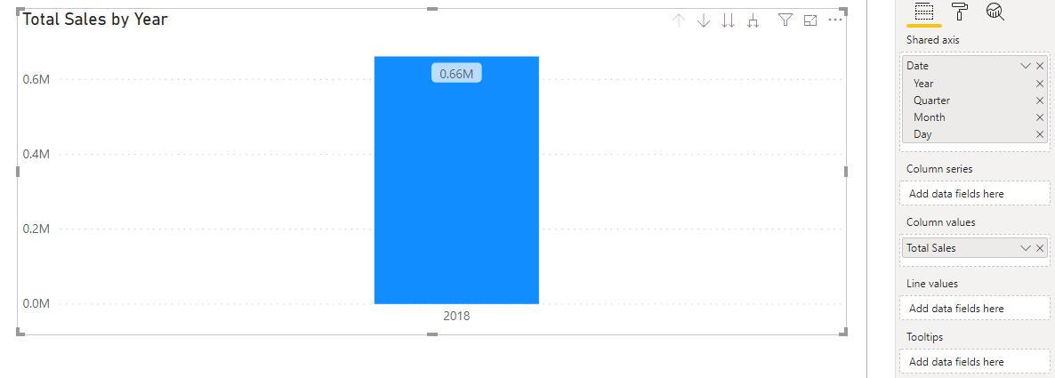
Drag the Total Sales measure into the ‘Column values’ area, and the Date from the Calendar table to the ‘Shared axis’ area:
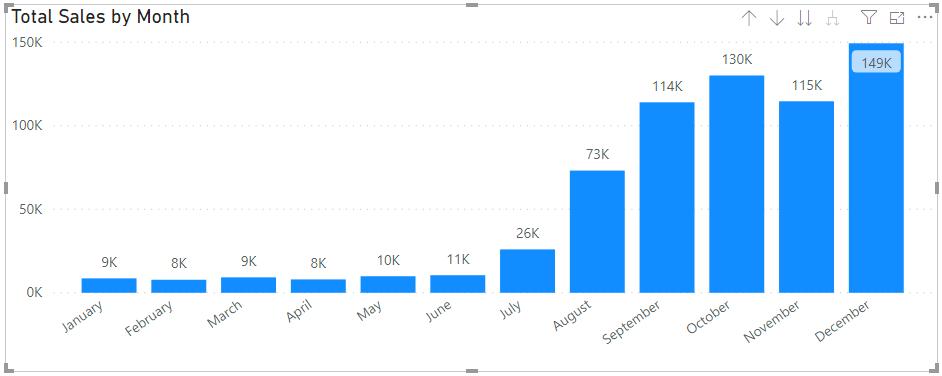
Drill down through the visualisation using the dual arrows pointing down icon in the top right corner of the visualisation:
Now add the Profit Margin measure into the ‘Line values’ area:
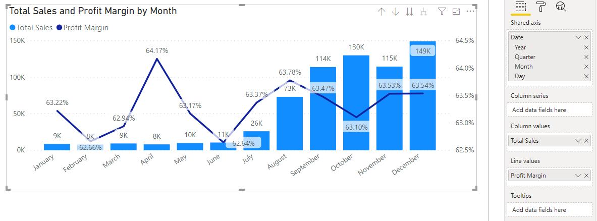
Notice that the Y-Axis scale for the percentage’s ranges from 62.5% to 64.5%? Power BI defaulted to that range to best illustrate the changes between each period although it may be a little misleading. If we wanted to change the Y-Axis scale, it can be adjusted in the Format tab:
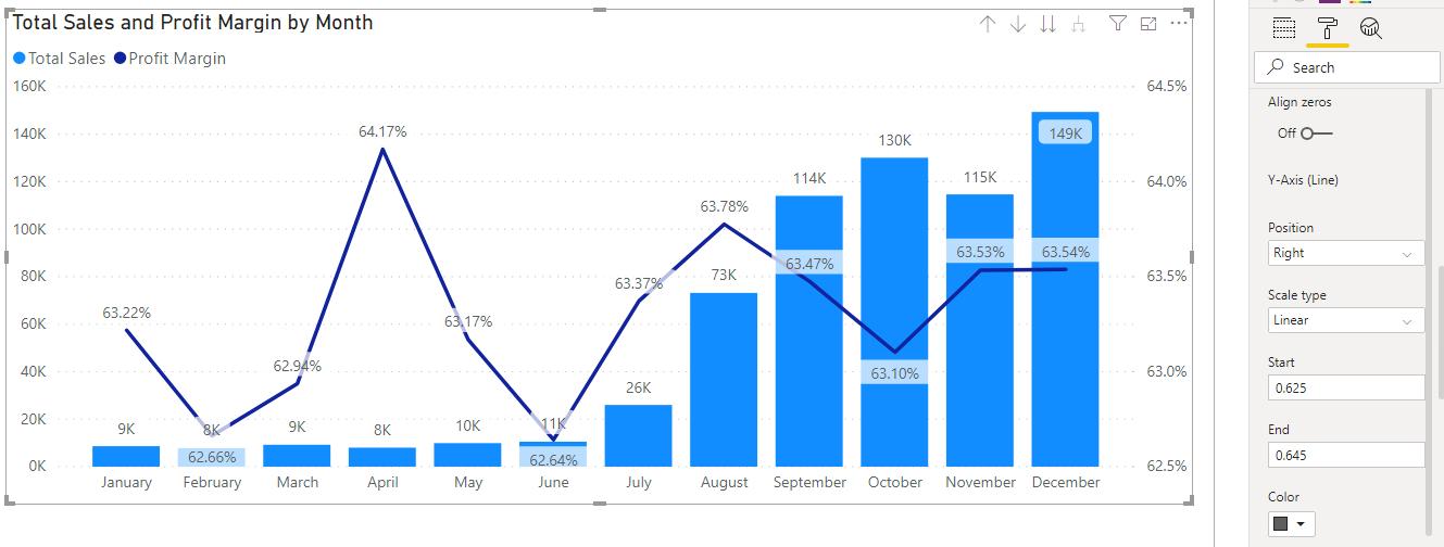
The trick here is to keep scrolling down until we can see the options to adjust the Y-Axis (Line). We can then change the starting and ending values of the axis to suit our needs:

We’ve elected to set the range of the Y-Axis to start at 0% and end at 100%.
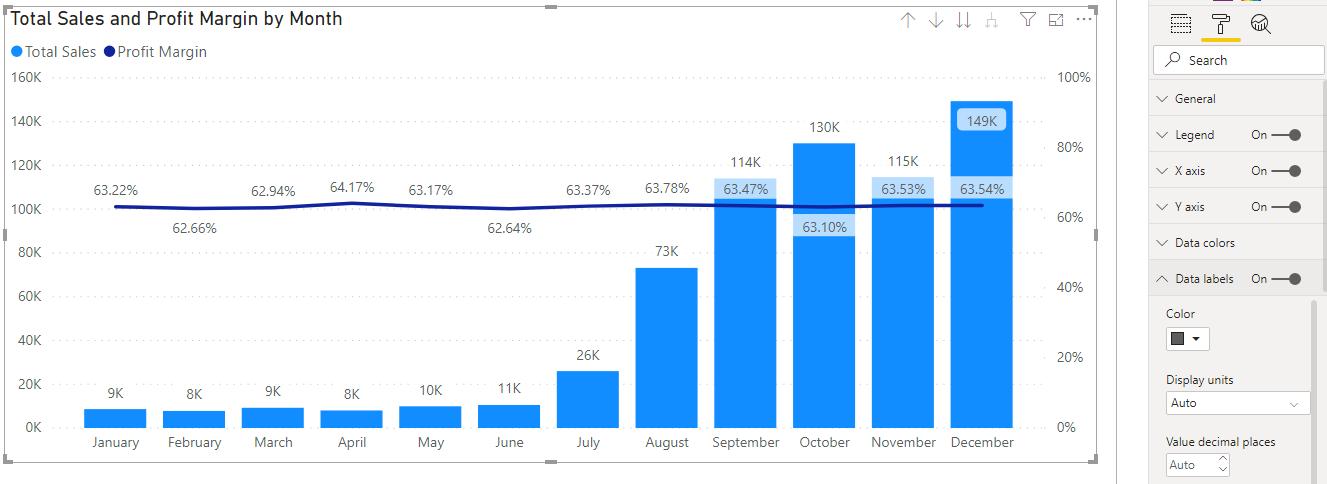
Next up is to fix up the chart title:
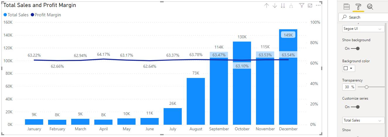
We can also add other fields into the Column values area such as the Total Costs:
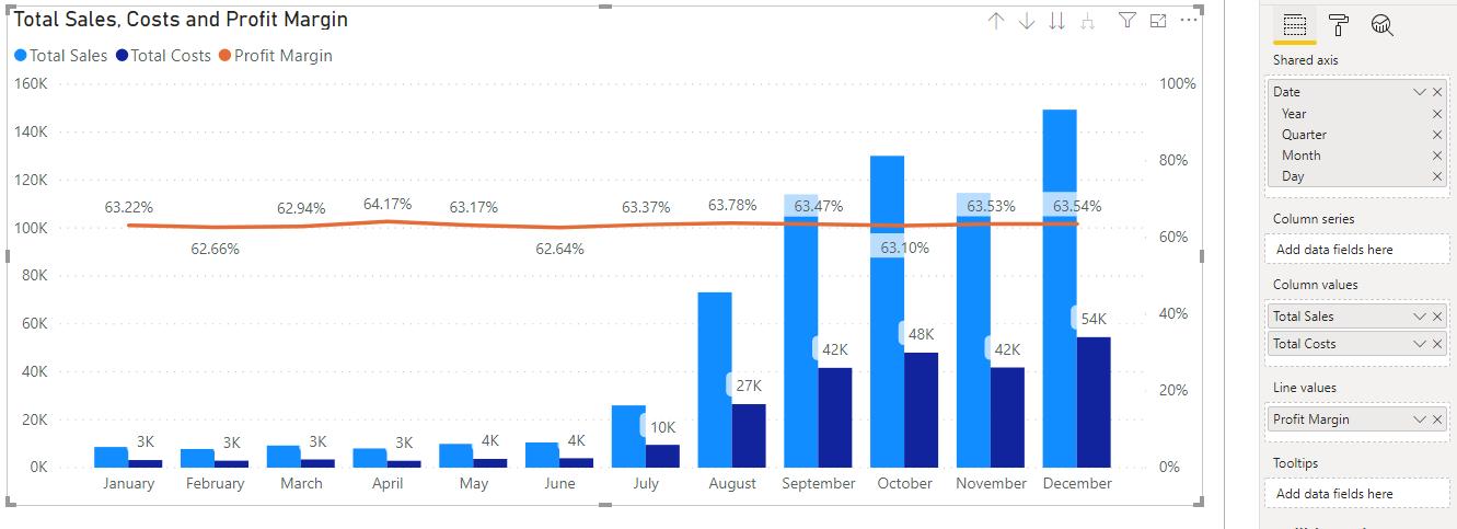
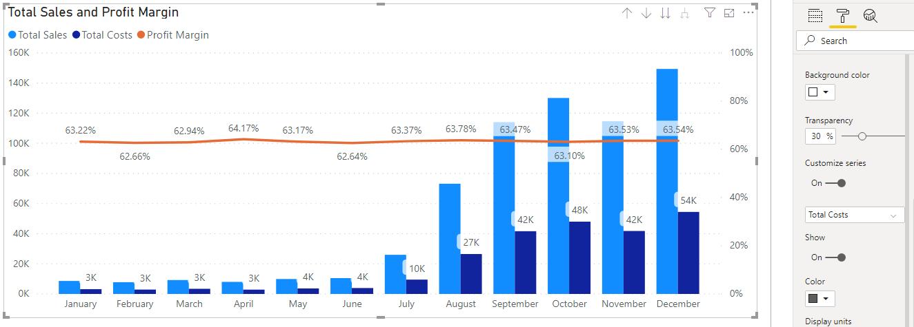
We can see that data headers are ‘on’ for the Total Costs measure. We can change this by going to the Format tab -> Data labels, scroll down and toggle the ‘Customize series’ option to ‘on’:
Then, toggle not to show the Data labels for the Total Costs measure:
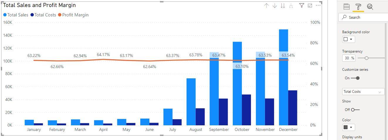
There we have it, how to create a simple Line and clustered column chart.
That’s it for this week, come back next week for more Power BI!
In the meantime, please remember we offer training in Power BI which you can find out more about here. If you wish to catch up on past articles, you can find all of our past Power BI blogs here.

