Power BI Blog: Impact Bubble Chart
5 March 2020
Welcome back to this week’s Power BI blog series. This week, we look at how to use the Impact Bubble Chart.
This week, I am going to have a look at a different custom visual called the Impact Bubble Chart.
For this blog, I am going to use Microsoft’s Contoso database, which may be downloaded from here. To download the Impact Bubble Chart, click on the ellipsis in the Visualizations pane:
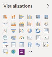
This will open a dialog box where you can search for the relevant Power BI visual:
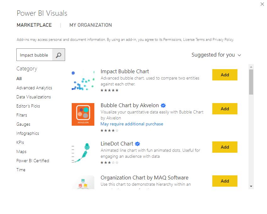
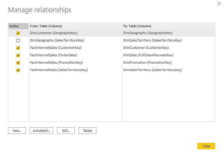
After searching for the ‘Impact Bubble Chart’ click on Add and Power BI will import the visualisation to the PBIX file. For the purpose of this blog, I am going to assume that you are familiar with how to establish relationships between tables imported into Power BI. If you would like to read more about establishing relationships, you can read about it here.
I am going to establish the following relationships:
Drag the visualisation into the report page. If you want to see the TotalProductCost on the x-axis, and the OrderQuantity on the y-axis, then I want the size of the bubbles to be the SalesAmount. I will have to drag the TotalProductCost field into the x-axis, the OrderQuantity field into the y-axis and finally the SalesAmount field into the Size area, viz.
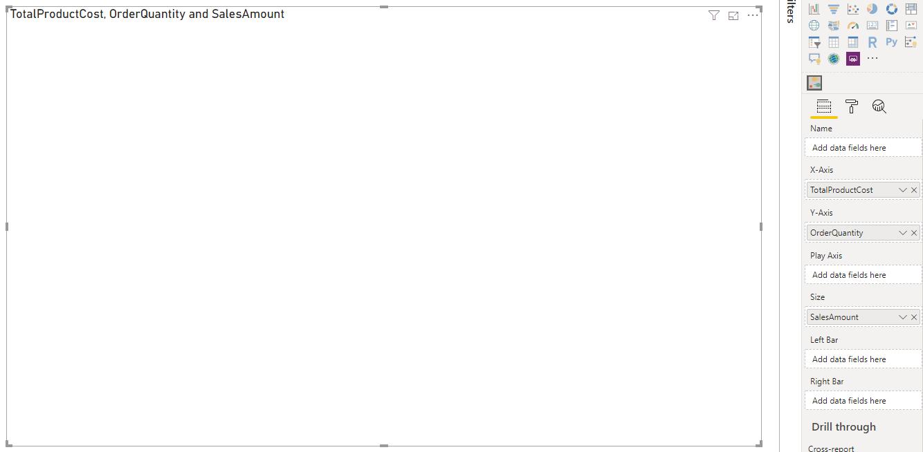
Do not be surprised if there is nothing populating in your visualisation at this point in time; I still need to put in two more fields. If I put the EnglishCountryRegionName field into the Name area I will see that the bubbles will appear on our visualisation:
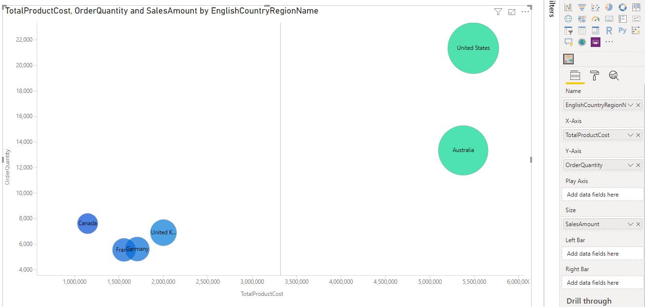
Sure, it’s working now, but what is the difference between this chart, in its current state, and the built-in scatter chart? Well, there is one more field I need to bring in. I will have to bring in the FiscalYear field into the ‘Play Axis’ area. This will create a slider bar at the bottom of the visualisation allowing me to slide through the years:
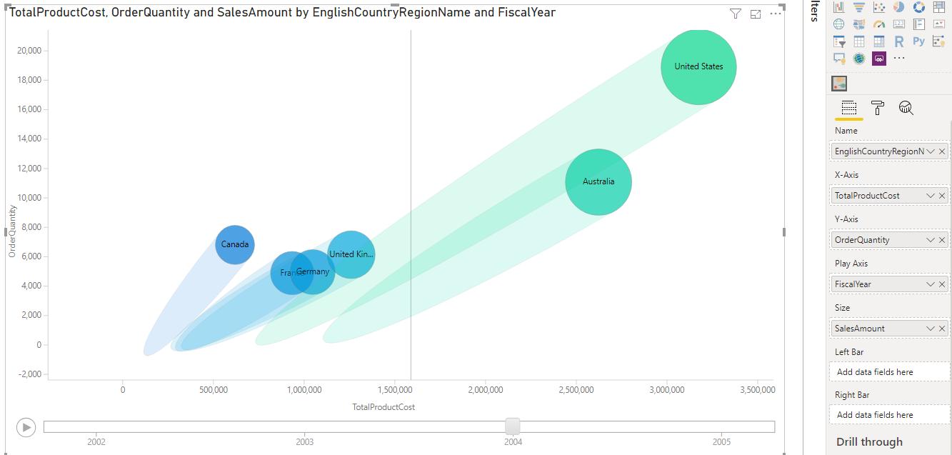
As you can see with the slider set at 2004 we can see the trails that illustrate how the countries sales figures have changed as the order quantity has increased and consequently the product cost.
That’s it for this week, come back next week for more Power BI.
In the meantime, please remember we offer training in Power BI which you can find out more about here. If you wish to catch up on past articles, you can find all of our past Power BI blogs here.

