Power BI Blog: Power BI Report Builder – Part 5
9 April 2020
Welcome back to this week’s edition of the Power BI blog series. This week, we take a look at how to format built charts in the Power BI Report Builder.
Last week, we created a chart in the Power BI Report Builder. This week, let’s look at how we change the formatting of said chart.
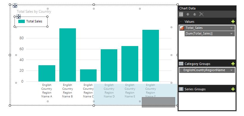
We can change the location of the legend by clicking on it and dragging it to a different location within the chart. The chart will highlight the various appropriate regions where we may place the legend. Looking at the picture below, the dark grey box is represents the current legend and the lighter blue area highlights the area where we can 'snap' the legend to on the chart:
Right-clicking the vertical axis shows a whole suite of axis-related formatting options:
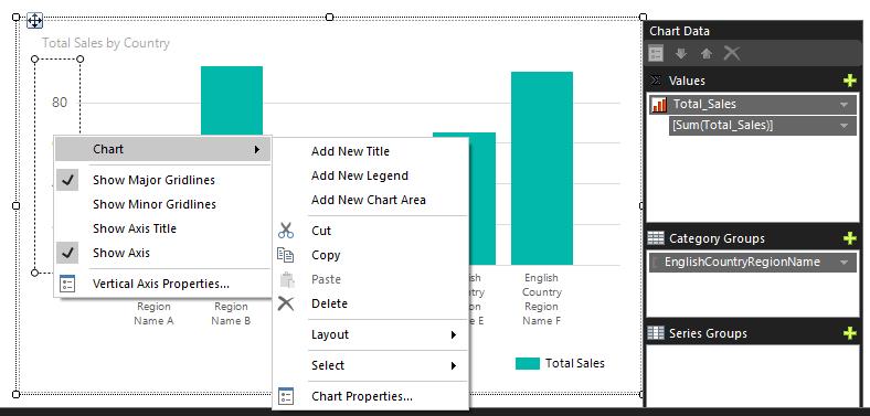
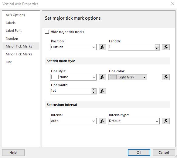
We can add minor gridlines, axis titles and more. If we click on the ‘Vertical Axis Properties…’ option it will display the ‘Vertical Axis Properties’ dialog, where there are even more customisation options:
Right-clicking on the horizontal axis displays a similar set of options:
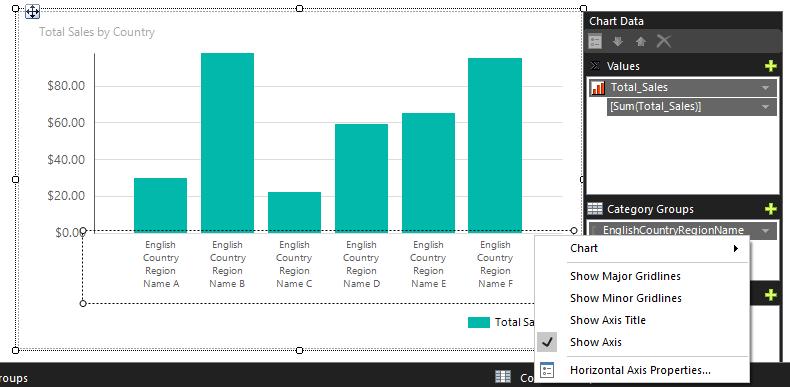
I have decided to add a line on the axis, so that the chart now looks like this:
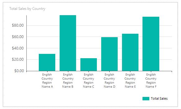
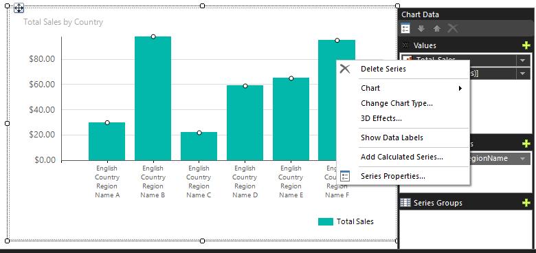
The last thing we can customise on this chart is the data series. Right-clicking on the data series presents us with several different customisation options:
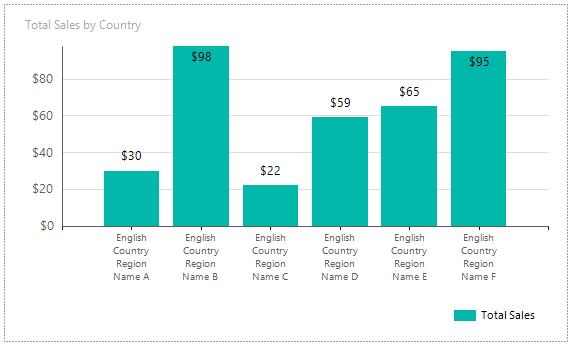
I have elected to show the data labels:
Referring back to the Power BI Report Builder page, clicking on Run would produce this:
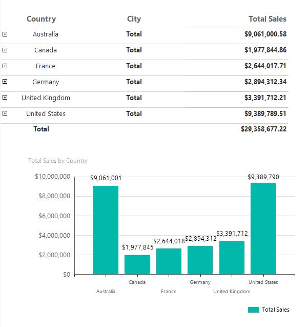
Fantastic! We finally have a simple report to print out. That only took us a couple of weeks. 10 out of 10 for efficiency!
That’s it for this week. Come back next week for more on the Power BI Report Builder.
In the meantime, please remember we offer training in Power BI which you can find out more about here. If you wish to catch up on past articles, you can find all of our past Power BI blogs here.

