Power BI Blog: The Pane Switcher
14 March 2024
Welcome back to this week’s Power BI blog. We will look at the new Ribbon design and the new Pane Switcher together.
When the recently updated version of Power BI was released, some amazing features came out as well, such as the revamped Ribbon and the introduction of the Pane Switcher. These features aim to improve your workflow with a cleaner user interface (UI).
The old Ribbon was a static panel, displaying all available options regardless of your current task. This often led to a cluttered interface, with relevant options buried deep in menus. The new Ribbon promises to be dynamic, adapting to your current context and displaying only the relevant tools and commands. This makes it easier to find what you need quickly and reduces visual clutter.
Previously in Power BI, we used the double arrows (<< and >>) to expand and collapse panes.
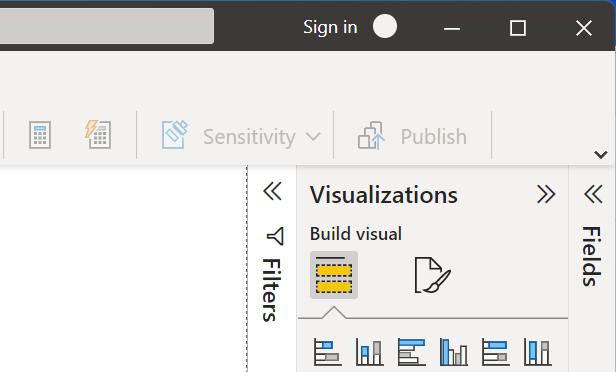
Power of the
Pane Switcher
The Pane Switcher solves the problem of having too many panes open in Power BI. It provides a central hub for managing all your open panes. You can easily switch between panes, group them together, or dock them to the side of your workspace. This keeps your workspace organized and your focus sharp.
To enable certain panes, navigate to the View -> Show panes and select the panes you would like to enable:

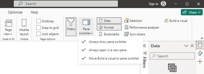
On the very right-hand side, we now have the Pane Switcher Ribbon, where you can switch between the panes easier, with a dynamic and context-aware Ribbon. However, if you are longing for the previous version (I confess I am), you can still bring back a similar UI. You simply navigate to View -> Show panes and click the Pane switcher button:

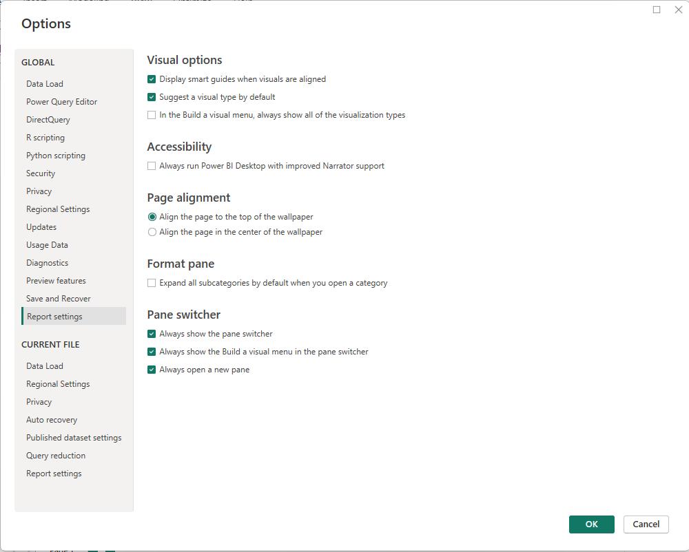
Turn on the Always open in a new pane option, and then you can have the all your panes open side-by-side.

But that’s not all. You should note that you now have a down-arrow down in each pane, which upon clicking shows a dropdown menu. There you can opt to collapse a pane, and still keep its icon in the Pane Switcher Ribbon.
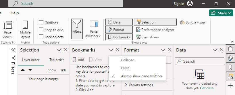
You should also note that the second option, Close, will close the pane and remove its icon from the Pane Switcher Ribbon. To open the pane again, you need to select it again in View -> Show panes.
The third option, Always show pane switcher, will attach the Build menu to the Pane Switcher Ribbon, if you'd prefer displaying it that way.
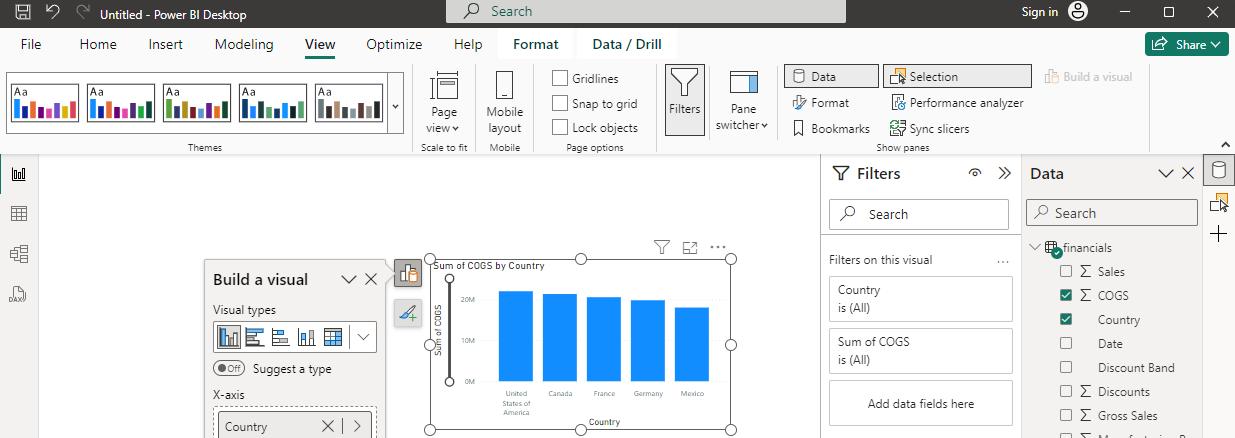
This option will enable a floating menu that pops-up in each visual, but the Move Build a visual to pane switcher option within the Pane Switcher button needs to be disabled first.
These features may also be changed from the settings. In File -> Options -> Report settings, you can see the Pane Switcher settings.
Whilst some users might miss the old Ribbon at first, the new design offers significant improvements in workflow efficiency and user experience. It is worthwhile to explore the new features.
In the meantime, please remember we offer training in Power BI which you can find out more about here. If you wish to catch up on past articles, you can find all of our past Power BI blogs here.

