Power Query: More Room for a View
27 May 2020
Welcome to our Power Query blog. This week, I continue my look at some new additions to the View tab, which are still not available on all versions of Power Query. Today, I look at ‘Column Profile’ and ‘Column Quality’.
As I mentioned last week, I have been waiting since last year for this to hit my version of Power Query, but as yet it is only available in some versions. It is however available in Power BI – where the View tab has some interesting new features.
Column Profile
If you tick the ‘Column Profile’ box, then for the column selected, you will see information at the bottom of the screen:
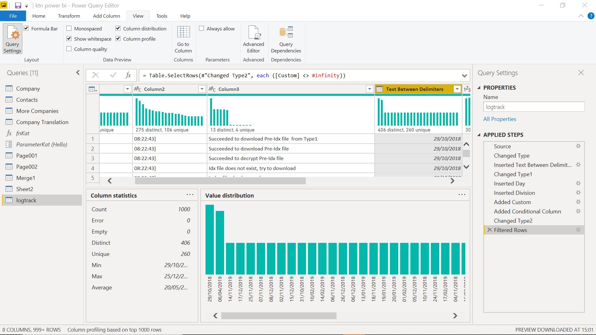
One thing that become apparent from this data is the count. The count is 1,000, but the data I have has many more rows than that. Currently, the new column analysis functionality only samples the first 1,000 rows by default. I can change this by left-clicking at the bottom of the screen, where it currently says ‘column profiling based on top 1000 rows’.
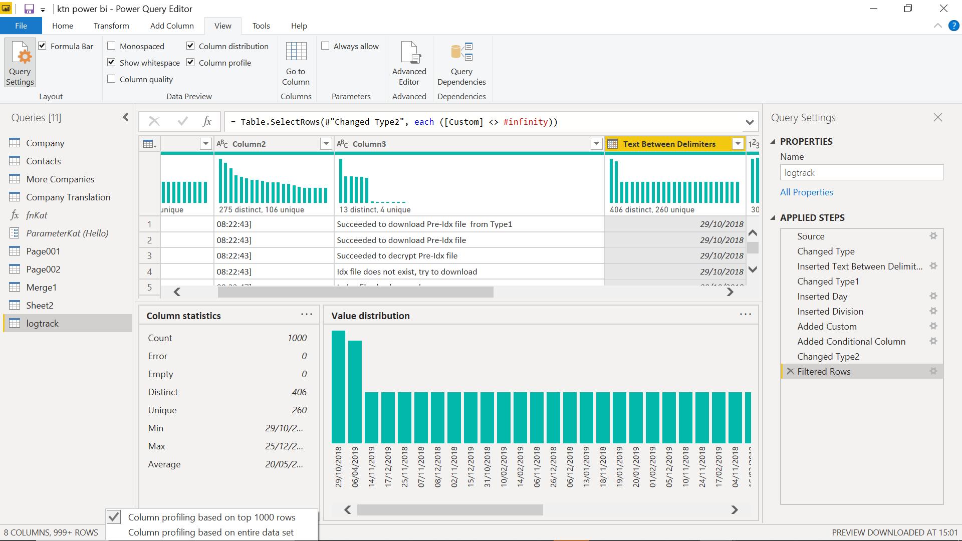
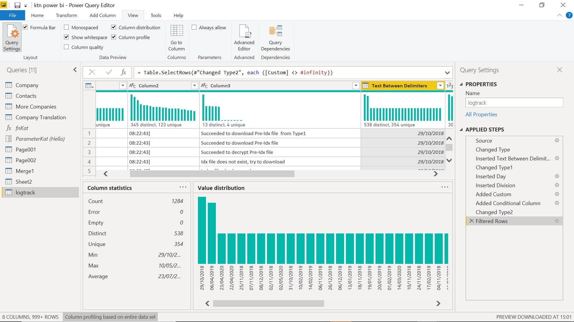
I can change this to profile ‘…based on entire data set’:
This information varies slightly depending upon the Data Type of the column. The previous screen is for a date column, whereas the next screen is for a text column.
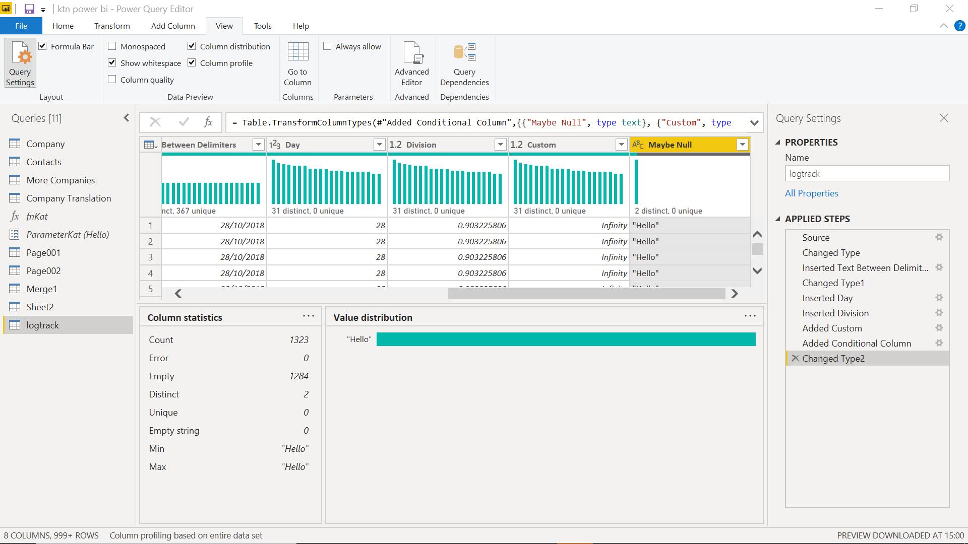
I have an ‘Empty string’ count and no average. Empty string is “”, whereas empty is null. I have lots of null rows, which is why there are two values, but null is not considered to be the minimum value. Another point to note is that I am no longer filtering on Custom, but now I can see the column distribution data! It seems that if I access the other column analysis data first, I am able to see the distribution data too without filtering as long as the datatype is not ‘Any’.
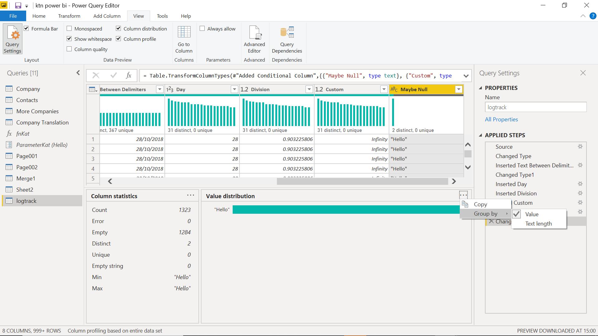
There is also an option to group by text length for text columns. This changes into a bar chart which is not a great option in such a small display pane though.
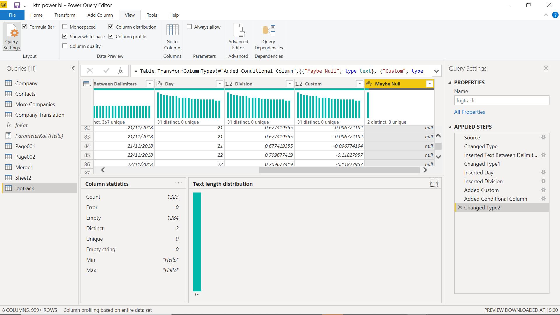
This also keeps a bar chart format if I move to a numeric column.
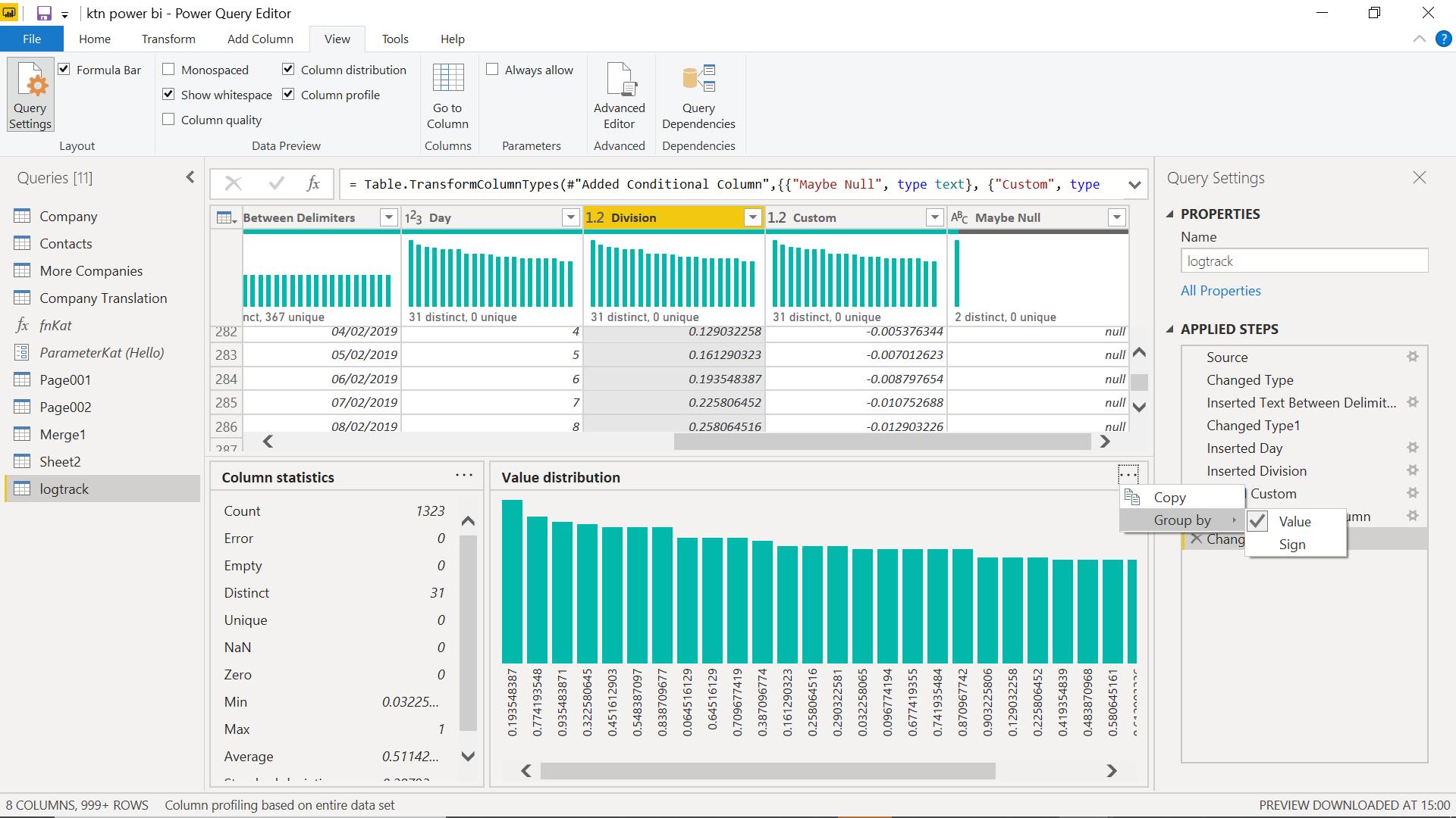
In the numeric column, I have the option of grouping by value or sign.
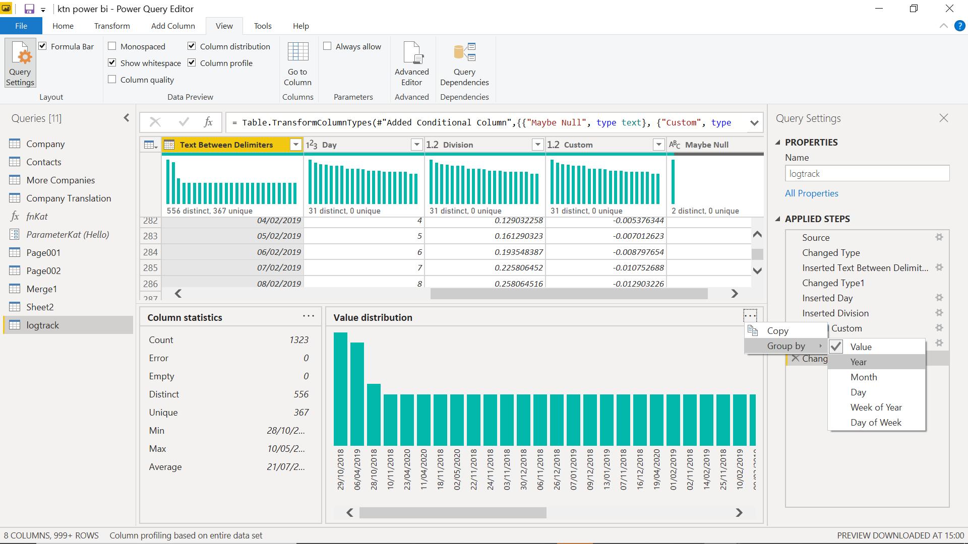
In a date column, I can group by Value, Year, Month, Day, Week of the Year or Day of the Week.
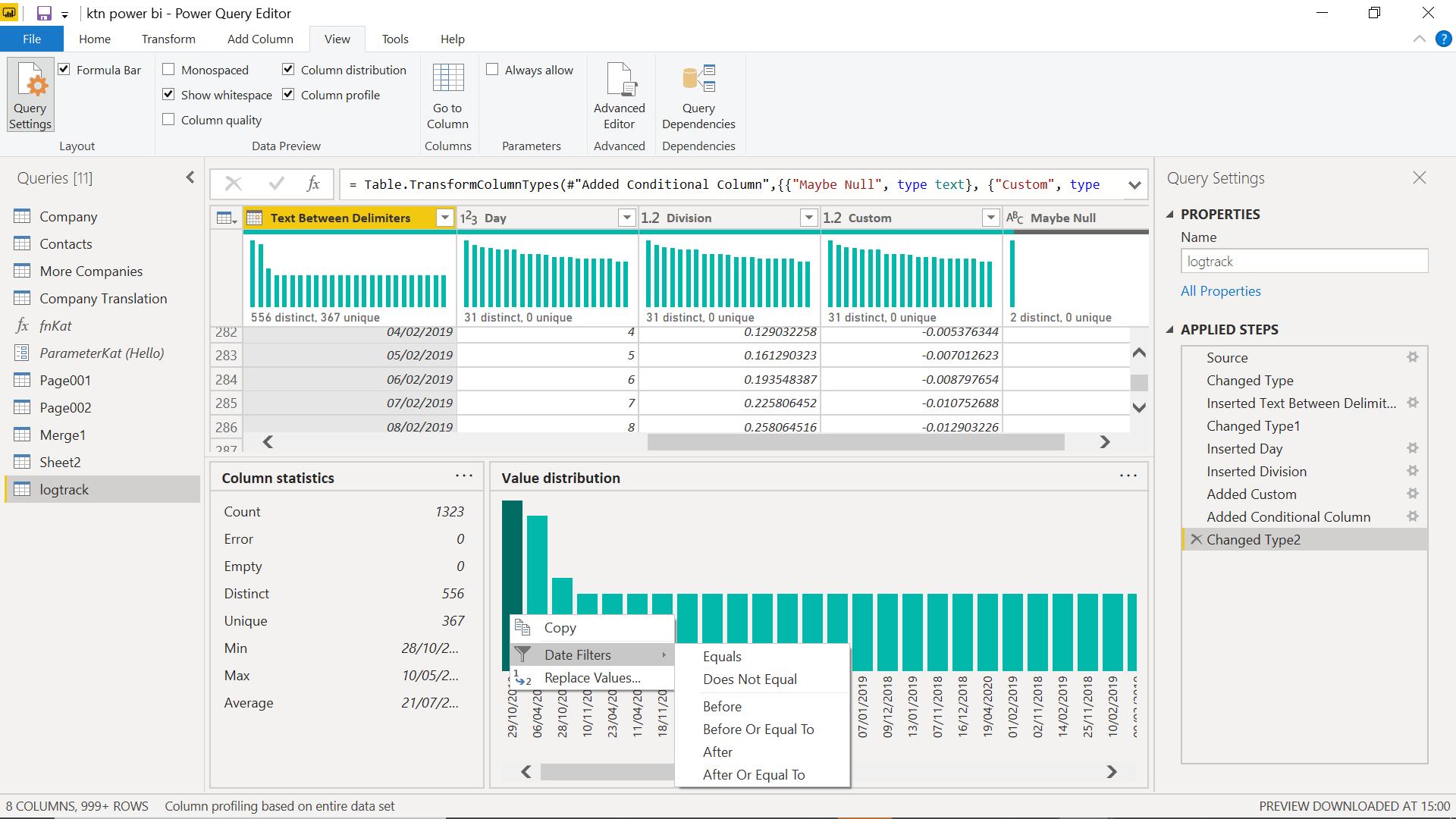
I can also choose to filter by specific values, by selecting a bar and right clicking.
Column Quality
If I select the checkbox for ‘Column Quality’, I can see more data. I have unchecked the other column analysis boxes to make the column quality data clearer.
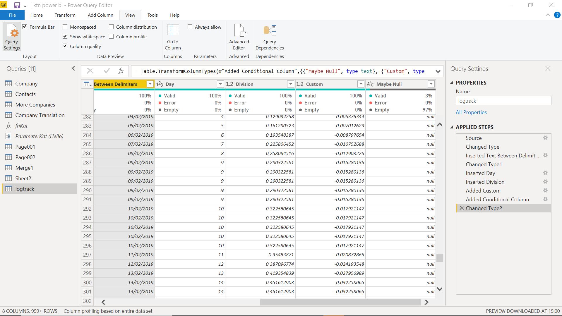
There are three coloured dots: one for valid, one for errors and one for empty.
The errors are those recognised by Power Query, and empty means a blank or null entry, ‘valid’ denoting the rest. The values are given as percentages, but if I hover over the quality for a particular column, I can see the number of rows for each category:
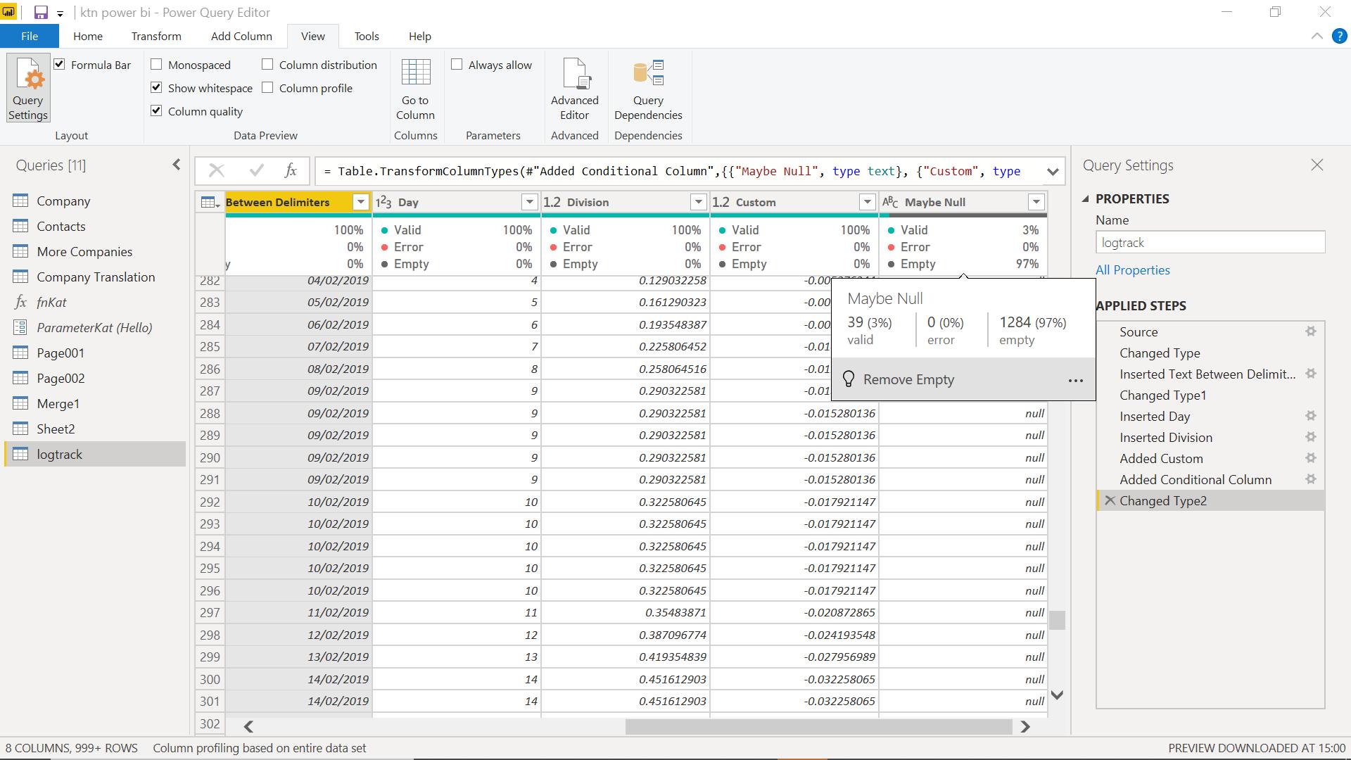
There is a suggestion to improve quality if that is possible, which for my example is ‘Remove Empty’.
In summary, there are some inconsistencies with the way the analysis data appears, but it is a good start, which will hopefully be improved on in future releases, and installed in all versions of Power Query.
Come back next time for more ways to use Power Query!

