Power BI Mobile Apps Gets a New Look (Preview)
3 September 2019
Power BI Mobile provides the tools you need to stay connected to your data, wherever you may be. However, as organisations grow, it becomes increasingly difficult for Power BI users to discover and manage the content that matters to them on the go. Microsoft has indeed recognised that users must be able to find exactly what they need quickly and easily when they’re using the Power BI Mobile app to view and interact with their content.
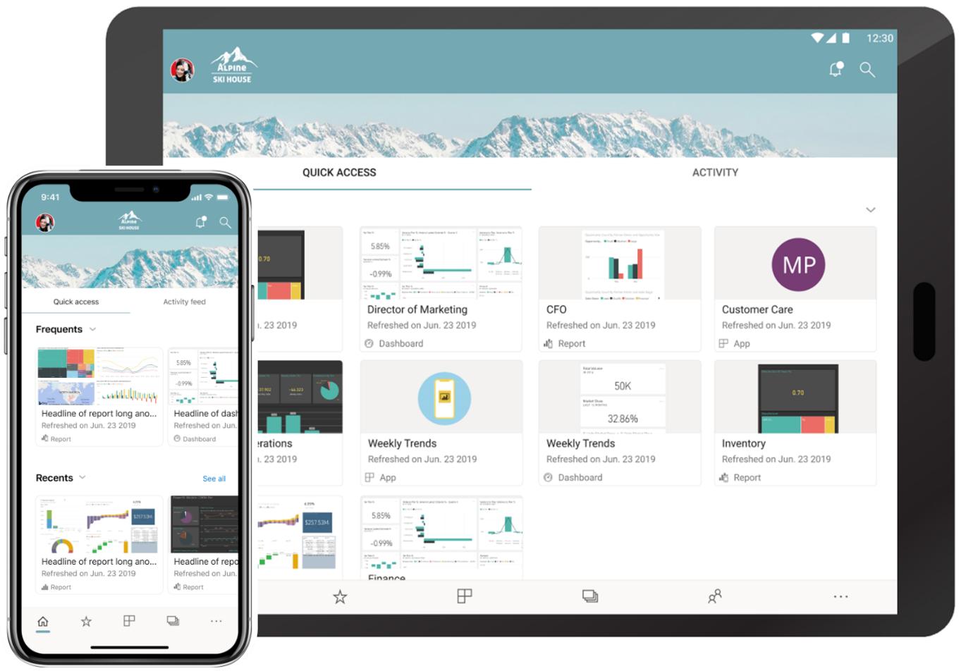
With this borne in mind, last month saw the public Preview of the ‘new look’ now available on Power BI Mobile. Now, there is a home page that provides quick access to your commonly used content and includes your organisation brand theme and new navigation bars that give you a simpler way of navigating through the app.

As this is a Preview, you’ll need to opt in and turn it on in the mobile app. Once you do that, the app will display several new features:
- Home page
- Organisation branding
- Navigation bar.
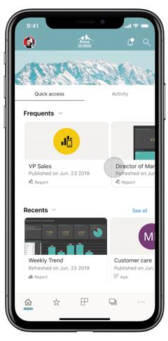
Here’s an example of how the new home page shows on the mobile app:

At the top, the app will show your organisation’s branding, so it will have same look and feel as your Power BI Service to match your corporate theme. The organisation brand elements are defined by your Power BI administrator in the Power BI Service, and will show up in your Power BI Mobile app as well.
In addition, the home page provides two tabs:
- Quick access: here, you’ll have a way to view and find your most commonly accessed items in Power BI. You’ll be able to view the content cards that provide easy access to that content, in addition to metadata for the content itself, such as its last refresh time. You may look for your items in the Frequents section, where you’ll see a list of items ordered by the number of times you viewed them; you can use the Recents list to view the items that you’ve recently accessed
- Activity (coming soon): here, you’ll receive a feed with events happening in your Power BI account that are relevant to you. The feed ensures you can stay up to date with the latest comments and activities.
Microsoft has re-built the app navigation, implementing a more standard mobile navigation experience to make it easier to find your way in the Power BI mobile app. Now, instead of using the top left ‘hamburger’ menu, you have a bottom navigation bar, providing you with an easy way to swap between pages and use your preferred way to find your content.
From the top bar you can access the notification center and search for Power BI content. If you want to connect (or switch) to Report Server or access the app setting page, just tap on your account avatar. Simple.
It’s noted this may not appeal to all. During the Preview period the new look experience will require you to turn it on explicitly, so you have time to become accustomed. There are several ways you can opt-in to the new look Preview. You may turn it on from the introduction banner or, if you have closed the banner, you can opt in from the side panel or from the app settings.
The Preview period allows us to get your input and feedback on our new design, learn from it and improve. During this period, Microsoft will continue to add new capabilities and might adjust the experience, based on your feedback. You have been warned!!

