Trendy Forecasting in Excel
Excel is often used as a forecasting tool – but specifically, which functions can aid forecasting? By Liam Bastick, Director with SumProduct Pty Ltd.
Query
I have a lot of historical company data and I have been asked to create some forecast projections in Excel. Any tips please..?
Advice
Lies, damned lies and statistics: it doesn’t take long for us all to become ensnared in the dubious world of Excel forecasting. I could write a book on useful Excel functions / functionalities that can assist, and another weighty tome on the perils of using such techniques.
The main problems are to know which techniques to use when (consult a statistician if unsure) and how to interpret the ensuing data. Here, I plan to keep it simple, but please be aware that in this area of modelling, like many other areas, GIGO still applies – Garbage In, Garbage Out.
To aid with this month’s article, please refer to the attached Excel file, and note that in order to keep it simple, we will only be considering linear relationships (i.e. if we plotted the points on a graph, we should find that we could draw a straight line through the plot points).
Time Series Forecasting
A common forecasting technique is to take existing data, say sales, and extrapolate forward. Excel has a very simple function for doing this: TREND.
TREND(known_y’s,known_x’s,new_x’s,constant) projects assuming that there is a relationship between two sets of variables x (independent variable – the inputs) and y (dependent variable – the output), through a formula y = ?x + c, i.e. the equation of a straight line (? is the gradient of the line and c is the y-intercept).
Here, time is our independent variable (x) and sales is our dependent variable (y). We only specify the constant if we want to force c in the equation (not common – it will usually be left blank).
Let’s consider an example (in the Excel file):
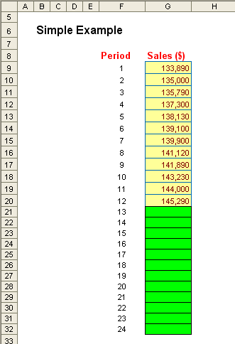
Problem
Solution with TREND
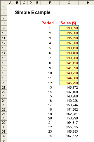
Here, we have 12 months of sales data and want to project what the sales will be for the following 12 months. We can enter a straightforward formula into each cell, e.g. G21 could be
=TREND(G9:G20,F9:F20,F21),
or in one go, we could highlight cells G21:G32 and type in the array formula
=TREND(G9:G20,F9:F20,F21:F32)
and press CTRL + SHIFT + ENTER (this will insert the braces, ‘{’ and ‘}’, automatically). Either way, you would get the solution pictured above.
The problem here is what happens if you have seasonality (i.e. the sales go up and down during the first 12 months)? TREND would not accurately account for this as it assumes the relationship between time and sales is linear. A common “bulldozed mathematics” technique to counter this is given as an extension of this example in the Excel file – but it is a highly arbitrary solution.
Other Functions: Finding the Gradient ?, the Slope c and the LINEST Function
For transparency, using TREND alone may prove insufficient. End users might wish to assess the gradient of the line, the intercept and even the “goodness of fit”, i.e. how well the equation matches the data.
Using another example from the Excel file:
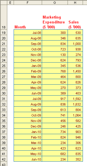
Here, rather than use the time as in the TREND example, we can assume that sales is a function of marketing. We could use the formula SLOPE(known_y’s,known_x’s) to estimate the gradient, viz.
=SLOPE(H19:H42,G19:G42) = 1.44.
We could also use INTERCEPT(known_y’s,known_x’s) to estimate the y-intercept:
=INTERCEPT(H19:H42,G19:G42) = 8.55.
This gives us the equation y = 1.55x + 8.55.
Alternatively, this data could be plotted on a scatter chart very simply. We could then add a trend line as follows:
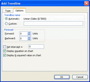
Excel 2003 and earlier
- Click on the Chart;
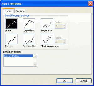
- Go to the Chart drop down menu and select ‘Add Trendline…’ (ALT + C + R);
- From the ‘Add Trendline’ dialog box, select the first tab ‘Type’ and choose ‘Linear’;
- From the second tab ‘Options’, tick the ‘Display Equation on Chart’ check box; and
- Also, tick the ‘Display R-squared value on chart’ check box
Excel 2007 and later
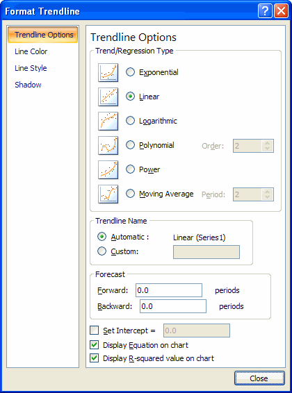
- Click on the Chart;
- Under Chart Tools, select the ‘Layout’ tab on the Ribbon;
- In the ‘Analysis’ group, click on ‘Trendline’;
- Choose ‘More Trendline Options…’;
- Under ‘Trend/Regression Type’, choose ‘Linear’;
- Tick the ‘Display Equation on Chart’ check box; and
- Tick the ‘Display R-squared value on chart’ check box
This would then give us the following chart:
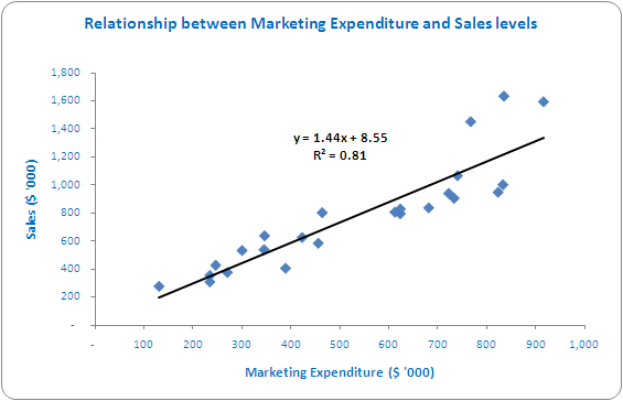
Note that the independent variable (input) should always be plotted on the horizontal (x) axis.
Not only does this give us the equation derived above, it also shows us the goodness of fit, R², the correlation coefficient. R² gives us a value between zero and one, where zero means no relationship and one is perfect correlation. In this example, a correlation coefficient of 0.81 is a high correlation in practice and can be seen by how well the line approximates the data.
We do not have to use SLOPE and INTERCEPT to derive our ? and c.
LINEST(known_y’s,known_x’s) (simple version of the function) will calculate this all in one go as follows.
Returning to our earlier marketing versus sales example and referring to the Excel file as necessary, let’s highlight two cells, say H73:I73 (see file). Then type:
=LINEST(H19:H42,G19:G42)
and then press CTRL + SHIFT + ENTER (array formula). Cell H73 will calculate the slope (1.44) and I73 will derive the intercept (8.55).
The advantage of LINEST over SLOPE and INTERCEPT is it can be used to derive an equation where the dependent variable is based on a series of independent variables not just one, e.g.
y = ?1x1 + ?2x2 + ?3x3 + ?4x4 + c, etc.
The Excel file provides such an example.
Error Estimates
Where projections are used, variance analysis surely follows. In order to ascertain how well we have forecast we often use measures that estimate bias and accuracy:
- Bias – A forecast is biased if it errs more in one direction than in the other (i.e. we under-estimate or over-estimate on a regular basis); and
- Accuracy – Refers to the distance of the forecasts from the actual data, ignoring the direction of that error.
The idea here is that forecasting is an iterative technique and we use the outcomes from our error analysis to refine our forecasting techniques (e.g. not using all of the historical data, making ‘normalising adjustments’).
Consider the following example. For six time periods, t1 to t6, we compare actual demand at time t, Dt, with forecast demand at time t, Ft, as follows:

Obviously, this is not enough data points to make a proper conclusion – the intention here is merely to provide an illustrative example.
We can consider the following measures:
- Cumulative sum of Forecast Errors (CFE). This measures both bias and accuracy = SUM(Et) = -20;
- Mean Absolute Deviation (MAD). This considers the magnitude of the average error = 170 / 6 = 23.33;
- Mean Squared Error (MSE). An alternative to MAD, it takes the square of the errors and divides it by the number of observations = 5,150 / 6 = 858.33;
- Standard Deviation (SD). A common technique to measure the ‘spread’ of the distribution, care needs to be taken if the error spread is skewed in one direction or another (e.g. if the magnitude of CFE is large) = SQRT(MSE) = SQRT(5,150 / 6) = 29.30; and
- Mean Absolute Percentage Error (MAPE). This is the average of the percentage errors = 83.49% / 6 = 13.91%.
No one technique should be used in isolation. The user should look at what the overall summary is rather than review one metric in isolation.
Summary
We have looked at forecasting only where we believe there is a linear relationship between the independent variables (inputs) and the dependent variable (output). Other types of forecasting are quite common however: e.g. where there are logarithmic, exponential or polynomial relationships instead (in these instances plot points on a scatter chart will not tend to a straight line).
TREND is useful for forecasting ‘linear’ outputs; INTERCEPT is especially useful for deriving the linear equation necessary to generate forecasts, especially if there is more than one independent input contributing to the output.
You should consult a statistician if forecasts are to be relied upon heavily. Professional analysts will review each input and ensure there is a true rather than spurious correlation, which is way beyond the scope of this article.
But it’s a start – as long as it is viewed as that and nothing more.

